We all know that all those decisions damage blender’s current comunity more than help new users, Blender Foundation is expecting to replace blender comunity with kids?
Just take a look at the comments on the last Live with @pablovazquez, you see, the vast majority dont like whats being done with blender, we paid codequest for nothing? developers made this site to gather feedback or to ignore what we write here?
@brecht, you are a developer also, please tell us why we are being ignored, replaced.
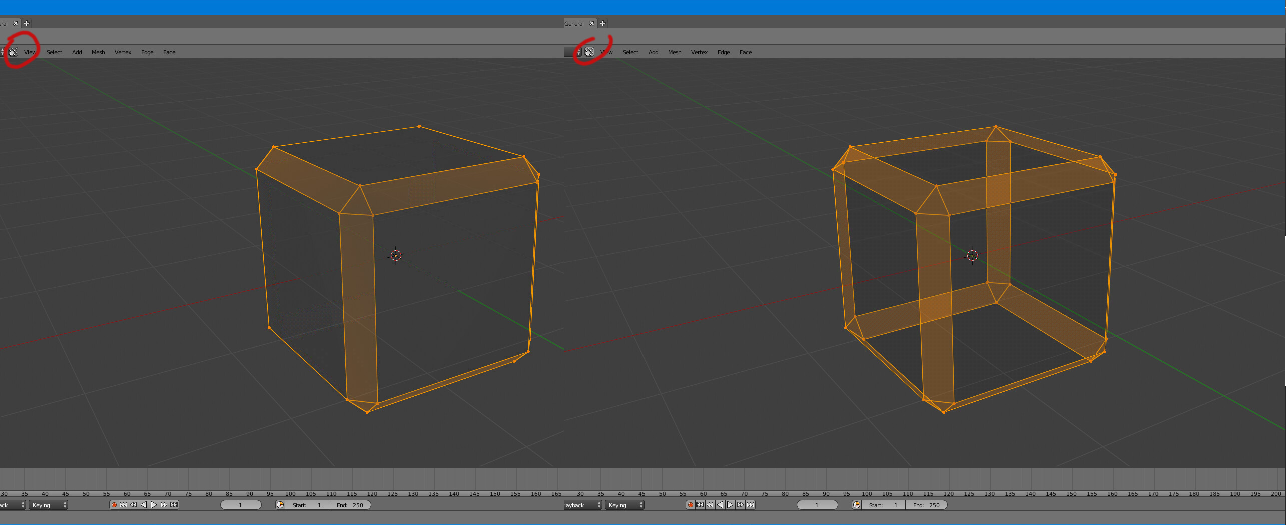
First, I agree communication around this wireframe topic has been quite poor and confusing. There will be a fast way to switch to wireframe display, most likely using a wireframe draw mode with a shortcut as there was in 2.7x.
Second, the user interface changes are being done by the same people who designed and implemented the Blender 2.5x UI, and everyone has a long experience using Blender that goes back to much earlier versions. Finding a better alternative to wireframes is something that Ton has been pushing for, and of course he is the one who originally designed Blender.
You can certainly disagree with design decisions, but that doesn’t mean there is no reasoning behind them or that most other Blender users would be unhappy with the changes. I remember quite a few design changes that were controversial in 2.5x (like switching to vertical panels), that are practically never mentioned nowadays. The best way to have an impact on development is to just provide constructive feedback here with practical suggestions. It’s almost always possible to find solutions to keep existing users happy and make things more friendly for new users, but it takes some iteration and temporary breakage to get there.
How close will we be able to get 2.8 to 2.79? It seems like most changes are made to help new users learn how to use the software, but they also damage old users’ workflow.
I hope it’s not the addon people are talking about… It was almost a laugh among colleagues that blender depended on addons for almost everything, if I have to put in an addon, or activate it, to switch to wireframe mode… Laughters will be heard on the other side of the globe.
We also have dozens of users freaking out that blender has a dark theme by default… Let’s be clear, if all the 3D modeling programs (Houdini, Modo, Cinema4D, Maya, Max, Photoshop, Nuke,…) come with a gray theme is for a very simple reason, it’s the most comfortable thing to see when you work 10 hours with a computer. Putting design above pragmatism or ergonomics is another example of such wonderful decisions. And you can have 200 people on twitter rejoicing, that the decision is bad anyway. Because these are decisions that no one will complain about, the user will simply get more tired and will not know why.
About the changes in blender2.5, I think it’s a comparison that’s very out of context. In Blender 2.4 there was a clear problem with the interface (I tried it a dozen times and it seemed unfeasible to use it and in Blender2.5 it was very simple). It is not the case of Blender2.79, that its interface is not practically touched, things are changing place, but the interface design is practically the same. And we can go to any program in the industry and see that they have much more complicated interfaces, much denser and no problem at all. In the case of blender2.79 it has an interface that is practically the same structure as MODO, so it’s hard to see how that could be a problem.
I do find the Tools panel been removed a bit… sad. BUT, since when did I last use a button in the tools panel?
Never.
At least when it is the 3Dview. I do have a lot of things I like in other editor’s tools panel.
I think, any changes that are optional doesn’t have to be criticized. We can change them. A one time fix and no longer problem. What’s the point in complaining about that kind of changes?
No, the removal of the tools panel desnt, affect that much, but where addon buttons gonna appear now?
I have an addon to maintain and I must find a place to put all the tools, they arent modal, only one time clicks, I hope they keep the toolbar as a new editor like Pablo told on the last live.
The problem I have mentioned few posts earlier is with Limit selection to visible. It does affect the viewport when wireframe is on in the wrong way I think.
if you are a new user that tool panel is basic, also that you need the panel for a lot of plugins and functions. Actually in custom normal branch you need it to setup your custom normals weights
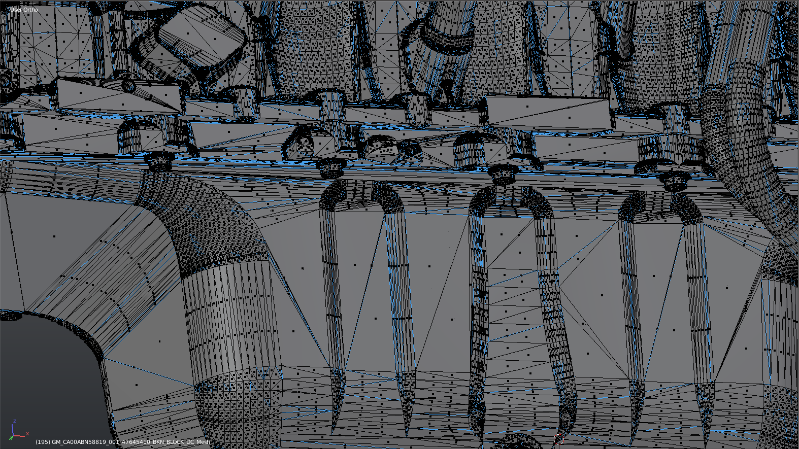
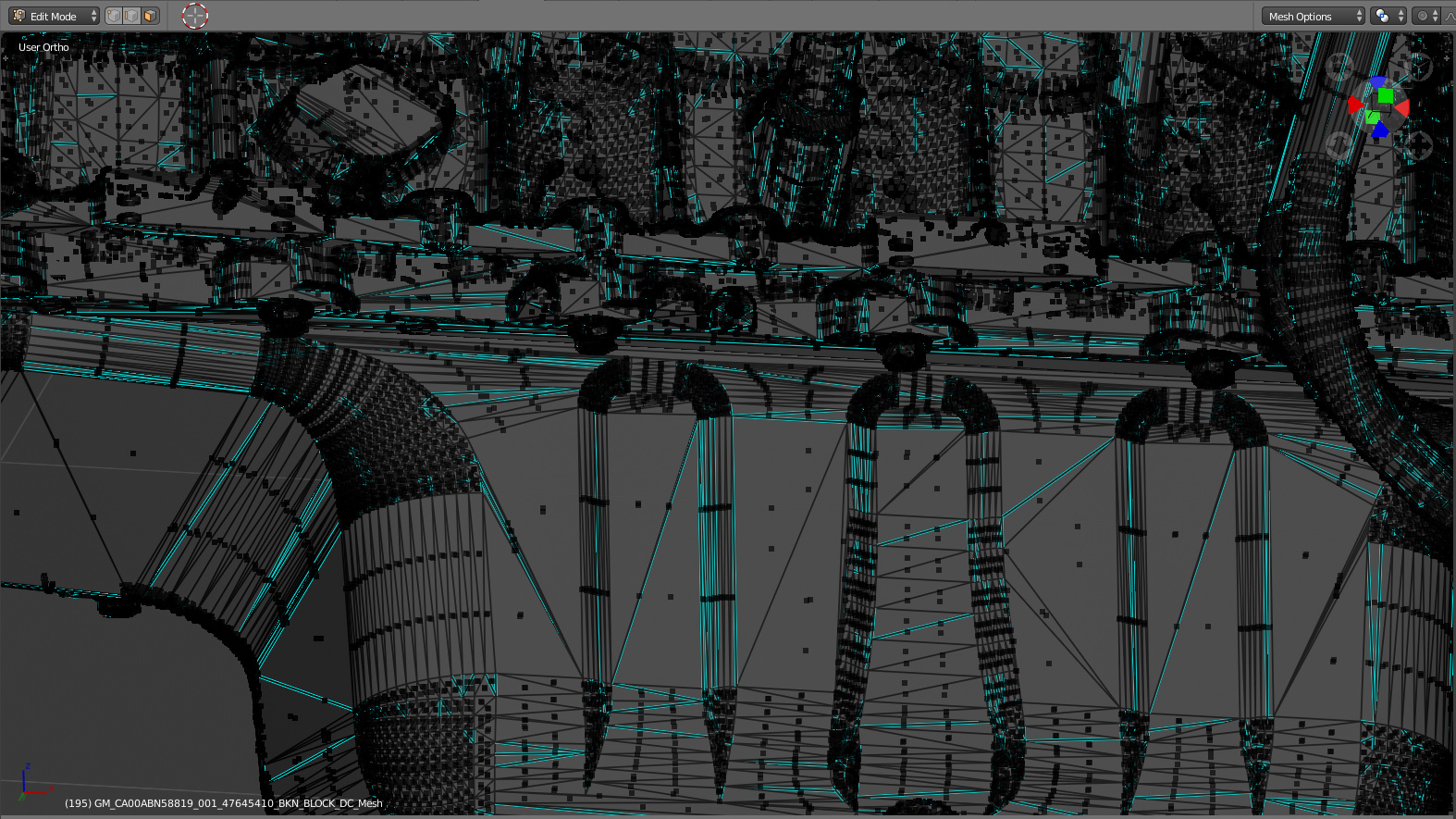
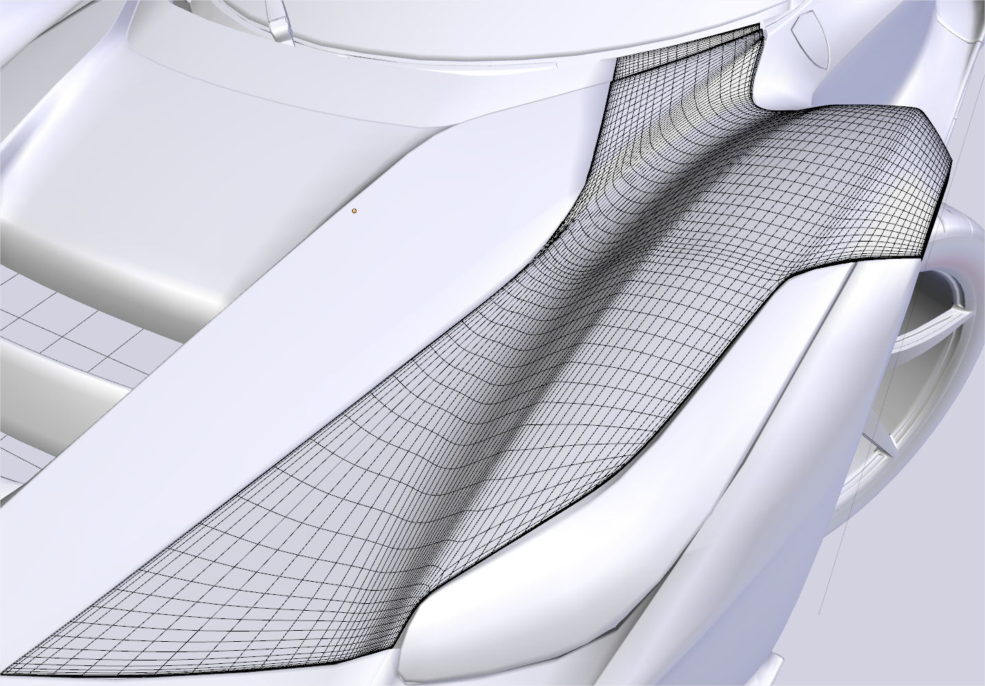
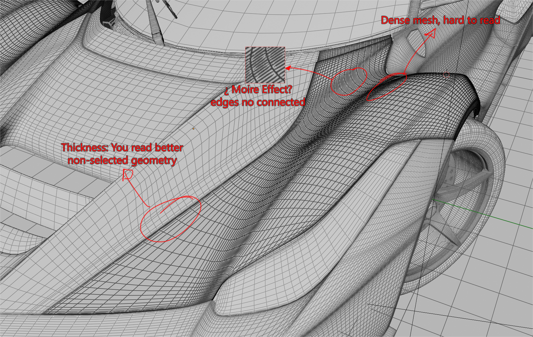
Even the Wireframe on Edit Mode is too cluttered. We are suffering a loss of detail and clarity because of how “thick” every line and face indicator is, compared to 2.79 and previous versions. A new version should never be worse than the one before it.
Compare a screenshot I took of a very dense mesh in edit mode on the viewport on both versions:
2.79:
PS: both screenshots were taken from the same distance, if it was not clear.
Ignore the mess of triangular faces and Sharp edges, this was an .STP converted file that I received from a client. It can happen to any of us who uses blender in a professional capacity… not always will you receive the cleanest of meshes, and the bad mesh should not be an excuse for worse viewport visualization.
I know it’s a matter of opinion, but I’m not a noob, I work with blender since 2.48 and IMO the new version suffers a loss of visual information clarity and could be improved to 2.79 standards or better if possible.
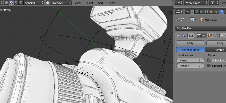
It’s intended for visually cleaning planar faces, so what you show is what I expect. What was your expectations about this, instead? how should it behave?
I agree with alberto here. Ability to change the thickness and opacity of the wireframes is really usefull.
One use-case for this is while doing tracking and matchmoving, when the models/lidars are really dense and you want to see your backPlate clearly through the mesh.
In this model, you can see the problem, actual wireframe of edit model is really thick, so you can’t see the model correctly. Also the new wireframe model is not consistent.
Blender2.79 wireframe (perfect representation, zero problems)
I understand that it’s temporal, like thickness are easy to change parameters, but some problems appear to be the new wireframe system technology (moire effect)