This problem of wireframe selection becomes especially noticeable when watching modeling video tutorials on YouTube - it has been very difficult to keep track of selection there for the last two years.
example:

This problem of wireframe selection becomes especially noticeable when watching modeling video tutorials on YouTube - it has been very difficult to keep track of selection there for the last two years.
example:
Exactly, it is incredibly hard to follow selection during watching 2.8+ videos. because it is barely visible most of the time.
A nice example from Yegor in twitter (he proposed to change color from dim orange to dim yellow, but the original issue is the same):
Working with mesh in 2.8+ turns to a instant colorblind testing
Yes the selection wireframe is tragic… color, opacity, line thickness… everything…
At least for selection edge there should be no opacity(if there is) and line thickens could be increased.
Plus the overall wireframe could be more “inelegant” to try to keep the contrast between it and the object as high as possible.
And, maybe not directly related but edge length(measurement) is unusable with the current color scheme.
The overall contrast in viewport is poor.
Well, yes, elegant AA wireframe is good for observing models as a whole, but edges roughness is more helpful for topology recognition during modeling.
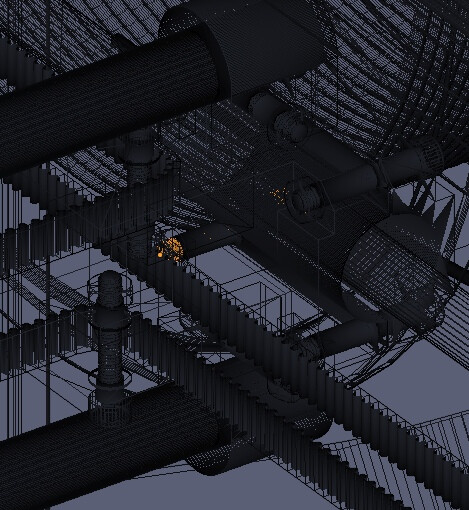
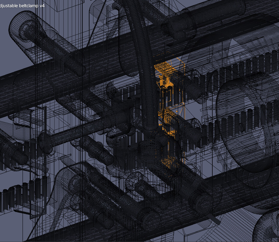
Next Issue: wireframe draworder.
Workflow: heavy CAD
Selection’s draworder was flipped between shaded mode and wireframe mode.
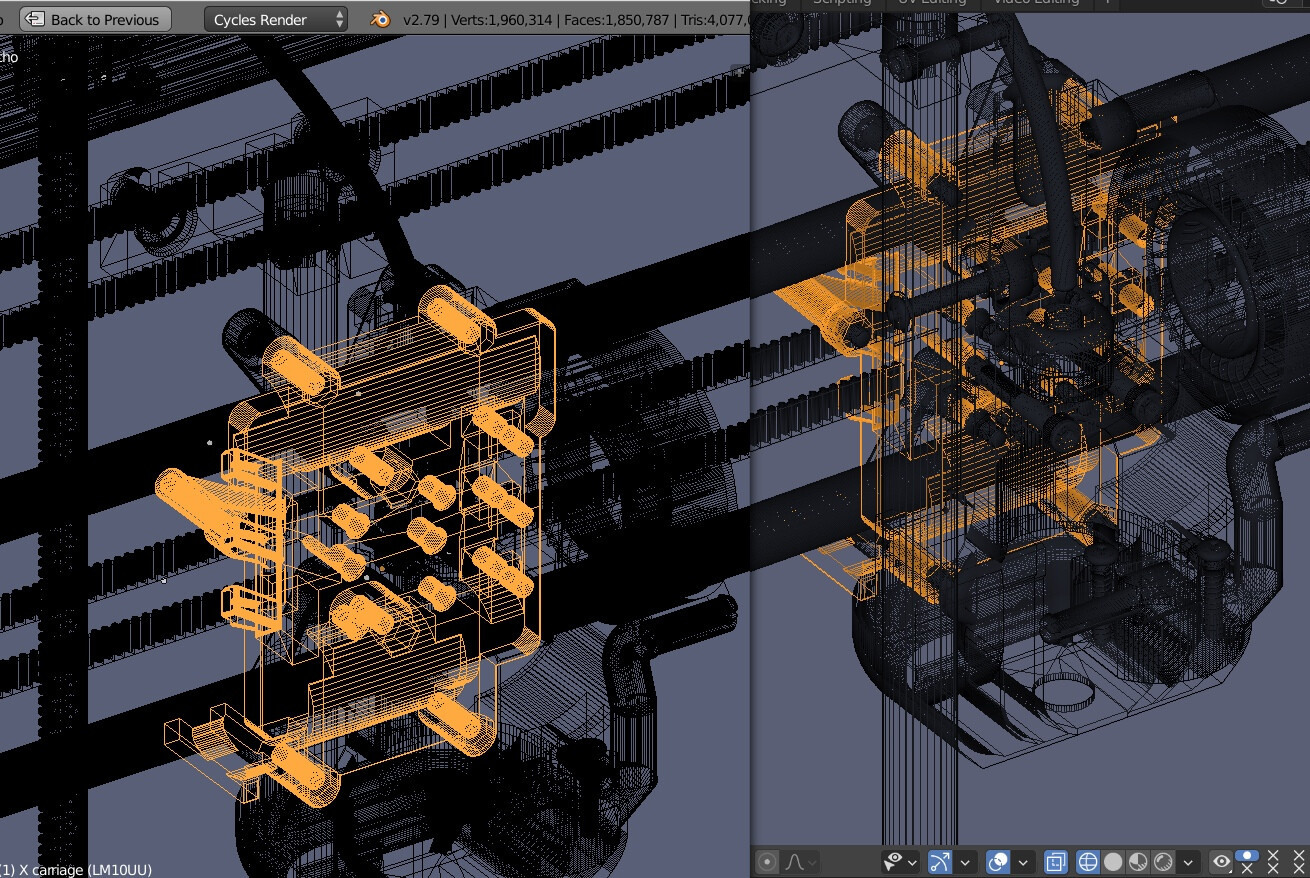
As a result, when working with dense CAD meshes and when switching to wireframe, you cannot read the selected objects correctly to check how they are distributed in the model.
Objects became barely visible
or unrecognizable
As a result, you cannot check the selection in either shaded mode or wireframe mode.
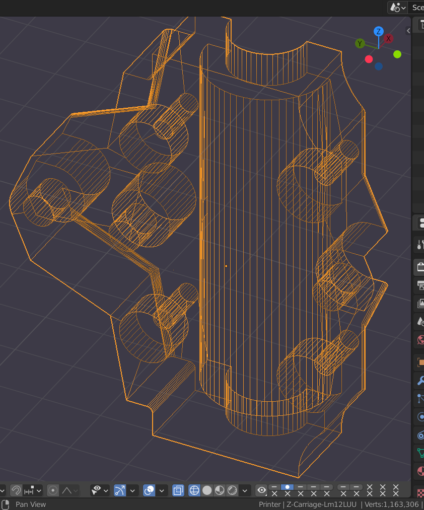
Next issue: fresnel effect wireframe inconsistency
Workflow: CAD
There are two shading types are needed to obtain full information about CAD model
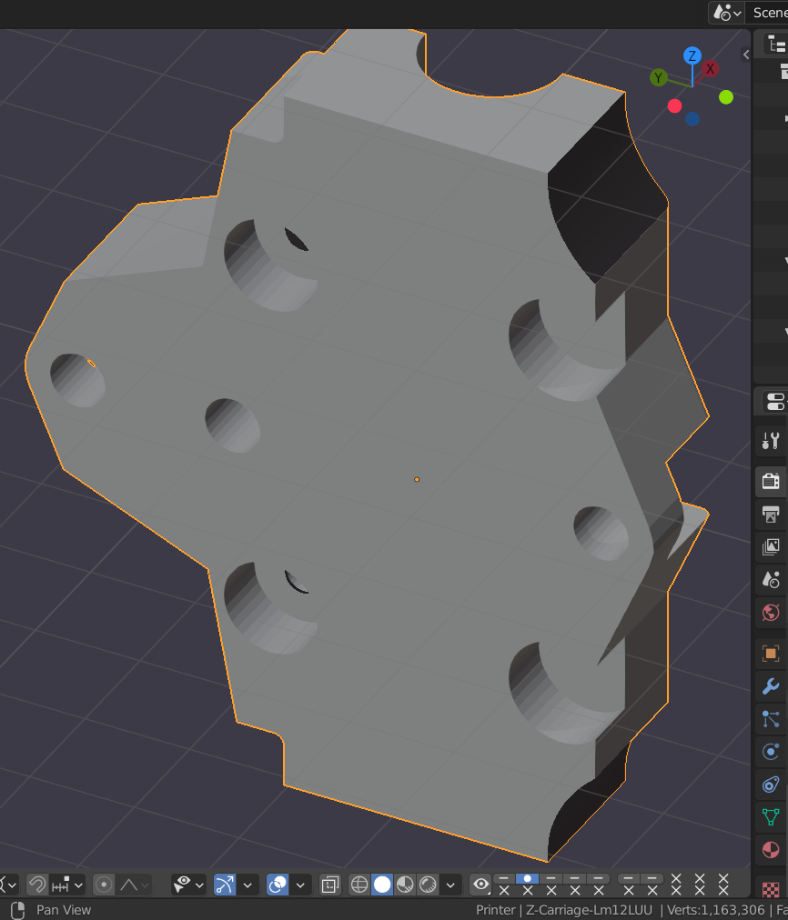
All holes are shaded differently (some have upper brighter part, some - lower)
As a result, some of cylindrical holes are looking like cylindrical protrusion because of knowingly false shading.
Parallel lines are fading to top, so they are not recognizable as vertical anymore, they look skewed from viewer:
This icosphere doesnot look like a spherical object, because its center have the same tone on both sides:
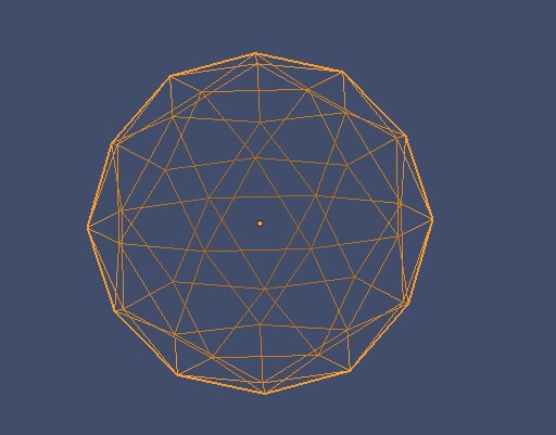
It looks way more flattened like that instead of having a spherical shape:
The shading gradient also shimmers when the viewport is rotated and create lots of random false accents, making the CAD models incredibly difficult to perceive.
The main issue for me: when I tuned good object colors in solid and switch to wireframe mode, colors become worse and need to switch viewport backgroung to see em better.
More explanation here in the video:

So I think, hard color shift is nice for artistic purposes but bad for work.
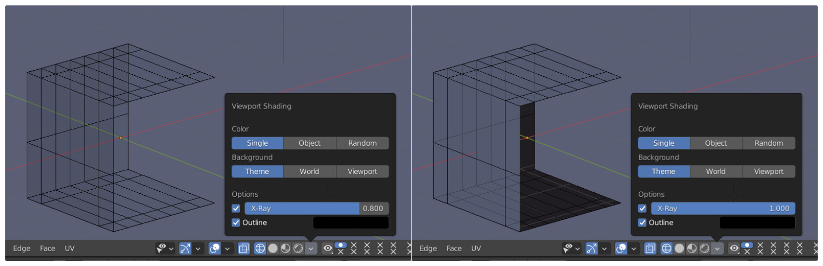
Next issue: faces shading in wireframe mode.
Workflow: Any modeling
During modeling it is important to observe face normals orientation, because they influence different operators and modifiers behavior.
To avoid endless switching to blue-red face orientation display mode, it was patched so front faces can be set transparent instead of blue and back faces can be set, for example, dark instead of red, to bring the ability to see face normals and materials distribution simultaneously during modeling.
Xray=1.0 is an option that allow to visually split front face wire from backface wires, but it also bring faces normals shading as well, so with this setup faces shading infiltrates from shadig mode to a wireframe mode, making wireframe less readable, bringing back the need for switching face orientation mode.
Next issue: Hidden mesh
Workflow: Any modeling
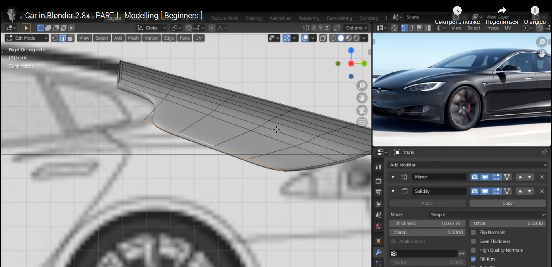
The hidden mesh is not displayed as ghosting when adding a modifier to the model, so it is hard to estimate proper amount of transformation, because there are no visual references to follow.
For example, it is impossible to estimate proper thickness of a detail:
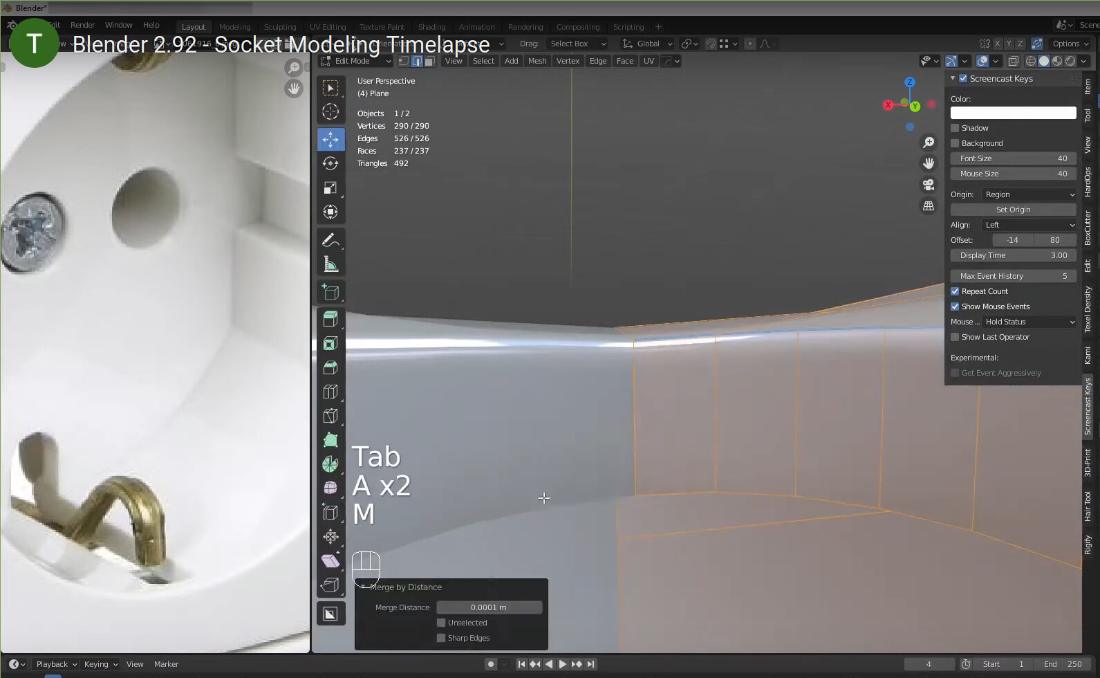
I’m unable to replicate the look of this cube. Which version of Blender is this screenshot created in, and could you attach a simple blend file?
2.9.2 version with enabled faces orientation and xray =1.0 in wireframe mode
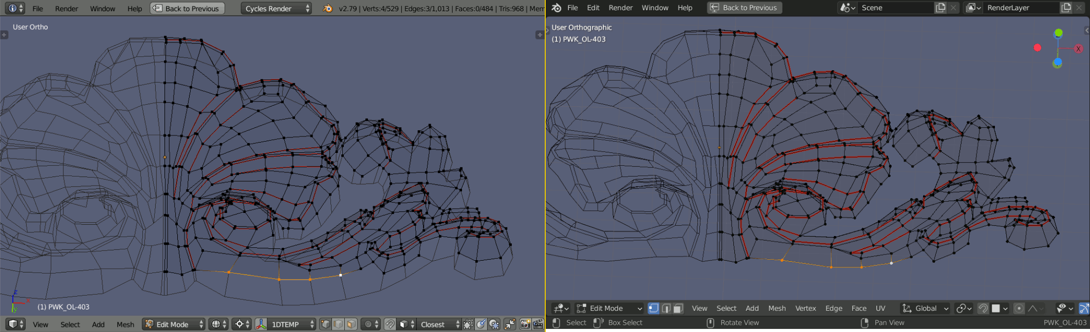
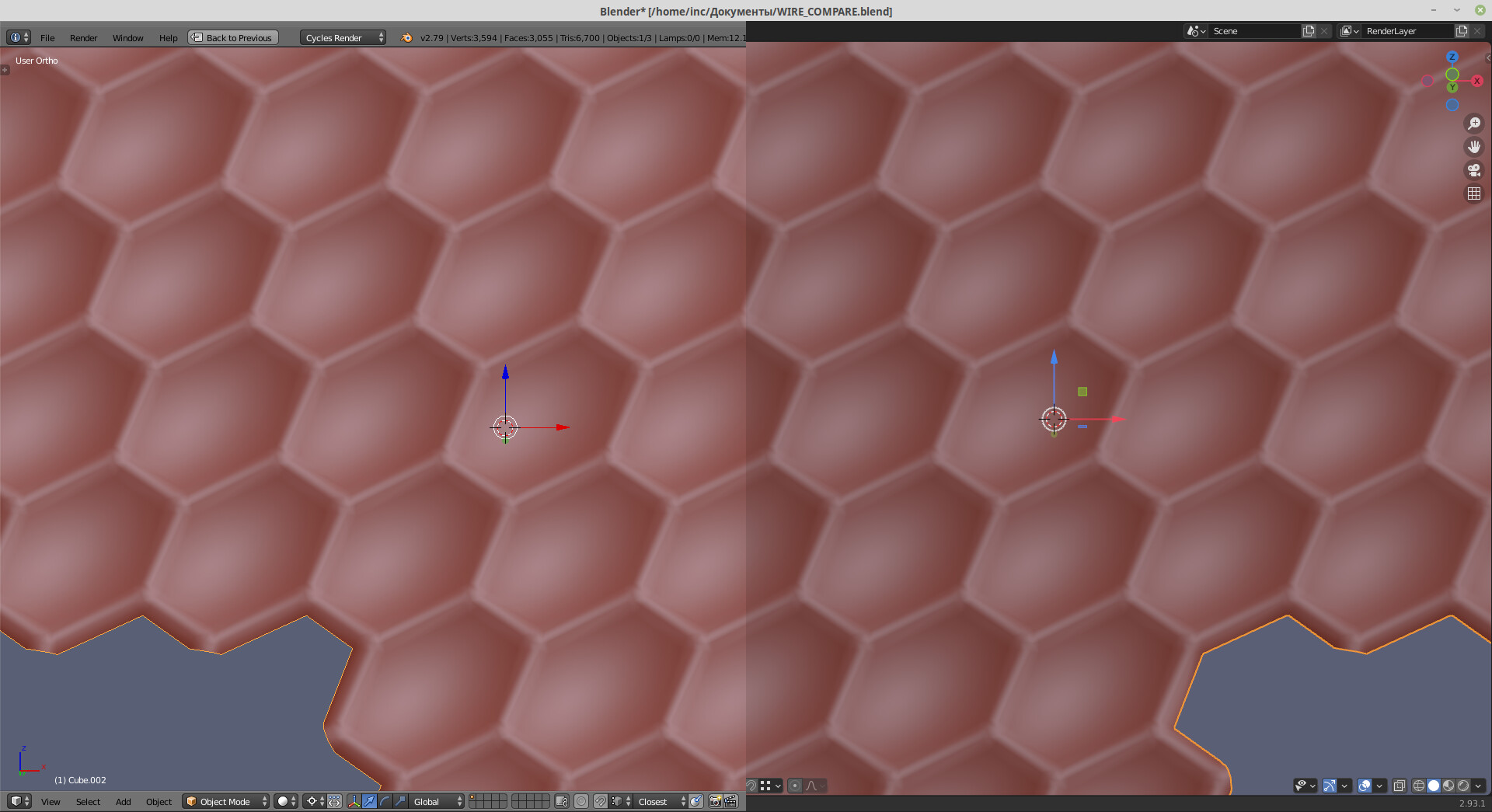
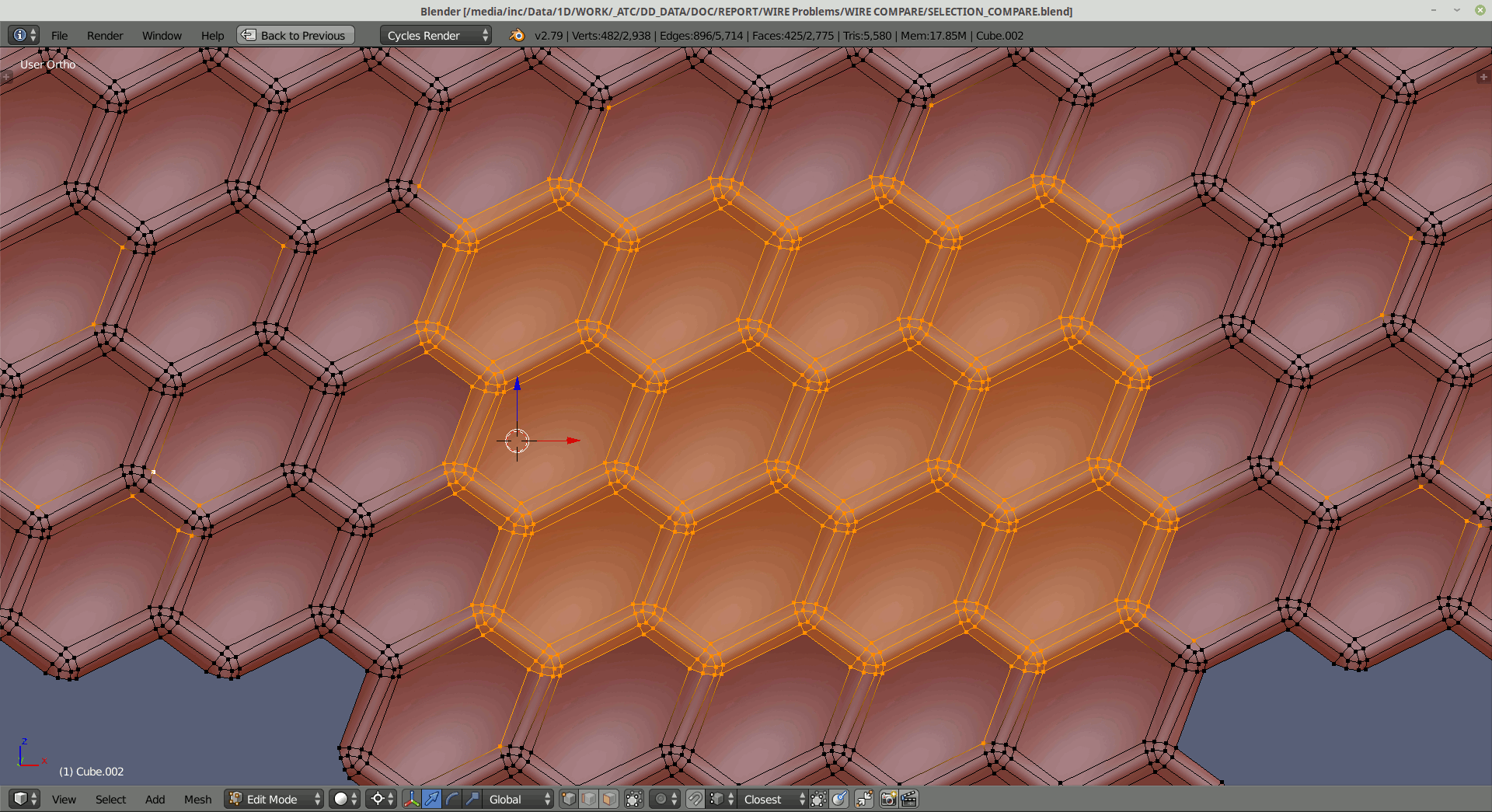
Issue: Wire/viewport draworder
Workflow: Architectural / Multiref CAD
A nice comparison
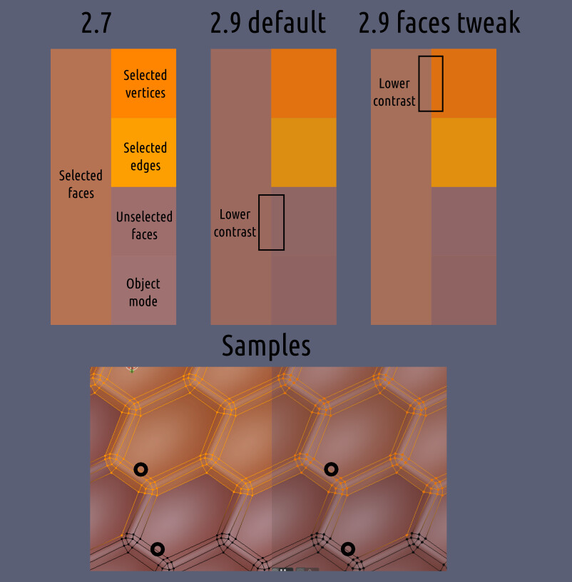
Selected vertices with edges (and widgets by the way) are not properly visible.
Selected topology is incredibly hard to read.
Separate selection parts are way harder to detect because of a low contrast.
Color scheme jumps between mesh subentity modes, so you never know what selection part you will miss because of a wrong mesh subentity mode.
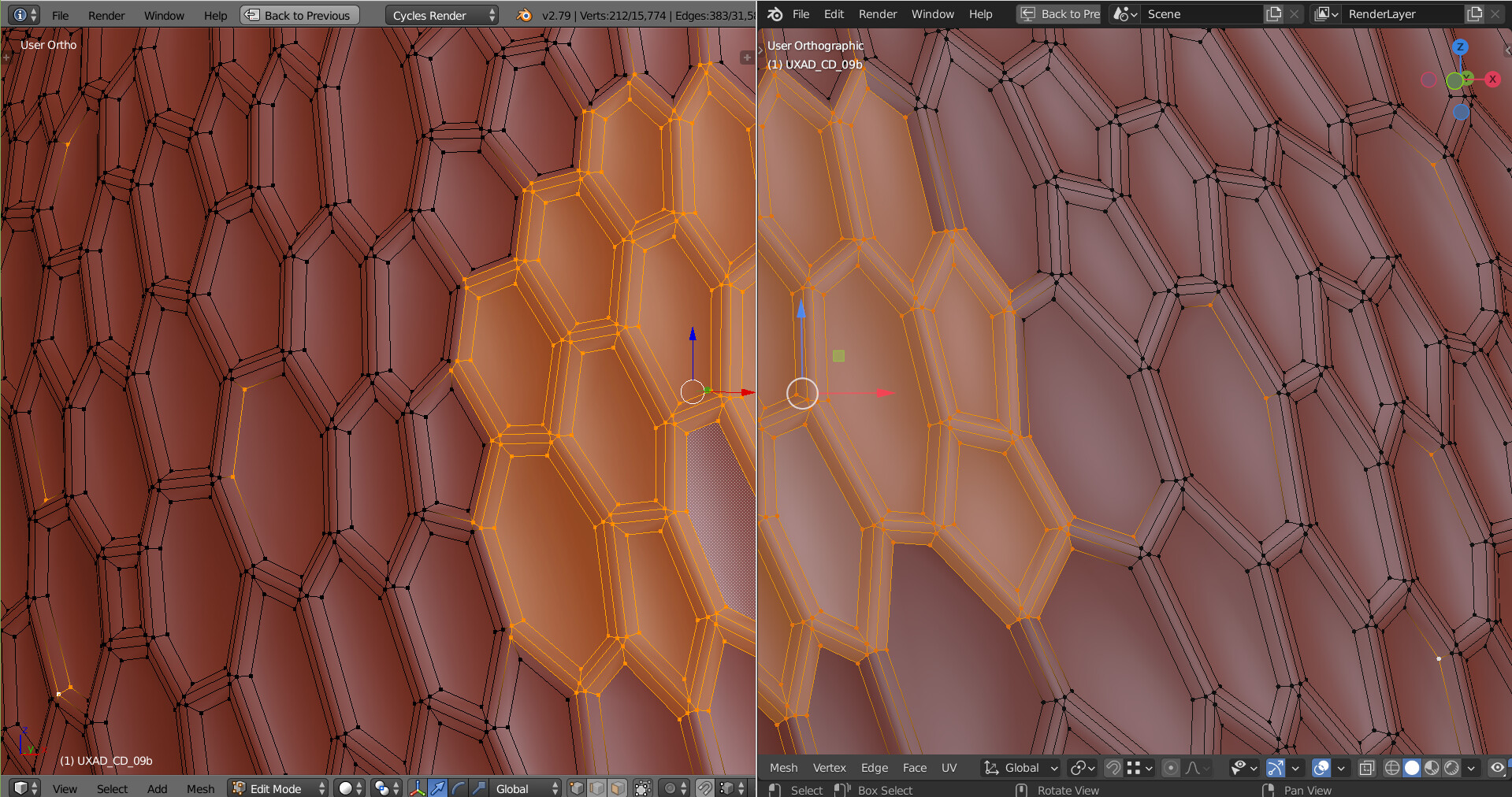
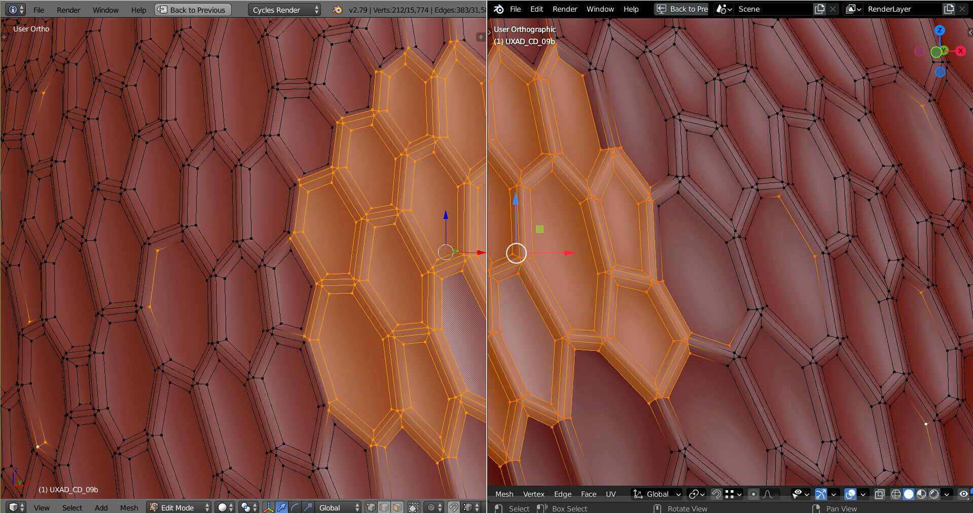
Isn’t this an unfair comparison? On 2.79x screen the yellow selections are against deep red, and make a good contrast. On the right side yellow is against pale and desaturated red.
Maybe all this reduces to a shading choice?
contrast +40 and red -15 (tweaked with XnView)
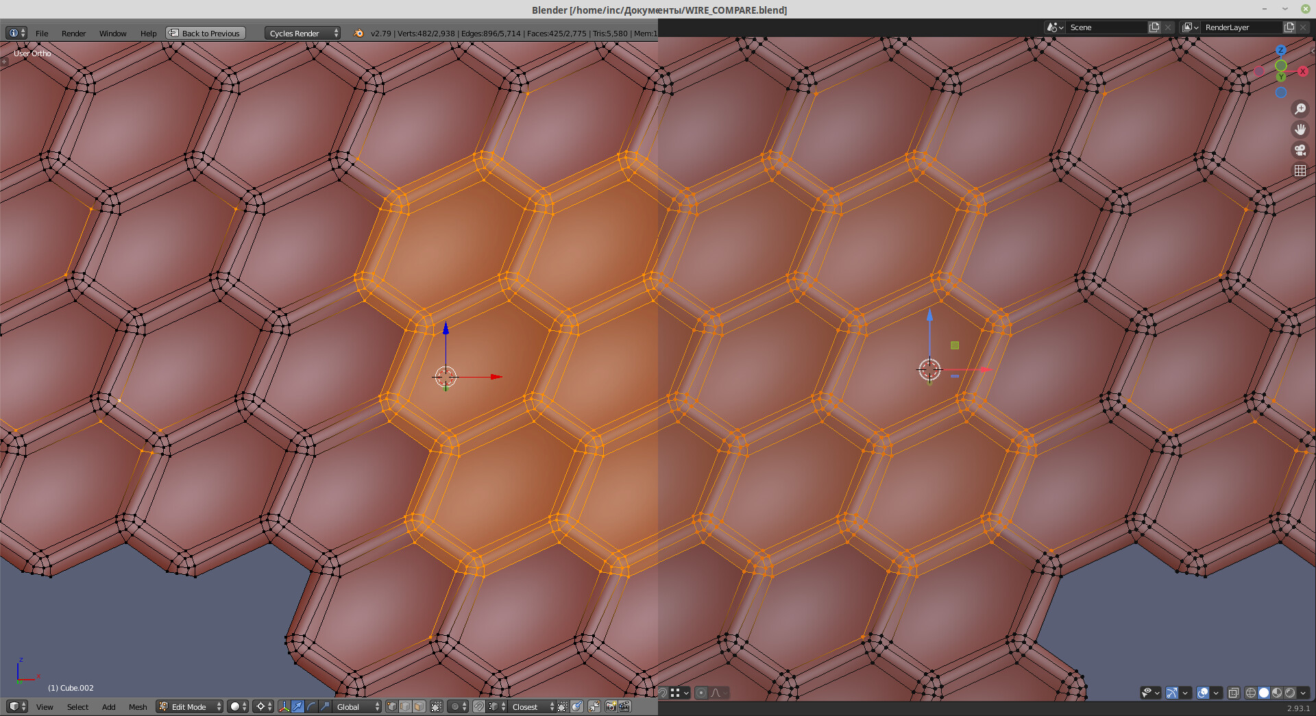
Well, I didn’t got the point of a screenshot tweaking, but okay, lets make a better comparisons.
Same matcaps, defaults with same background (595f75) and vertex size = 4
In 2.93.1 matcaps are a bit darker. Strange, but not a problem, it even should work for contrast better.
But in edit mode the selection is very dim.
Vertices, edges and even faces are hard to detect. There is a huge lack of a contrast, because of wireframe effects processing, that make them bright only at tangent angle (in fresnel style).
Such a wireframe selection requires much more attention to work with.
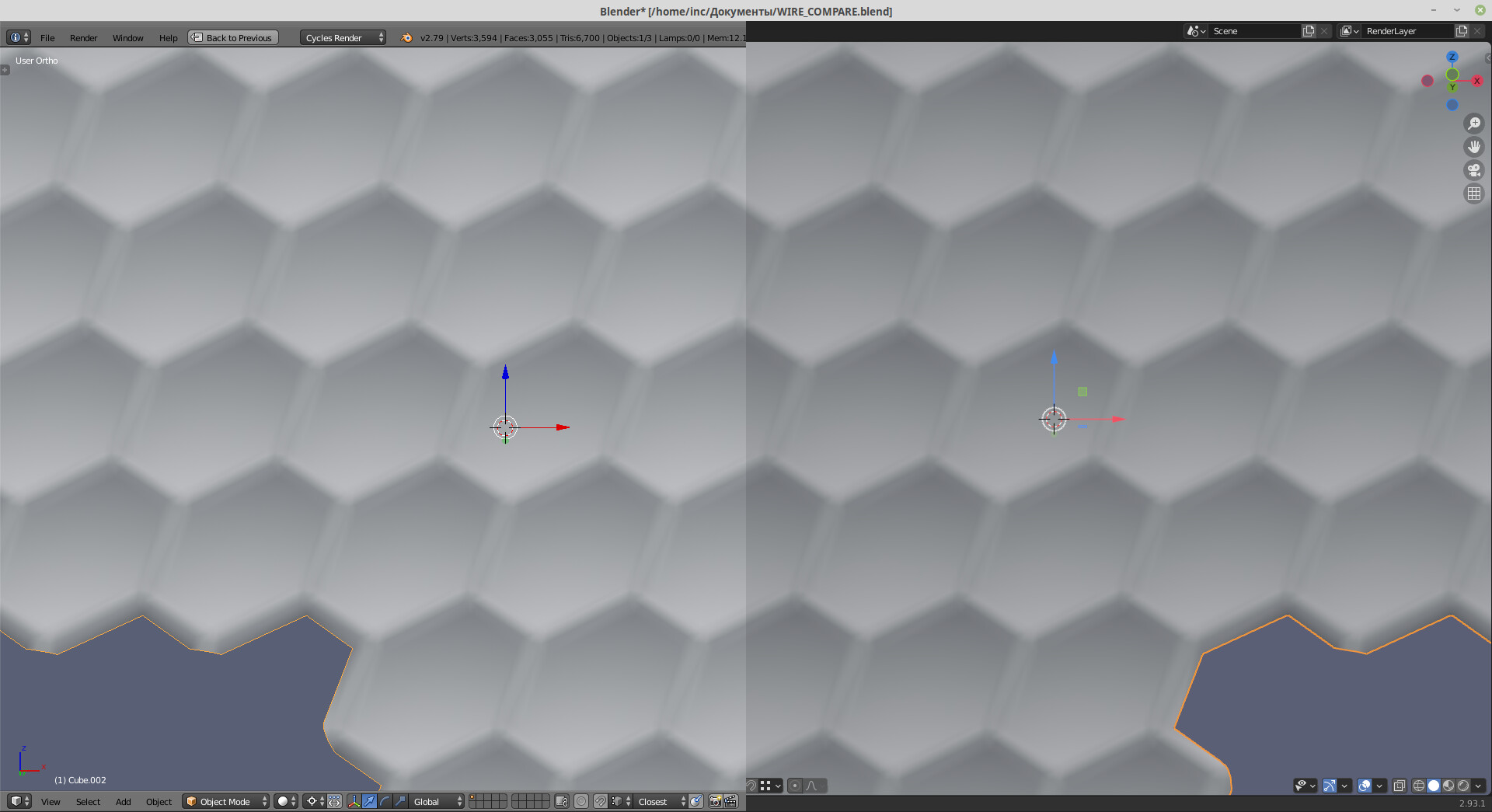
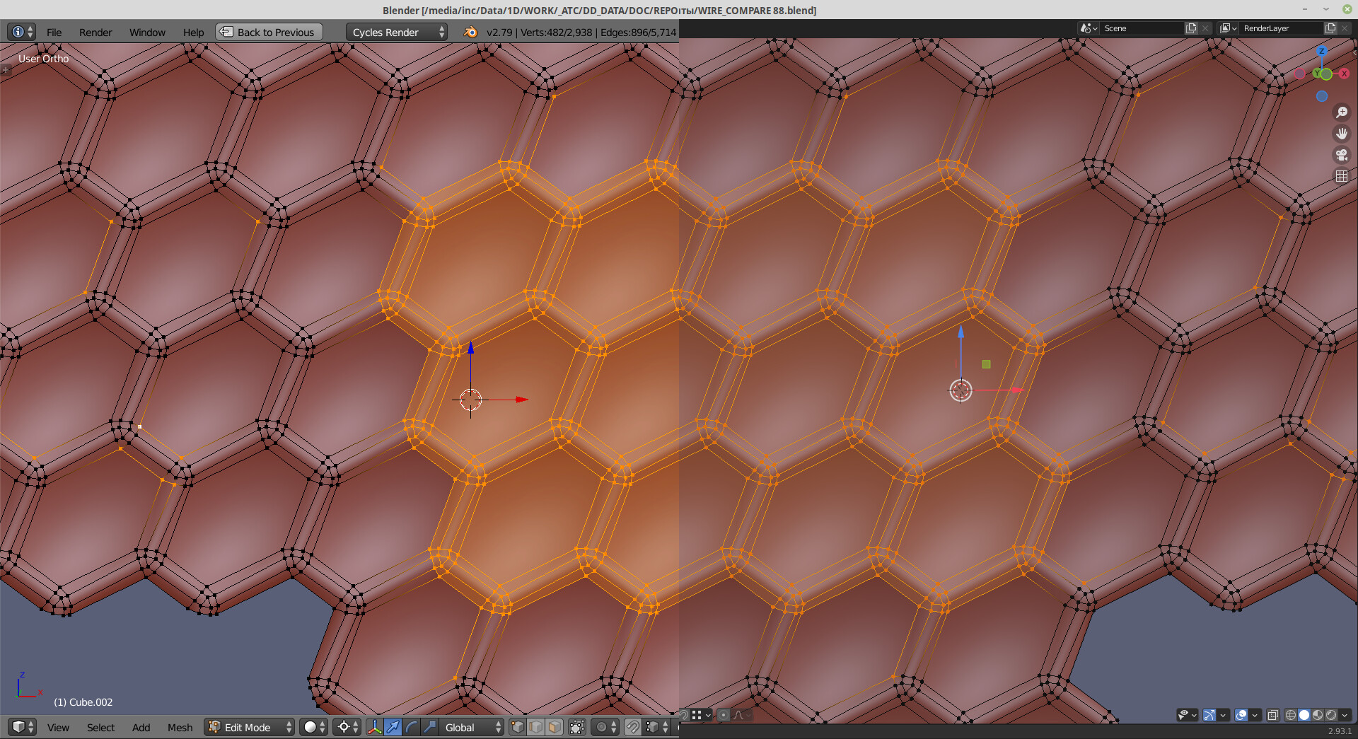
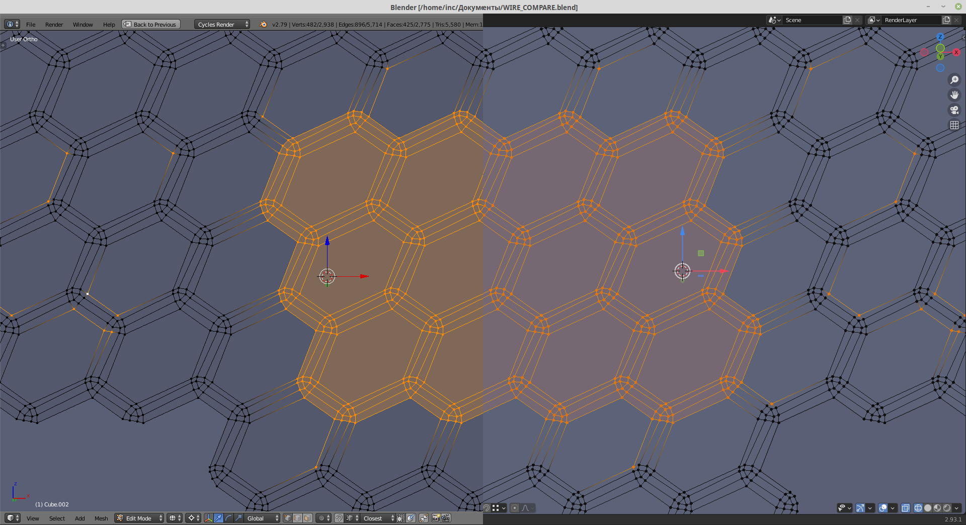
2.7 Solution is more stable during model rotation.
In wireframe mode we can see that faces in 2.9 also have transparent white shading, while in 2.7 it is transparent black. Of course, it influences contrast in shaded view as well, lowering overall brightness, because is supposed to work with gray background, but not with shaded model.
A gif comparison to feel the effect (indexed, but depicts the difference)
It looks like mesh selection was designed for viewing shape on dense meshes, not for extensive topology editing, especially with image references, which always dims selections even more.
Did you try alpha field in theme preferences for vert/edge/face colors? To match somehow 2.79
For example, Masterxeon (and other youtubers) enlarge vertices in his topology videos to make them properly visible.
In my opinion, it is related to the contrast problem as well.
Youtube still can’t process such contrast well.
Seems like that, in my first comparison I tried to compensate contrast (to fix unselected faces → selected faces → selected edges and vertices contrast ratio) to make face selection visible.
The second comparison is about defaults, so faces selection there is hard to detect.
In a system with lower overall contrast you can get only proper
unselected faces → selected faces or
selected faces → selected edges and vertices contrast ratio.
But not both of them, even for dark brown matcap shading.
Reduced contrast scale works like a short blanket, you can cover or head or legs.
https://developer.blender.org/D10436
This might be helpful.