Blender 2.8 Wireframes Discussion

Yes, its hard to guess without a screenshot)

Guys please tell me they will fix this because right now weight painting a dense object is really hard with
those orange wires that get in the way, also it feels like they downgraded the whole skinning workflow making it way too tedious.

1 Like

The vertex auto-scaling at the distance from the view should do the job for this issue. If anyone Im hoping to implement this refined feature of viewport that would be Blender
https://devtalk.blender.org/uploads/default/original/2X/b/b01520e4ef896cab78bf45e8a6f803cf3ee0aa3e.gif

4 Likes

Exactly! Wireframes got WAY less thick in 2.83 and nothing has been done to mitigate that, they are very aliased and washed out and my eyes literally bleed now when I model for hours… That is a health hazard right there, please let us properly control thickness of edges in edit mode!

is there some way/ option for clipping the outline inside or behind other objects? i find this is really distracting and breaks my depth perception, looks almost like one of those impossible geometries
image :smiley:

like it was in 2.79 would be perfect or dimmed would probably also work

i found when i have multiple objects selected then the outline is rendered as expected.

and found a workaround by disabling the outline and enabling wire overlay

EDIT:
Figured out that this is caused if the near clip distance is to low.

2 Likes

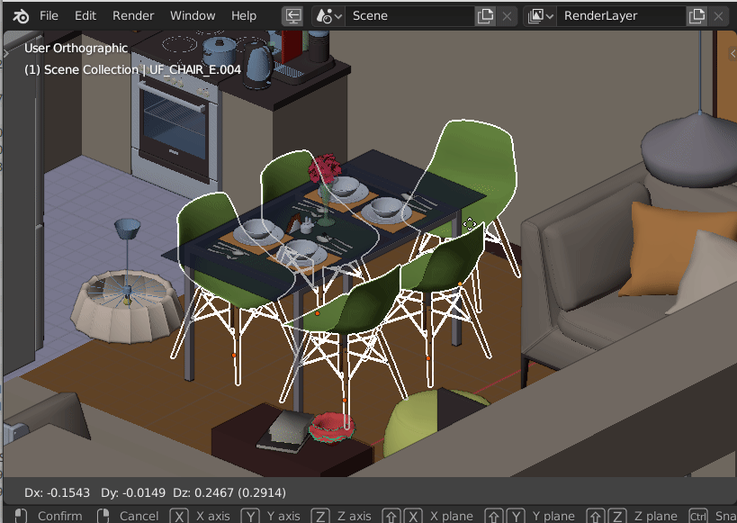
Agree, that fat xrayed outline is distractive as hell, and also disallow to read if objects are perfectly matching (for example, for checking model for 3d printing)
This outline constantly screams an alert in your face “Warning! Something is selected! Nothing else is important!”
It is painful even to think about working like that:
outline hell

Where are my objects in 3d space? What and where do they intersect?
What is their best placement? Impossible to say. You are just focused on that thick screenspace outline instead of 3d objects, experiencing a severe overload of perception.

Peek 2020-09-19 22-37

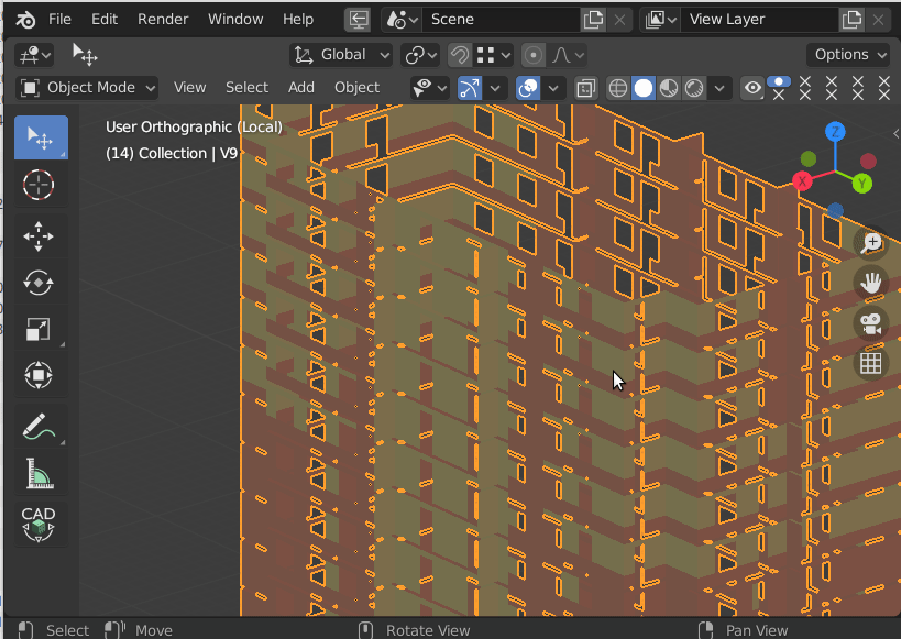
Keeping wireframe constantly on is not an option for complex scenes as well.
This outline is a serious perception breaking workflow issue.

20 Likes

atm wireframe opacity delivered to alpha. So it can help

1 Like

It seems, edges color is always dimmed, so there is no possibility to set up the brightest color.
That’s why it is so hard to work with mesh selections in 2.8+

so 2.79 selection is significantly brighter and more readable by definition.
Here is GIF, selected mesh looks semi-transparent in 2.8+ (the difference is very noticeable in fullscreen) and there is no way to set maximum brightness:

WIRE_DIM_C2

As far as I remember, it was made for better dense meshes volume detection, but it completely worthless for any other model types.

14 Likes

That is precisely why I have Overlays On Off on a shortcut:

wm.context_toggle

space_data.overlay.show_overlays

Sometimes you just don’t want to see anything “helping” you.

I agree that the outline is a bit overly dramatic. But doesn’t that improve if you have anti-aliasing on?

That’s strange if you have to turn off Overlays every time you need to see your objects, it was not even needed before Blender 2.8+
It is not a regression, it is an example of antiprogress or something, a new word in UI/UX design.

AA is not used in precise modeling due to “soap” and lack of ability to detect small angular deviations, which is critical for long distances, for example, in architectural modeling.

2 Likes

There is no way to set and achieve proper wireframe color in viewport.

1 Like

There was a wish to have wireframe reflecting depth in 2.8 to make suggestive contours pops-up on High Poly meshes.
That is the reason why there is a gradient of colors based on Object Color.

But the assumption that everybody wanted that was wrong from my point of view.
Many people are annoyed by that, on low poly models.
Some people complained about that change at its introduction. And other ones are still continuing to do, so.
Yes. Results on high poly models are prettier. But prettier does not necessary mean easier to read.
If we have a Flat shading in Solid mode, it is to neglects depth and concentrate on silhouette.
In wireframe mode, we are searching for edges intersections and face corner/vertices superpositions.
We don’t necessarily care about depth.

I think that users should have a choice possible between a Shaded wireframe and a Flat wireframe.

It is a pity that colored wireframes are limited to Wireframe Display mode.
We can have Wireframes colored randomly or through Object Color or a single color per viewport in Wireframe Display mode.
We can have Solid faces colored randomly or through Material Color or a single color per viewport, Object Color, Texture Colors or Vertex Colors in Solid Display mode.
But we can not have desired combination of both in Solid Display mode.
In Solid Display mode, all wireframes are using theme’s color (black by default, no color).
When colored wireframe were accepted, I thought that I could use Object Color for Wireframe and Material Color for Solid Faces. And that way retrieve same colors in Wireframe mode and Solid mode. But no. Blender does not allow that.

I think that we all would like more customization.
1D_inc 's complaint is just about letting user define wireframe thickness.
We can choose in theme, size of vertices, size of face dots, size of origins, width of outline.
But we have no setting for wireframe thickness.

3 Likes

Exactly.
Suсh wiremesh shading is nice for extremely dense meshes (photoscan editing workflows), but is completely hostile to any other workflows, like gamedev/lowpoly, CAD, subd/organic, etc.
As a result, it causes eye pain after just a few minutes of modeling, due to the need to constantly look for selection in the mesh because of low editmode contrast, and feel severe cognitive overload in object mode, because of nuclear object mode selection.

This is a very strange path in design - to provide a solution that allows you to oversatisfy 2% of software using (tweaking photoscans), but damage 98% of the rest of the use (regular modeling). And this is not the first time (like face normals shading or broken vertices selection).
We download software - we open software - we start to work - we feel severe discomfort after a few minutes of using the software, right here, at the very beginning, with the default cube - we close software, because in busyness we are forced to use software for much longer than a few minutes, and implemented solutions contradicts this condition, especially if to take into account working with blueprints and photoreference underlays.

Current solution is dangerous to physical health at the very basic level for two years in a row.
Please, help us.

2 Likes

I really just wished we would be able to finally fade out or dim the wireframe from the overlays panel instead of just hiding every n-th line along the normals. This is, and I do not say this lightly, an absolutely useless feature.

2 Likes

I guess this will be in 2.92.
https://developer.blender.org/rBdb7d8281c5a2a56bbc2b7c05ec7160d8819ee191

2 Likes

Issue: Editmode selection draworder
Workflow: Architectural/CAD modeling

Yes, there is no problem with wiremesh dimming in Blender.

But there is a problem with selection drawing order.
Unselected geometry hovers selected geometry, which block the ability to comfortably work with linear / repeating geometry (prioritizing ARTwork over CADwork)
It was told that it was made to increase perfomance, but it seems, at the end all the perfomance has gone to drawing wireframe shading.

5 Likes

Issue: triple width edge marks
Workflow: any modeling

Sharps are looking more accurate, but have TRON effect.
There were several proposals about that ( 1 2 )

АА example

4 Likes

This problem of wireframe selection becomes especially noticeable when watching modeling video tutorials on YouTube - it has been very difficult to keep track of selection there for the last two years.
example:

4 Likes

Exactly, it is incredibly hard to follow selection during watching 2.8+ videos. because it is barely visible most of the time.

A nice example from Yegor in twitter (he proposed to change color from dim orange to dim yellow, but the original issue is the same):

Working with mesh in 2.8+ turns to a instant colorblind testing

4 Likes

Yes the selection wireframe is tragic… color, opacity, line thickness… everything…
At least for selection edge there should be no opacity(if there is) and line thickens could be increased.
Plus the overall wireframe could be more “inelegant” to try to keep the contrast between it and the object as high as possible.
And, maybe not directly related but edge length(measurement) is unusable with the current color scheme.
The overall contrast in viewport is poor.

3 Likes