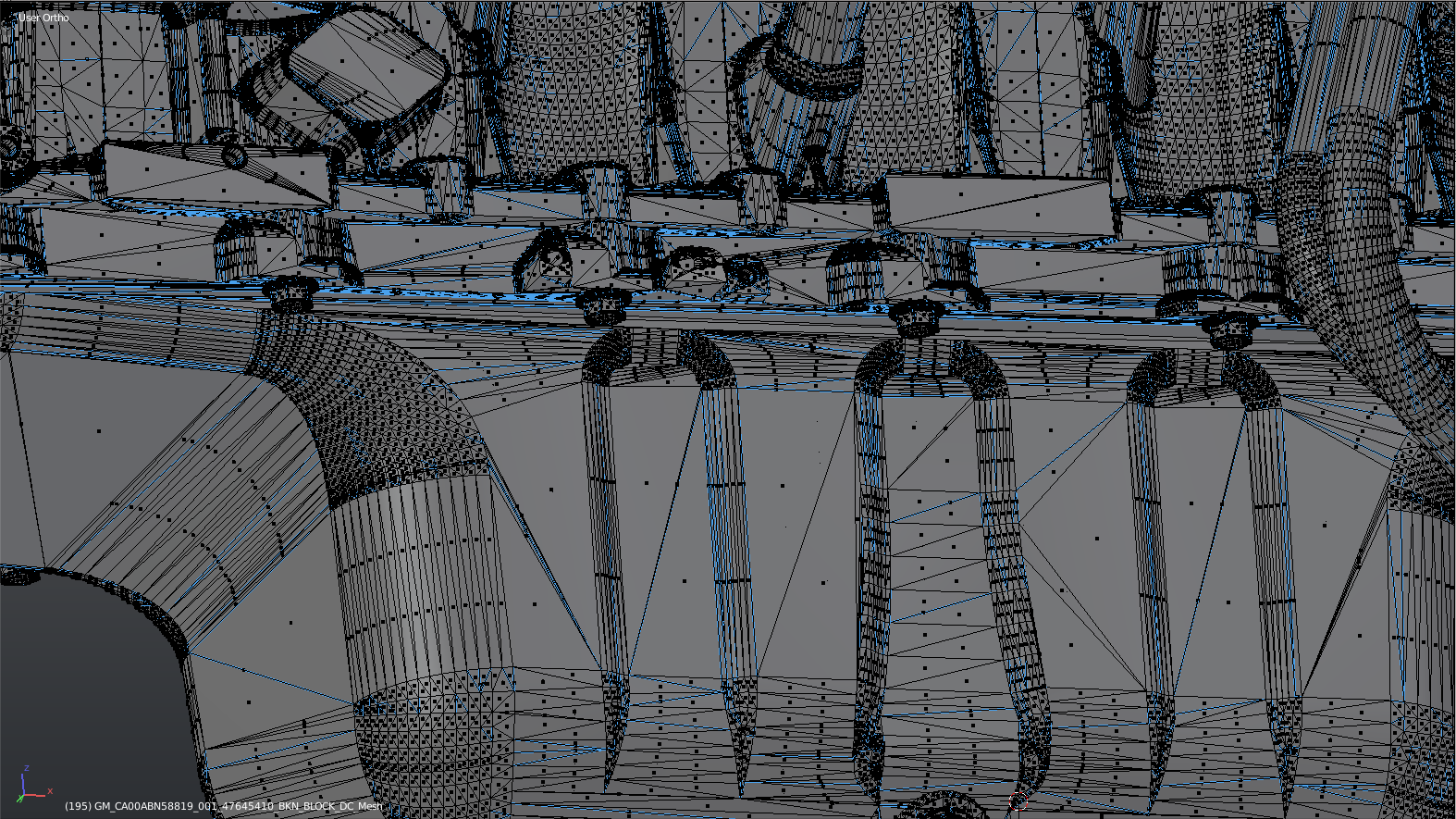
Even the Wireframe on Edit Mode is too cluttered. We are suffering a loss of detail and clarity because of how “thick” every line and face indicator is, compared to 2.79 and previous versions. A new version should never be worse than the one before it.
Compare a screenshot I took of a very dense mesh in edit mode on the viewport on both versions:
2.79:
2.80:
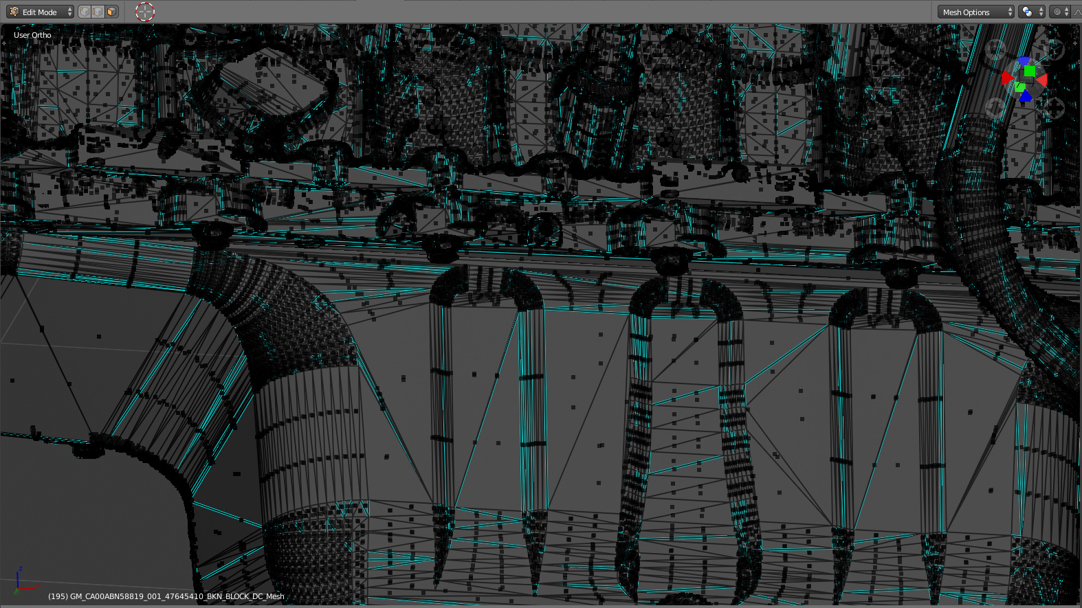
PS: both screenshots were taken from the same distance, if it was not clear.
Ignore the mess of triangular faces and Sharp edges, this was an .STP converted file that I received from a client. It can happen to any of us who uses blender in a professional capacity… not always will you receive the cleanest of meshes, and the bad mesh should not be an excuse for worse viewport visualization.
I know it’s a matter of opinion, but I’m not a noob, I work with blender since 2.48 and IMO the new version suffers a loss of visual information clarity and could be improved to 2.79 standards or better if possible.