Ali6, I agree with you. Why added a monitor icon, I do not quite understand. Combining the icons of the eye, the monitor and the render will be very helpful for beginners.
Once, I rendered a scene, I see that some objects are not in the image, although these objects could be seen in Viewport. Only then I realized that the render icon was disabled for these objects. Yes, at that time I was just beginning to learn Blender.
2 Likes
So how would you maintain the current behaviour? For example if you want to disable only renderabilty of an object, how would the outliner reflect (and let the user know) that?
I suspect the problem here is that you are using a small resolution screen. The most screens used for 3d work are HD and it looks fine with Blender out of the box:
On a big 4k screen the problem is even hard to imagine:
Let’s face it - HD screens are pretty much everywhere and 4K screens are becoming more popular and will be even more so when 2.80 will be released. It is getting to be reasonable to dedicate less attention to the smaller than HD resolutions. I am not saying things should stop working, but one might expect some discomfort - that seems to be natural. You can still adjust the scale of the panel to make everything visible and it still works.
Edit: It seems originally I was wrong about screen resolution statistics and HD being the most popular one. I thought so - I haven’t seen a smaller resolution used for work in a while now… Maybe a slight adjustment to the default screen layout would be in order so it works well on popular laptop resolutions(1366x768, 1440x900):
Two of these icons are being combined already - the eye and the screen icon. So that’s one less at least.
But I actually agree with you too, that for the vast majority of cases, the fact that viewport and render visibility are different, is actually annoying.
One way to solve it, would be to add a global checkbox for each object or collection to disable it completely, both for the viewport and the render. By default, we could make it so that’s the only thing you see, by hiding the viewport/render toggles. In most cases that’s all you need.
As for the header thing, I can tell you that it used to be way worse. In 2.7x, the header for the Outliner is much wider, for example.
7 Likes
Yeah I understand your point but I’m using a 15inch MacBook Pro with a retina screen so the resolution definitely isn’t an issue. I understand you can stretch out the sidebar out but it’s a lot better if you can keep it small and have a majority of space for the viewport and not have to scroll right to see information / add a collection.
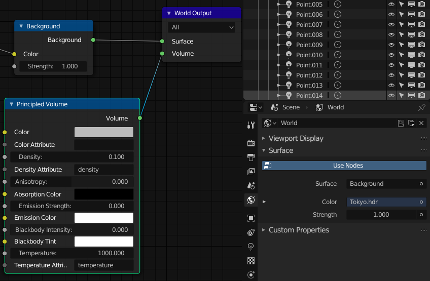
Small thing, but Eevee doesn’t show Volume settings in the World Properties like Cycles does, even though it’s now supported:
1 Like
That sounds like a regression: one more widget, two icons hidden providing less control on the scene.
Did you just wrote it down, or is there already a plan (with a mock-up maybe)?
Why there is no grid in UV editor?
It would help with many things.
Not having the facedots activated by default, considerably worsens the task of modeling, since you have to be guessing what mode you are in, if edges or faces mode.
5 Likes
Face dots are not a good way to go about it though. My suggestion would be that in face mode, faces are filled out with color completely, while in edge mode, edges are filled out with the selection highlight color, and faces enclosed by selected edges are just slightly tinted.
3 Likes
I think separating the options from object and edit mode could unclutter them. Either two popovers when in edit mode or two tabs inside the top of if, or something else like sections being collapsable as @billrey said.
Looks like your screen is not FHD, I find something around 0.8 level of interface scaling much better for those resolutions on a 15" screen laptop.
Edit: I also thought about this Blender 2.8 user interface design some options could be brought to that second panel from the preferences.
I think collapsible sections are a lot better than nothing, but it does not seem to solve the issue completely. I think as a deign solution pop up panels that go away when mouse is moved away should be used for quick actions, quick little edits that do not require a lot of attention - like a quick peak, quick turn of some knob and going back to work. One should not work inside of them. If the settings were like that in another part of the UI that is not a ‘quick pop up’ I would not necessarily see this as a problem, but it makes sense to me that everything that pops up in such a way should be immediately clear or it starts to feel unnatural and uneasy. So I think the idea should be to keep the options and settings in the pop ups as few as possible. Why not split them into two panels AND have very clear sections that are collapsible?
Edit: I tried to give this a bit more serious thought. I came to a conclusion that this feedback of mine might not be that useful as it initially seemed to me  . I didn’t think it trough thoroughly enough. It might not make much sense to split it and take more space at the header. It does seem to me like there are too many options there, but when thinking about the whole picture I really cannot come up with any truly good suggestion. I think collapsible sections will be great improvement.
1 Like
IMHO some settings don’t need to be there. Those popovers should be for settings you need often.
I.E. I’m not sure most user often change the grid settings like axis display, scale, and subdivision. It’s the kind of thing you change once every ten years. x)
I cannot agree to that. The settings are needed. They are nice to have. I change the grid and axis view often. I might turn it on when modelling a single object in a scene that is full of other stuff if it’s a quick job and I don’t happen to have a separate scene for modelling. I will use pretty much all of them, maybe not Measurement section because I use other tools for measurement and I don’t happen to use motion tracking, but that is a very important thing for people who do. All of them are needed. All the new ones seem like I will use them even if I didn’t have the chance yet as I mostly still work on older projects in 2.79. I want to have them reachable, I can definitely say that. Even though it does seem crowded there, I cannot think of anything else that would actually make more sense to me as far no matter how hard I try. Can you? Where would you put them?
I think I get your point. Thank you for laying it out.
Am I wrong thinking that binding Key sets to Workspaces still would be more intuitive in a lot of cases?
For example
- When the user actively selected the sculpting workspace, he is custom from other applications that he now gets an optimized key set for the Task (convention).
- Not every key has to be changed, it makes sense to let as much as possible consistent, but for effective sculpting it would be useful to have the keys for all the brush options sitting around the left corner while in animation I want to have deleted and insert key frames around the view change left corner, also keys to jump 1 and 5 key frames forward and backward, or play the animation and hide and view bones. My point is some keys are completely useless in some workspaces and could be used productive (efficiency).
- If it would be possible to load and save key sets for different workspaces separately I can see a timeline in which I load Zacharia Reinhardt sculpting key set, and Andrew Price modeling set and so on. So an artist that want to learn a new skill could profit more from professionals that already established good workflows and useful habits for certain tasks. (accessibility)
- Last point is Blender is a huge application with a lot of different parts. It seems to make sense to me to give Workspaces own key sets because with such diverse tasks like sculpting, animation, 2D drawing, video editing, … you will sooner or later end up in a situation where every task will have only few keys for itself, and too much has to get done by wasting time in menus while the keyboard with the huge amount of buttons sits right in front of the artist. (practicability)
Two things to consider:
- Blender already has different key shortcuts for the different modes, which correspond to different tasks. We already have different hotkeys in Sculpt mode vs Edit mode. So it’s not clear to me what the advantage would be to add yet another layer of complexity on top of that.
- Currently, users don’t have to worry about which Workspace they are in. They can jump between them freely, but Blender stays working the same, other than the fact that they change the active mode. If we were to do what you suggest, users would have to pay a lot of attention to which workspace they are in, and they would have to learn and remember the differences in the keyboard shortcuts.
So this adds extra mental burden and complexity, for a goal that we already have covered by the separate shortcuts in the modes and editors.
6 Likes
Now I see,
I think I have to educate myself on modes to get a better understanding on this.
It’s not clear if you think it or not. According to your screenshot, you prefer 2,79, and in this case there aare points for agreement
1 Like
In reality there would need a good streamlining.
At the moment the shortcut system is “fat and heavy” …
Should be simplified, all the levels of shortcuts should be combined …
The ideal would be to have a single main base level for all the work and space-view modes … and where necessary to change locally and only the shortcuts that need to change in functionality
1 Like