the purpose is that rarely the user wants to create non-manifold geometry and as an aid to selection is great.
For example, if you select a vertex loop and give it extrude what is the most logical behavior? extrude each vertex individually? or extrude the entire loop?
When you adapt that way of working to your workflow it has more pros than cons.
I don’t know you, therefore I would never call your hard work idiotic. There is constructive criticism which is helpful and then there is rude behavior. What you’re exhibiting is the latter. This accomplishes nothing. Please, try to keep your criticism positive, and remember that you are slamming a non-profit organization who gave you free software. Also remember that you are talking about incomplete software. The devs are working really hard to try new paradigms. Some will work some won’t. No reason to get angry about it. No reason to attack others.
No one is forcing you to use 2.8. If it’s making you this hostile, maybe you should wait until final release before you open it again.
I think what you propose looks a lot cleaner. The issue I see with having tools and settings in the top bar, is that you’re limited by both the number of tools and the number of settings available. When there are more tools than will fit what happens to the other icons? What happens when there are too many tool settings to fit?
I see what you mean but there is still a difference between behavior and presentation. What do you think? Wouldn’t it be better in that case to have different/contrasting colors for vertices, edges and faces respectively selected vertices, selected edges and selected faces - it would be much easier to see than the current mostly black color.
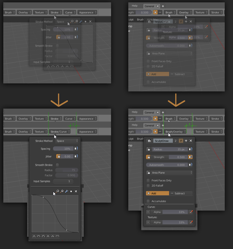
How about a more regular topbar, filled with the most usual stuff, as seen on most 3d apps?
Tbh, this is the kind of stuff I expect from a topbar, not settings.
For now all modes can hold all settings & tool buttons inside one row. But in case of " Compact " interface layout i think it can be more compact. Buttons already can include few options inside one button. Maybe it is reasonable to merge some of settings together?
Obviously, you have no clue on what’s happening. So why are you opening a WIP editor and complaining about it then? It makes no sense, you’re just making noise
I know whats hapening, I just dont understand why would devs hardcode UI stuff if there are editors, They did it with properties editor, why not do it with everything else, Blender’s UI main philosophy was always:
100% Customizable.
Specially, I dont understand why would devs take the info editor’s header and put on a locked ui region while everything they needed was just to split the timeline and set to INFO EDITOR.
Its like 100% more work while they only needed to change a editor tipe on the startup file (NO CODING AT ALL)
I’m certain they will implement it as part of the pie-menu worflow.
Favorites should also include some type of macro recording like photoshop action-recording… nowadays if I want to perform 2 subsequent actions instantly, it’s impossible to do it AFAIAK, I can only redo the last action, not the last two or three actions.
Sure, obviously I meant a directly integrated UI-way of doing it… we can do almost anything using scripts… could add primitives on the scene only by means of plugins or scripts, doesn’t mean that we should do it instead of shortcuts