In case any of you still don’t understand the importance of facedots.
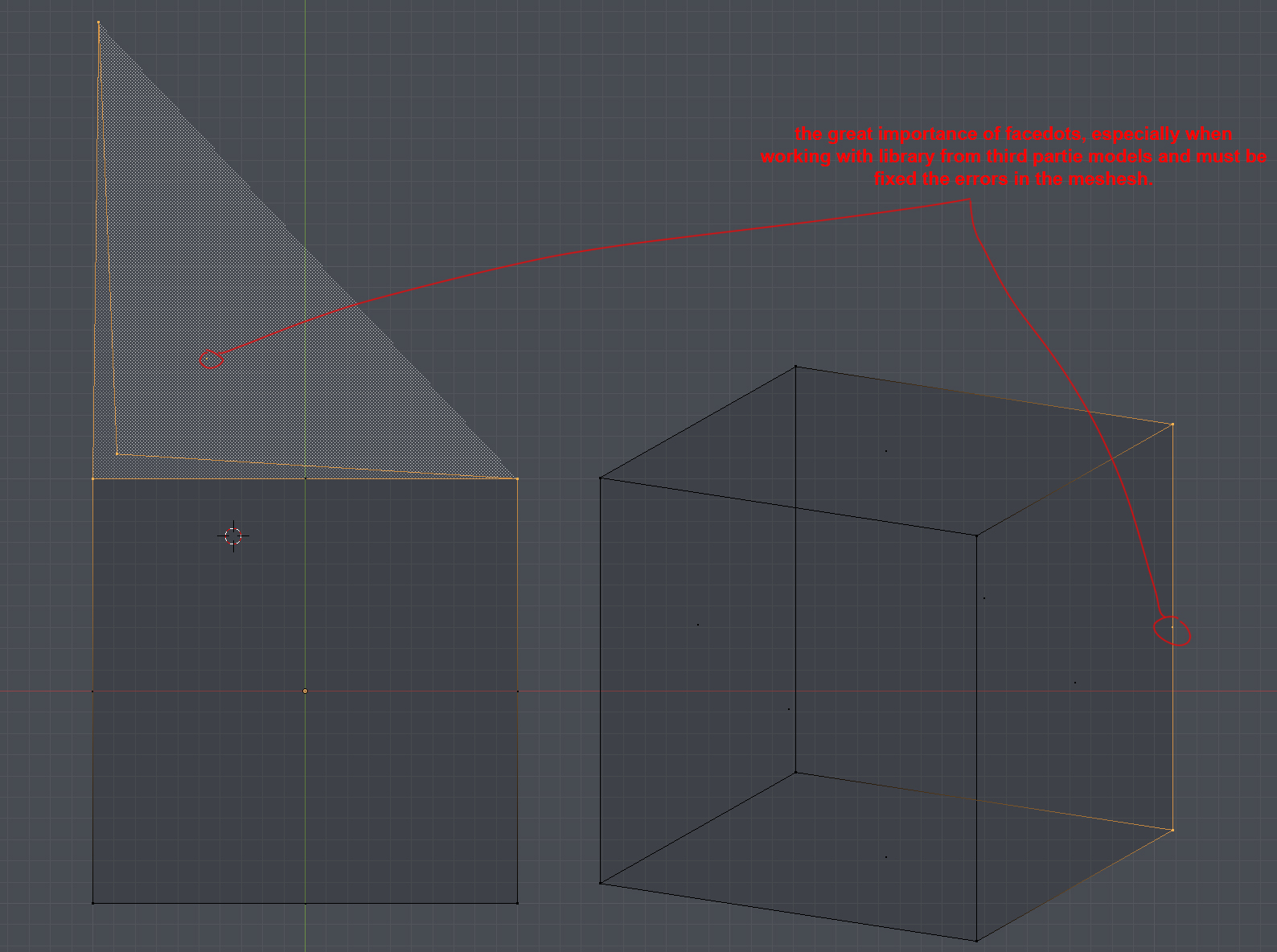
I think the ideal thing would be to be able to choose the size of the facedots by the user.
In case any of you still don’t understand the importance of facedots.
I think the ideal thing would be to be able to choose the size of the facedots by the user.
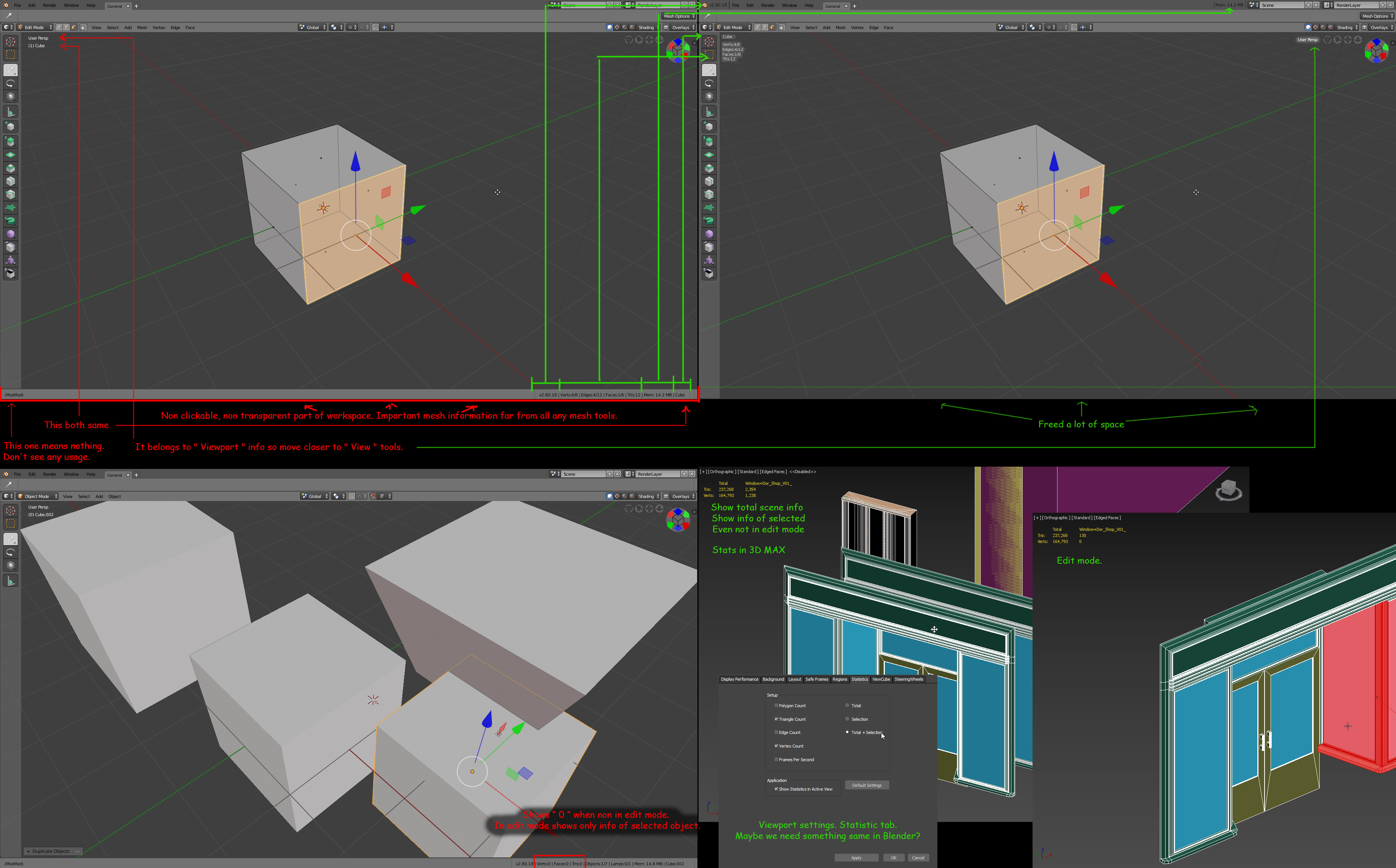
About non clickable bottom stripe. Maybe it would be better to organize this part of interface in this way.
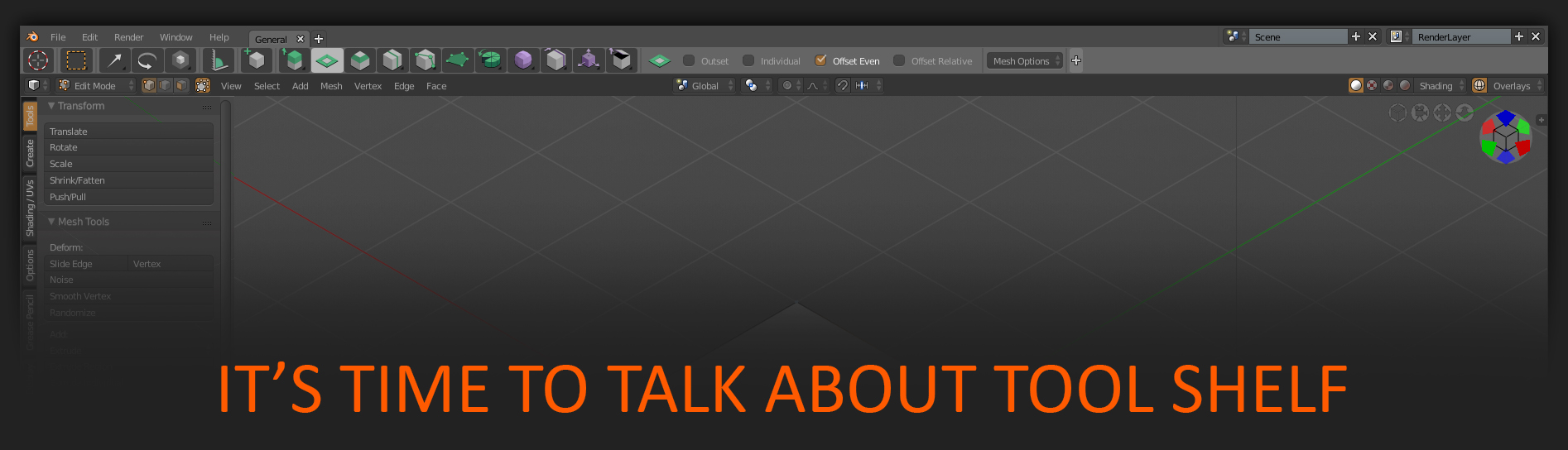
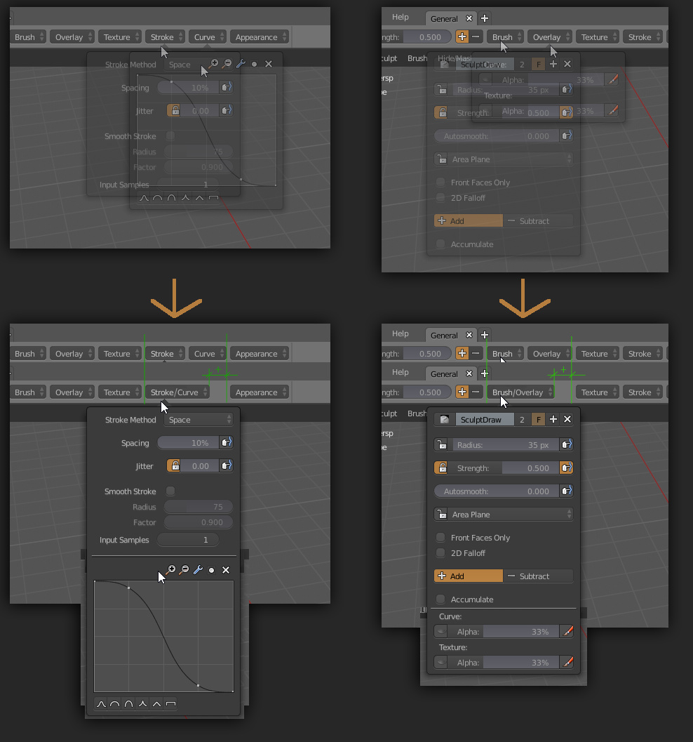
I’m trying to understand the current goals with the many tool editors so I can make a suggestion. Most seem to not be working at this point while you’re ironing out the interface, so I’m not completely sure of the direction you’re heading.
So, with the tool settings…There are now 4 places to see the tool settings?
I extrude a face. The extrude settings show up in the pop over in the 3d view, in the top bar, in the dropdown menu on the right side of the top bar, and in the Tool tab of the properties editor?
If I understand…The pop over will have the most common settings only. Right now it has all of the extrude settings, but this will eventually have for extrude maybe orientation and distance only. The full settings can be seen in the Tool tab. The top bar will have the most common settings with any overflow showing up in the dropdown. Is this correct? Will the top bar have the same limited settings as the pop over? The other settings will show up in the dropdown and the Tool tab will have a combination of both?
If that is indeed the case…
I like the many options for various different workflows this provides, but it seams like this could be more elegantly solved by making the tool settings a view type like you guys experimented with a few weeks ago. If set in the vertical align mode (right click popup that we presently have) it would work like it is where you can scroll up and down through the settings if there is any overflow (not all settings fit on the screen). If set in the horizontal align mode, any overflow shows up in a dropdown at the end (similar to the top bar dropdown we have in current builds). If this was the default behavior of any editor set to horizontal align, everyone could have the best of all worlds. We could put the editor in vertical mode on the right or left side (which many seem to prefer) or it could be horizontally aligned like the top bar with the added benefit of being at the top or bottom, above or below the time line like I’ve seen many people request. Being an editor type lets us use the standard workflow for arranging the interface any way we want.
Yeah, I don’t like this immovable strip’s guts too. It seems stupid that its not merged with the info editor anymore.
Lot of characters & pictures. Sorry for that but I can’t speak briefly. Also sorry for all the pictures at links. Website say that it was too much images in post for such peasant like me, images is too big … bla bla.
At first time buttons was implemented - old Tool Shelf was absolutely replaced by " Button Shelf " and Top Stripe with settings. I find it uncomfortable from the beginning. But time is go. Then developers take back old Tool Shelf as part of Properties window… I look at all this, try to work with such UI configuration. I really don’t like feelings of working with current 2.8 UI scheme. In compare to 2.79 it feels not same efficient.
But let’s check what a difference.
And you known what? I feel absolutely f*** up with all this moves… I feell that it is not Blender I love, not Blender I want to work with. There are lot of amazing changes already implemented in 2.8 and I’m very excited of it all. I watch all the videos of new in 2.8. But this useless movement with Tool Shelf haunts me… I can’t eat. I can’t sleep ( of course a joke but… ).
But there is no point to criticize if there is nothing to offer?
So i spend some time by thinking how it can be done to make pleasure everyone. Also those who want all this buttons and etc… I propose for conception of two variation of same things in UI but represented in two ways.
" Compact " Tool shelf ( stripe + buttons ) for all who want it. For all who just like it. Want to see his Blender this way looked. Maybe for some newcomers for easy learning. Maybe for some disabled for easier using, we must remember them too. Also I represent how current " Button " system can be improved in it’s functionality.
" Advanced ". For me. For other who want to see workspace free from extra stuff with same efficiency as in 2.7X. Who need to be fast and do his best. For those who need " quick to access hold all settings what needed transparent as part of viewport mighty old good " Tool Shelf. Not as a part of Properties. Not as a Stripe… And of course on " T " button. Just let me hide this stripe, this buttons and never occupy my workspace with all that stuff.
Also maybe it is reasonable to add hotkey to show/hide this stripe also - some Alt + T?
Here is " Compact " button system image. https://i.imgur.com/edcCONp.jpg
Here images of different Modes with " Compact " layout & 2.79 Toll Shelf together.
Edit https://i.imgur.com/YZLFBxB.jpg
Sculpt https://i.imgur.com/DaVJhDN.jpg
Texture paint https://i.imgur.com/kCg8ZhJ.jpg
Vertex paint https://i.imgur.com/KdciJ3O.jpg
Weight paint https://i.imgur.com/We6IFjI.jpg
If all this " proposals " is bullshit - say it straight!!! I want to see some feedback.
And of course I made a lot of mistakes in words … English is not my native language))) But I try to do my best.
Selecting all edges of a face highlights the face. What is the purpose of that? It makes no sense. For me it is just distracting and serves no purpose.
I think it’s the old paradigm that if you select all sub components of the next higher type it also counts as selected. Ie 2 verts -> Edge … 4 edges -> quad etc.
Personally I don’t really like it and in the case of edge loops it doesn’t even follow this convention anymore. To make it more messed up uv edges don’t act like regular mesh edges. i hope this will get sorted out at some point, but I guess the selection assumptions are all over the codebase.
“Its just Idiot…” Unnecessary comment. I honestly don’t know what are you trying to achieve.
the purpose is that rarely the user wants to create non-manifold geometry and as an aid to selection is great.
For example, if you select a vertex loop and give it extrude what is the most logical behavior? extrude each vertex individually? or extrude the entire loop?
When you adapt that way of working to your workflow it has more pros than cons.
I don’t know you, therefore I would never call your hard work idiotic. There is constructive criticism which is helpful and then there is rude behavior. What you’re exhibiting is the latter. This accomplishes nothing. Please, try to keep your criticism positive, and remember that you are slamming a non-profit organization who gave you free software. Also remember that you are talking about incomplete software. The devs are working really hard to try new paradigms. Some will work some won’t. No reason to get angry about it. No reason to attack others.
No one is forcing you to use 2.8. If it’s making you this hostile, maybe you should wait until final release before you open it again.
I think what you propose looks a lot cleaner. The issue I see with having tools and settings in the top bar, is that you’re limited by both the number of tools and the number of settings available. When there are more tools than will fit what happens to the other icons? What happens when there are too many tool settings to fit?
I see what you mean but there is still a difference between behavior and presentation. What do you think? Wouldn’t it be better in that case to have different/contrasting colors for vertices, edges and faces respectively selected vertices, selected edges and selected faces - it would be much easier to see than the current mostly black color.
I may be hostile, yes, sorry Its my fault, I should have spend 5 Years of my life learning MAX or Maya instead of blender.
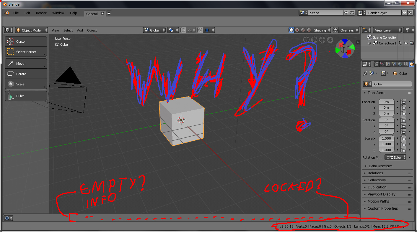
Please tell me why spliting info editor in to a locked status bar that is a little more than useless and cant be hidden.
How about a more regular topbar, filled with the most usual stuff, as seen on most 3d apps?
Tbh, this is the kind of stuff I expect from a topbar, not settings.
Example:
Thx.
For now all modes can hold all settings & tool buttons inside one row. But in case of " Compact " interface layout i think it can be more compact. Buttons already can include few options inside one button. Maybe it is reasonable to merge some of settings together?
Obviously, you have no clue on what’s happening. So why are you opening a WIP editor and complaining about it then? It makes no sense, you’re just making noise
Have you at least searched on developer.blender.org or old 2016’s 2.8 workshop writeup in order to at least understand what they might be trying to do?
If not, that is the first thing you have to do. You can’t criticise an unfinished work you’re not even aware about.
Otherwise, as said @DanPool :
No one is forcing you to use 2.8. If it’s making you this hostile, maybe you should wait until final release before you open it again.
I know whats hapening, I just dont understand why would devs hardcode UI stuff if there are editors, They did it with properties editor, why not do it with everything else, Blender’s UI main philosophy was always:
100% Customizable.
Specially, I dont understand why would devs take the info editor’s header and put on a locked ui region while everything they needed was just to split the timeline and set to INFO EDITOR.
Its like 100% more work while they only needed to change a editor tipe on the startup file (NO CODING AT ALL)
I agree 100%.
This is the best topbar solution so far…
Dont forget the custom factor.
