Blender user interface design

I don’t care that once you were against a change, that’s no argument. What matters to me is that blender was a highly efficient program and today it is not because of bad decisions in the new design. And that is something that worries me and many users that we would like to be able to talk quietly in the forum without having to suffer the discredit just because we have our reasons that are different from those of other people, mostly for reasons of work and efficiency.

Because for us blender is a great program because it allows you to work intuitively, without thinking, very fluid. I felt like sculpting a figure or drawing with a pencil, I didn’t think about tools, I just worked. Without interrupting the evolution of the artist’s thoughts or interrupting it as little as possible. And that was something I never got with Max, Maya or any other program. Because they are very “bureaucratized” programs that didn’t provide a solution as good as blender.

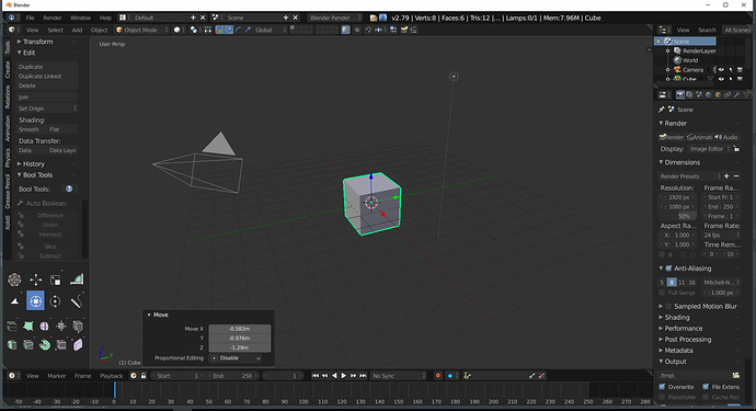
I’m sorry, I grew up in a society where reading from left to right is the natural thing to do. I like T-shelf not because it’s an old freak that I like to play against the world, I like it because my brain has been learning that way of interpreting information for more than three decades. Yes, the one who had the great idea of eliminating the T-shelf doesn’t care, mainly because he didn’t use it, but I don’t because having to divert my gaze to the right side of the screen forces me to use the left hemisphere, which is not accustomed to this type of tasks and finds it much more difficult to perform them. It’s nonsense for some, it forces me to get out of my creative “trance” just to change a parameter. That’s losing concentration, efficiency and what’s worse, money and quality of life.

I like very much the columns aligned to the left the text and the personalized layouts, because although they are not so pretty, so aesthetic, so much of everything, they allow me to find information with great ease. While now I need to go looking for each term like a little boy reading a book because all the controls are exactly the same, I am unable to differentiate them and on top of that the texts are misaligned. Yes, I know many programs make this mistake, but that doesn’t make it a better mistake. Okay, we accept that if you want to implement a search it is difficult to implement if there is no single column, but there are better ways to implement it and hundreds of people have already asked for the change, but apparently it doesn’t matter what we say.

I have the bad luck of having grown up in a world where the windows menu is on the left, where the lists are aligned to the left and where human beings find it less difficult to read from left to right. Would I have liked to be born in a world of heptapods where reading a pie-menu is very simple and I can also know the future? surely, but I have not had the luck and a menu of all life is more readable for me.

That there are people who have such skills because they live in Asia or have had a different education? I’m happy for them, and I think it’s great that they have the option. But I don’t see why I should stay without the T-shelf, without the hierarchy in the UI, without the possibility of placing a editor-area where it suits me best. In the false belief that it’s a matter of practice that I’ll get used to. No, I’m not going to get used to using the new blender because the old design simply coincided with certain neurological concepts that the new design doesn’t have because they haven’t been taken into account. I know because after 20 years working with this type of programs not a single program has come to give me that feeling of work that blender got.
4 Likes

and i don’t care about your rant either, the changes are the best blender has ever made and hopefully more will come in the future.

It happens to all of us, with any other program, as you just got tired of having to enter menus, of going to the toolbar to some nonsense… It’s like watching a movie while someone constantly interrupts you to tell you something. And with blender, if you knew how to use it well, this doesn’t happen. I don’t know the reason for that design, but it was a complete success. And now all that is broken for no reason.

And yes, I say without reason, because to this day we have not received a single answer to the main problems we have mentioned in the forum, nor an argument as to why to remove the T-shelf or other things. And much less what is the problem of continuing to maintain the T-shelf when all that has been done is to take it to the sidebar and by default is hidden. So… leave it hidden to the left of the active tools with the tool options inside, if it doesn’t hurt anyone.

The most basic logic tells us “the most important thing of an interface must be on the left” and so are all the interfaces of the world, the most important OS, websites and programs. Even google has the concept that secondary information goes to the right. What is done in all games? the important thing to the left, the less important (the map) to the right. You can go to the interface of the original Doom or even the super mario, in all happens the same, what should be at hand of the user is to the left and the least important to the right. What happens in the starcraft? the most important thing is the map, so it goes to the left. Why? for the same reason, not to deconcentrate the player when he needs fast information.

Not even by the way can be put further away from the comfort zone of work tool options. If blender would be designed with two monitors in mind I think that actually the tools properties would be put in the right monitor without any reason.

Nor were taken into account basic things in a program of this type, as users use giant monitors. The topbar is impossible to move, all its elements are far from the usual area of use. Main reason for the topbar problems, if the topbar was an editor/area would be much more useful and could have implemented many of the ideas that were initially had as the controls of the tools.

The same happens with the new window of “redo-last” that goes down to the left obligatorily, while it loses the old one that used the F6. Yes, it is still hidden but seems to have no support because the layouts are outdated, so I would not bet much on the future of this. Any user with a big monitor has just been humped a lot because now the window is too far away and the F6 can not use it. If we are lucky the new window will appear next to the cursor.

Well, I say without reason why all this has happened, although as we know the reason is that it has been copied to substance painter. Because we have had the bad luck that they have used as reference the program with the worst interface that has been done in years and is a program that has two tools and is basically 2D. It’s like trying to redesign office by looking at photoshop. When subtance painter is used only for its libraries and procedural materials, because anyone knows that blender to paint textures is a much better designed program, except the layers. It would like to have an interface half as good and a UX half as good as blender. They could have continued using the program modo as a reference and we would have avoided many problems.

And the worst of all is that these complaints that many of us have already seen for months, is that they are not even the important thing about blender2.8. Which is what bothers us most, that blender2.8 could still be just as good or bad for new users if it kept the T-shelf and tool options inside it. If topbar and statusbar were areas. If the only column outside with the text aligned to the left (which at the end so much column to make a cleaner interface and has become one of themost illegible things I’ve ever seen in my life). If the left click keymap did what has always been requested, flip the controls, and not break years of muscle memory (even in the 2.79 keymap). Make optional some things of the new keymaps (context-menu, piemenus)

And in addition we would have saved so many problems to the developers and stop facing the community on two fronts to see who is smarter and more right than the other. And seek a common path for all.


https://developer.blender.org/T55386
then you missed the party…people seem happy with the design otherwise it would have raised concer to the devs early on.

People have voiced concerns in the past, but they’re constantly drowned out, by people in similar topics praising active tools, and by people like yourself.

Also missed what party? 2.8 still isn’t released, feedback is still important. Hell, even if it was released, feedback is still important.

You’ve seen this, haven’t you?

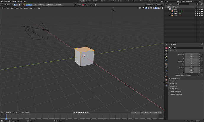
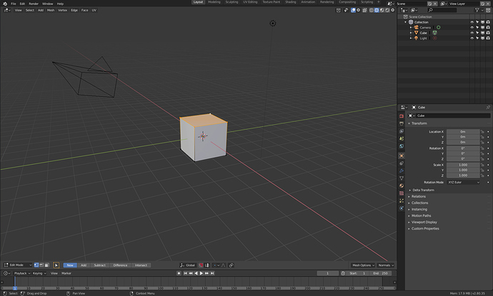
The best way to consolidate all that, is to put the header back on the bottom, or the timeline and last operator panel at the top, and then put topbar on the left, as a toolshelf between the active tools and the edge of the viewport.

The topbar has issues as it is implemented and conceived. And the first two of these have been mentioned time and again.

  • It takes up vertical space, on what is typically a wide screen.
  • It’s far away from basically everything (Also note in edit mode, there are mesh options like automerge and X mirror in the topbar, but they’re all the way over on the right, hiding above the outliner)
  • It prevents any future possibility of different viewports having different tools in use. Because it restricts you to modifying the options of, and makes the assumption that there is, only one tool currently in use for the entirety of the program and that’s it.
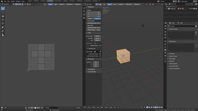
  • Along that vein, it breaks when two editors are using active tools. Open up the toolshelf in the UV editor, and when you go back to the viewport you have to switch tools or hide and unhide the toolbar to get the topbar (or properties editor tool options) to recognise which window you’re working in.

Tool options should be within the editor for which the tool is in use first. then optionally the properties panel can continue to have tool options for whichever tool the context sensing can pick up on you using, for anyone who wants to pop those out, or put them somewhere else.

3 Likes

oh so there is people like myself!!! okay cool to know.

1 )i never said you can’t give feedback, u can always do,the design however is locked(beta) and implemented and you won’t see a major changes in the 2.80
initial release maybe 2.8x or 2.90 and it’s better to bring a better and compatible one than just random rants from angry people.

  1. sorry,this is just stupid, the topbar is a topbar and header in the bottom is not clear readble for any user, u can still do it for your own if that’s your liking.
  1. different viewports having different tools in use, as far as i know you can’t have different tools for different viewports maybe different editos, where did you get that idea???
  1. of course you are using one tool at time you can’t use two tools at the same time so of course you have to click each tool to activate it’s settings.

i see alot of you crying on this T-panel and it’s settings or whatever, would something close to this combination of both ways easy your anger or you want just the old T-Panel?


1 Like

I’m all for topbar INTO the 3d view, imageviewer, and in whatever editor might need it.

2 Likes

Yeah, a global topbar makes no sence in a contextual application where each editor has its own tools and settings.

4 Likes

Hello,
I saw there is already being mentioned about icons but I write my opinion anyway.

I don’t like the icons of the Editor Type menu and top left file menus being white just like the text.
When it comes to human visual perception, the most immediate thing is color, then we recognize basic shapes (triangle, circle etc.), then simple icons (like on/off, wi-fi etc.) and then figurative images or symbols (like stylized scissors icon) that represent real objects we know from life.

The icons don’t have to be shaded and colorful, they just can have a light pastel tint and still be elegant.
I like modern graphic design and flat colors where it fits, but not when it reduces usability.

Also the icons of the properties tabs could use some color. Just one or two colors, not very saturated.
Because when I work I just want to work fast, know where to go. Colors lead my eyes and I don’t like to be interrupted by the interface itself, when it’s not clear and immediate.

This is my point of view about the icons.

Is a good idea, was proposed before, but then the topbar in the viewport is the header. Because if you put the topbar inside the viewport, and you put in the topbar the controls of the tools (snap, pivot, active tool, editing mode)… then the topbar is the header.

I want to live a feedback about the tools menu.
At first when it was introduced for spacebar key, i didn’t like it all. But on shift-space shortcut it is appeared like really convenient function. I like to use it during the modeling process and probably it is good to use during the sculpting.
Although i would like to have an option to use larger icons with horizontal rows instead of one vertical, just like in zbrush.

Feedback about the “tool properties” in editor properties area.

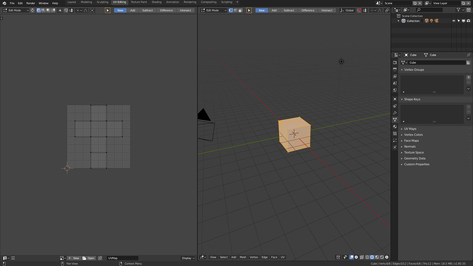
Having here the properties of the tool entails a rather annoying problem, the fact that this panel can only show the properties of a single tool, not several. When the user can have different tools selected in different areas, for example when editing UVs. Making it difficult to predict what will be in the properties of the tool.

Same problem in the topbar.

3 Likes

Yeah, its a need to each editor have its own tool settings panel.

1 Like

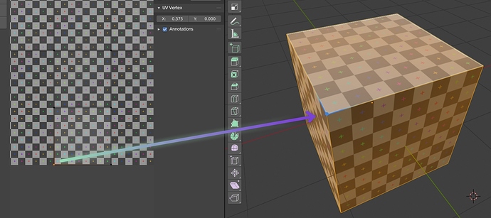
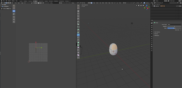
Visualization of selected Uvs (without sync)

10 Likes

Proposal for the topbar inside the each area, like other users told. It will work like a area with two headers.

This approach allow some interesting things like this

9 Likes

I love it. This imo could solve many UI quirks and perplexities

Other example of the idea with a UVeditor layout. Other good thing of this solution is that allow to separate viewport setting header of actual edit mode settings/tools.

Anyway I still asking for the tool tab in the sidebar. For complex controls. The idea could be that tabs in sidebar don’t have name, have an Icon, and if addon developers don’t create an icon the Tab only have one or two letters to identify.

And the good thing is that you can still naming it topbar.

8 Likes

As someone suggested, having toolbar into editors (only those who need it btw) could allow to send the toolbar content horizontally up there, and all the tools properties back to their 2.7x position on the left column

IMO, as long as the topbar contains editor specific content, it should be in said editor, or change according to the active editor + have a way to lock on a set (i.e. like the pin button). Otherwise, let the user choose manually what is in the topbar.
Other softwares already does that, and it works. And it’s another way to have an easy access addon widgets area.

1 Like

yes please, as in here!

1 Like