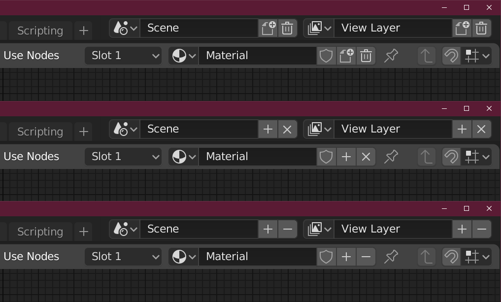
I thought i was crazy, but i needed a new scene in my project. Checked the scene enum and was like whaaat?? where is the add button? This icon is so confusing, it represents duplicate not new.
A “+” icon is more descriptive about its function. Its tells you it adds something, instead of showing a duplicating square which represents “duplicate”
The first is a bit fussy and complex, but at least is unambitious next to the OS frame icons. The second has a big “X” close to the “X” that closes the app. The third uses “subtract” instead but that conflicts a bit with the OS “minimize” icon.
Maybe the “+” along with “trash” might be a nice compromise. What are your thoughts?
the second one is no good choice. I think the plus and x icon are visually no good combination, and the X itself isn’t a really good choice for deleting something. At least for me it stands more for things that get closed but could be reopened or restored otherwise. The first and third option are both ok, but I’d probably take the first one.
Yes, personally I don’t like combining “+” and “x” because it is mixing metaphors in a way that make you think of mathematics instead. And the “x” is too close to the “close” icon. So my (current) favorite is this combination:
I thought it was discussed that these icons would go away and be supplanted by options in the dropdown/context menu?
You don’t create new scenes and view layers often enough for that to have to be a toplevel button, and having the delete there is just risky.
Yes, exactly the problem. The idea that they will go away with some future improvement means there is less interest in making (seemingly trivial) improvements now. Meanwhile nobody is interested in working on that longer-term solution either. LOL.