The bane of a flat UI is that it’s not intuitive to a new user like a more skeumorphic UI is. For example, which is which here:

I switched the text around from the way it appears in Blender. Did you notice that? Can you tell me what is a button, what is a tab and what is a menu from that picture? ![]()
So I know that context matters, and the missing context here is the layout, but I know that to some users it’s not apparent where the menus end and the tabs begin here:
![]()
Now, every experienced Blender user is going to jump down my throat, so I’ll stop pointing out what you already learned long ago, and go straight to my suggestion:

I think workspaces should have an icon.
Or something. Anything to differentiate them better.
I knocked these icons out in less than 30 minutes, so I know they’re horrible, but I just wanted to get the discussion started.
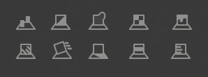
Maybe it doesn’t even have to be icons. Maybe just numbers? A dot? A better border?

