Hi There, I couldn’t see this after searching so sorry if it’s been logged.
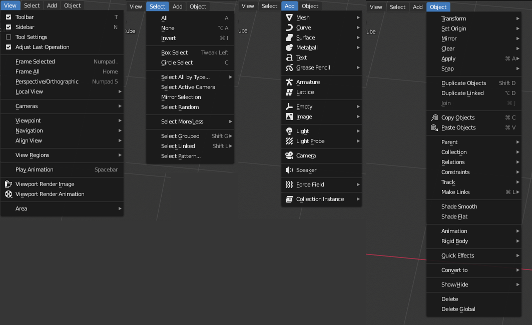
The View, Select, Add, and Object menus in the viewport are missing dropdown icons (at least they’re missing in OSX).
![]()
Hi There, I couldn’t see this after searching so sorry if it’s been logged.
The View, Select, Add, and Object menus in the viewport are missing dropdown icons (at least they’re missing in OSX).
![]()
What do you mean by dropdown icons? This is how it’s supposed to look.
Those are two different types of menus. In blender their names are a little confusing tho…
The left ones (with the arrow) should be called “Dropdown Menus”, and the ones on the right are the ones that should be called just “Menus”…
That little arrow icon at the end of ‘Object Mode’ is universally known to mean ‘I’m a menu’, that’s what I mean by drop-down icon.
If everything makes sense to you guys then no worries but as a new user, some items look like menus and some look like buttons. As a web UX designer, I’m sure most presented with this for the first time would say that ‘Object Mode’ looks like a menu and the other items look like buttons - do you see what I mean?
![]()
The left two icons are the equivalent of a <select> HTML tag, they are dropdown menus. You select one item from a list of items. The right four are toolbar menus like you see in the header of most desktop software, they do not traditionally feature an arrow icon. You select an action from a list or sublist. An arrow would be a confusing UX design choice because it would imply that you need to select one item from a list, but instead that list would provide actions and sublists of actions.
The ones on the right are popovers. It’s a container for panels, not menus.
https://www.gotbootstrap.com/themes/smartadmin/4.0.1/ui_popovers.html
Basically things that look like they might be menus but are not have the arrows to differentiate them from menus.
If it makes sense to you guys then all good! I actually think the menus and pop-overs do a great job of communicating how to interact with them once they’re open.
I’d just suggest that the View, Select, Add and Object pop-overs don’t look or behave like pop-overs. These particular pop-overs look and work like menus (complete with shortcuts).
Anyway, I think everyone has done an amazing job on 2.8’s UI and the UI changes are a reason I’m giving Blender a go - I think it’s taken a lot of people by surprise so nice work to all involved.
Cheers
Those are menus not popovers, though.
I see how my last post was confusing there, I meant the items on the very right of the viewport header, not the ones in your screenshot, sorry.
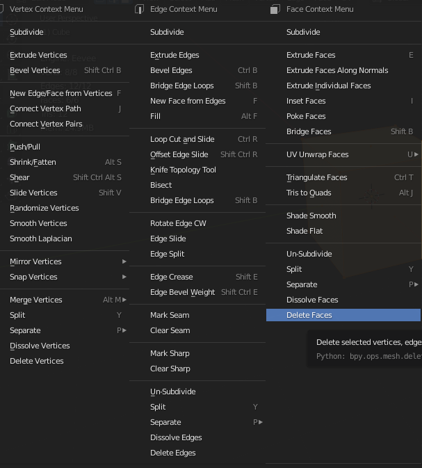
icons on menu tools and more …
@a.monti @jendrzych @billrey
Wouldn’t it be great to continue the refinement work?
Could You elaborate more? What do You think it’s missing there? What refinements You mean? Any mockups, ideas, proposals?
sorry you’re right …
is an idea emerged at the time seeing this screenshots … so I thought of suggesting to you icon gurus, that maybe (to start) the tools contained in particular W context menu could all be iconized …
![]()
I realized that it would be a useful job, when I could see that now the constrains are much easier to interpret and better recognizable in their function …
Are you just suggesting that all of those menu entries have their own icons, instead of just a few?
Some of those would be easy because existing icons could be applied. But I don’t know how much work it would be to make new icons for those which can’t be reused.
there are 60 elements, some already exist, others are the same for each category … should be made in estimate 40
could start from the most important ones, those that start a category … that are 19, some of which exist and others are the same for each category … maybe 10-15 icons … to start
Well, one of the main goals was to get rid of visual info overflood. Removing most of pictograms was intended. There’s room for a few more icons, though - the most used, most important menu items could get their glyphs here and there. Those would work as local landmarks, easing scanning and navigaatin lists.
Original poster here,
@jendrzych I agree on less clutter.
@nokipaike The thread was started because the View, Select, Add and Object popovers don’t look or behave like pop-overs. If you see the screen shot, they look and behave like the Object Mode menu.
It’s a minor inconsistency, so don’t want to waste people’s time with it, but it did cause initial confusion (if people care about that).
Cheers