We had been doing a pretty good job of scaling the user interface as users change the display resolution size in Preferences.
However, with 2.8 (I think) we gained the ability to also change Line Width and choose thick lines. I believe the intent was for drawing thicker lines inside the 3D viewport. But it affects all lines all over the interface. And I am wondering if we are keeping that behavior.
A question like this might seem to have an easy answer: “hell, yes!” But it does mean more work all over. Right now choosing “Thick Lines” is causing “off by a pixel or two” errors all over the place.
In the interface code it is pretty important to know how big things are. The following button, for example, is 20 pixels wide when the scale is set to “1”. In the code this button is exactly one “UI_UNIT_X” wide and it is that variable that changes as the user scale changes.
But to properly get the size of this button to account for differing line widths we’d have to instead consider it to be 0.9 of a “UI_UNIT_X” plus two times the line width. This is because thin lines are one pixel wide, and thick ones are two, regardless of interface scale. So this complication of calculation would have to be done all over the place.
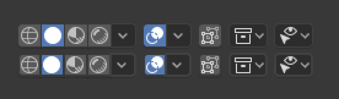
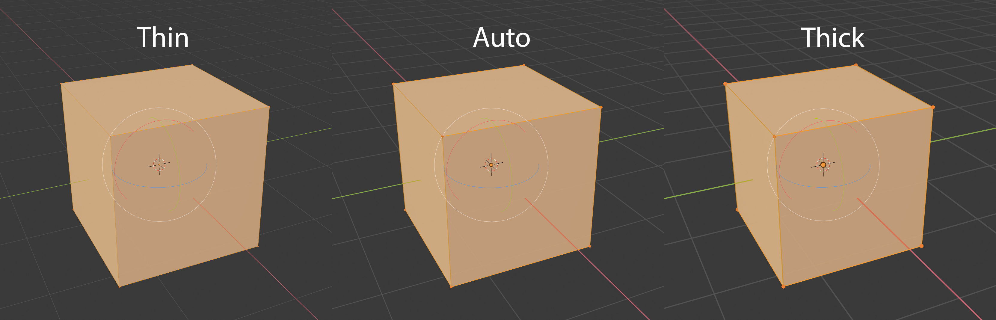
For anyone interested, the following is a good illustration of what I mean. Top row is what some elements look like at 1X scale with thin lines, the bottom with thick lines.
Since the interface does not properly take line thickness into account they just overwrite the edges, cutting off some of the contents. The “x-ray” icon being the best example.
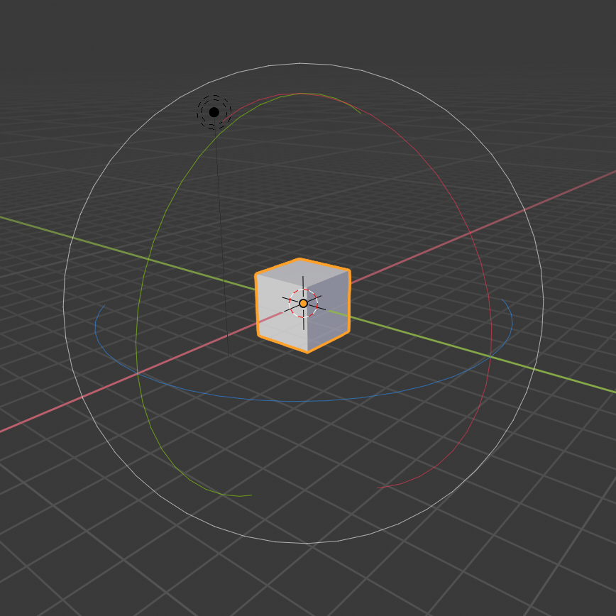
Interesting topic. Another thing that seems to be missing both line width and UI scaling are the widgets. Especially the Rotate widget - it’s lines are impossibly thin when viewed on a hi-res Retina display:
Yes, probably. I’d look at it, but I’m starting to have a lot of things backed up in approval. As it drags out it makes it harder to remember all the intricacies of the area you were working in. And some are blocking other, related, changes that I wanted to work on next.
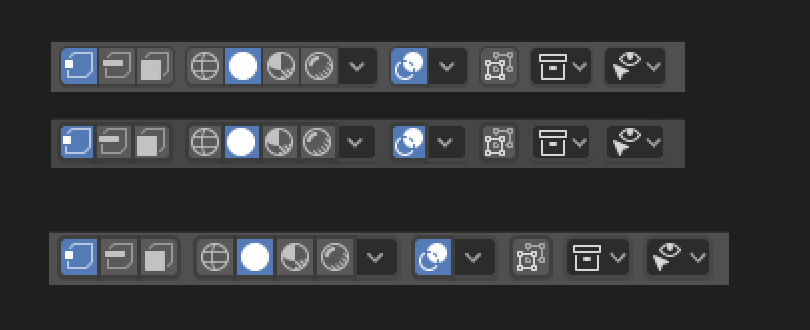
I did, by the way, find a strategy for the widgets with varying line widths. Basically made it so borders grow outward from the element, rather than inward where they cover content. If you want a bigger border on something you don’t want to make that something smaller. LOL
This image shows what I mean. Top two rows shows some buttons at 1X scale (and then enlarged). Top two rows show regular lines then thick lines. Bottom row shows how thick lines affect it after the patch, by growing outward.
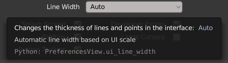
The purpose of line width is for high DPI screens, to go along with the interface scale setting. In 2.79 master we made line width automatically increase from 1px to 2px when interface scale crosses a certain threshold, and this setting gave some user control if that isn’t working as desired.
For completeness you can use thick lines with any interface scale, but it’s not intended for that.
I don’t understand that. I have a retina, 1080p and 4k monitor, and I don’t see reason to change interface because the resolution of my monitor. Anyway, could be better if the options mention that detail, like “HDPI” or “Normal monitor”
Thanks to brecht I was able to fix it better and can now even explain it better.
We scale everything in a nice linear fashion with a “UI_DPI_FAC” factor. But line widths are not scaled with the same method, and can even be set manually. Wonkiness occurs when the line width scaling doesn’t match the widget scaling. The patch has been updated to better do this adjustment only in these circumstances.
Sorry if I missed something, but will this patch (or any other task ongoing) also address the incredible thin lines the widget(s) have under macOS with a Retina display?
I’m really struggling here because I need to use screen shots for printing documentation…
You probably want to go to Edit / Preferences / Interface / Line Width. With a retina display you should have three options that change line width (thin, auto, thick). With retina (so 2X scale size) and set to “auto” you should be seeing most interface lines drawn two pixels wide. Thin is one, and thick is three pixels.
Does “Thick” lines do what you need? Or not thick enough? Or not changing what you need to change?
Before this patch, selecting thick lines would do so by taking space away from the content those lines are enclosing. After the patch we now preserve the content in the boxes by expanding those lines outward instead of inward.
Yes, I certainly tried all three options and I can see a difference when it comes to edges or vertices. But I can hardly see a difference for the widgets…
Old thread, so excuse me if I’m off base. But those thin lines you show there are probably because your mac only draws thin lines. For many Macs a call to glLineWidth() with something over 1 will be ignored and you get a 1-pixel wide line regardless. Drawing lines wider than a pixel is an optional behavior for the driver.
There are many ways that things are drawn in Blender, so much of it is not strictly gl lines. For example, many things are shaders, or we might draw rectangles in place of vertical or horizontal lines.
I know this is something they think about, have seen it mentioned, and hopefully will be fixed one day by not using gl lines in those places. But not yet.
I aslo made a propsal but related to Custom shapes, something similar as to what Harely had mentioned about Thick lines inside the Viewport.
Line Width affects everything and it would be much better to separate it to elements UI,Gizmo,Custom Shapes, Wireframe… so each can be tweaked individually.