Hi,
I’ve created a little Proof-of-Concept for myself to see if the tabs in the Sidebar could be displayed in a different and probably more efficient way.
Motivation / Problem to be solved
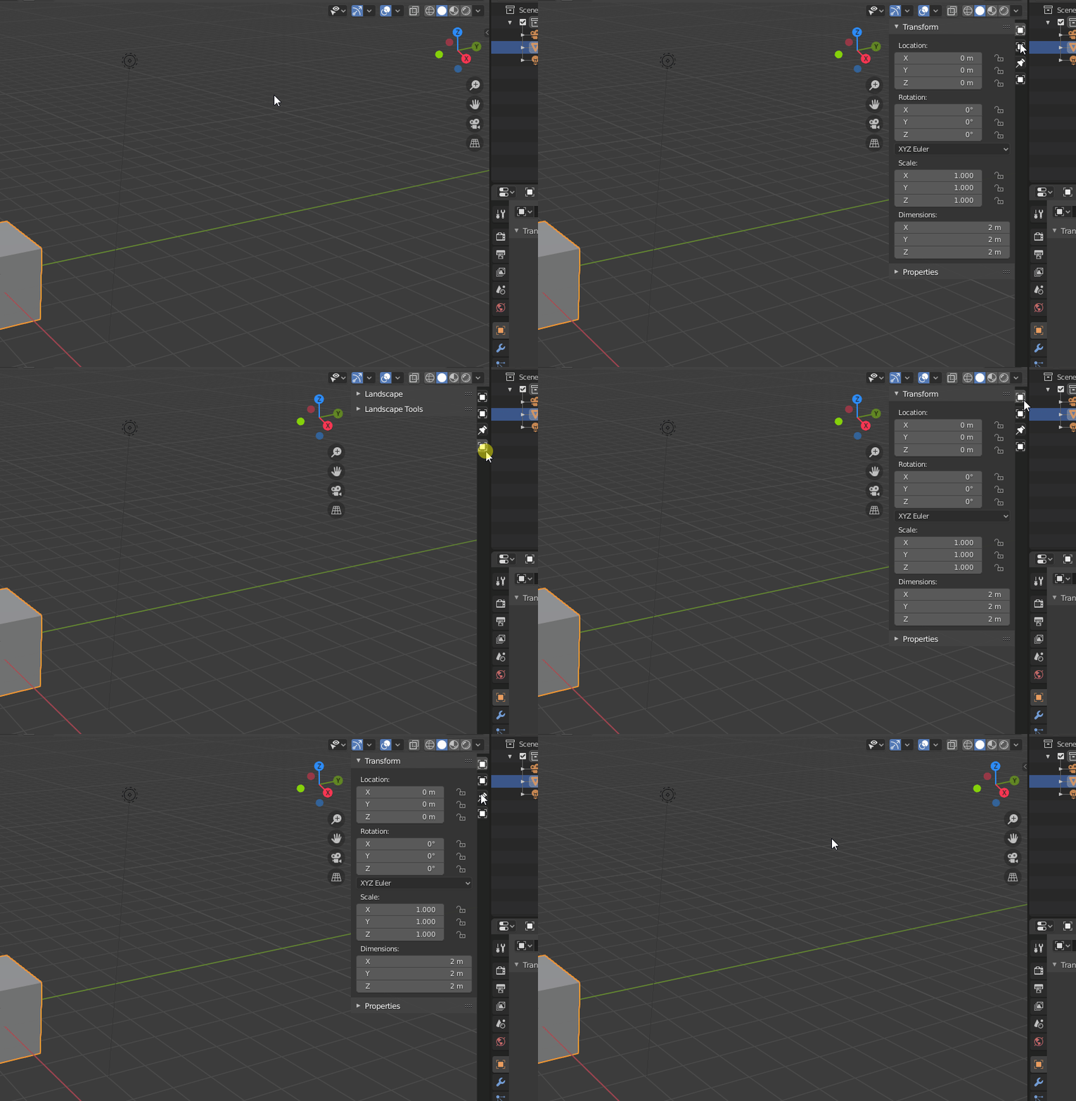
Over the time I have accumulated lots of add-ons that I use and the Sidebar gets extremely crowded up until to a point where those tabs don’t even show their text labels anymore due to lack of free display space.
Click on this image to see the full image:
Idea
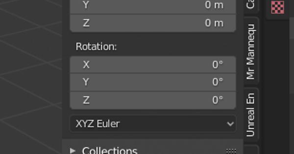
So my idea is to simply replace the text labels with icons for each tab. This is what I have so far:

I had to make some changes in the C sources to achieve this. The iconified tabs are fully functional and even the workspace Filter Add-ons feature still works as expected. ![]()
Next steps on my list would be:
- Add a new settings section in the
Blender Preferencesdialog inside theInterfacetab for the sidebar.- Allow users to toggle display modes:
text labelsoricons - Allow users to set a custom path where Blender should look for Sidebar icon image files. (There should be a default path as well, I guess)
- Allow users to individually assign an icon to a Sidebar category.
- Allow users to toggle display modes:
- Define an API for add-ons so they can provide additional Sidebar icons. User assigned icons always take precedence.
- Add tooltip support to the Sidebar’s category tabs. This enables users to still find out the category name per tab.
- Add resize support when Sidebar is used in icon mode (undecided)
Is this something of general interest to fellow Blender users?
Maybe also a Blender UI dev could give me some feedback whether this is a feature you’d like to see officially added to Blender after enough iteration time. If that’s not the case, I’m fine with that, too. Your feedback would simply help me decide how cleanly I should implement the things I listed above - just for me or for everyone. ![]()
Cheers
