Some changes were made to the layout, which in some cases may lead,
for example, labels are adjacent to the buttons.
Example:
Such issues can be reported on this topic.
Revision: https://developer.blender.org/D9058
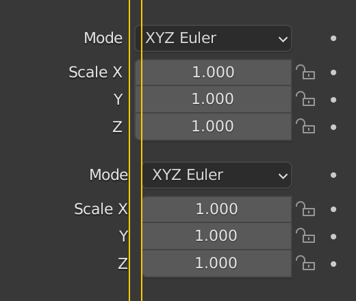
Some changes were made to the layout, which in some cases may lead,
for example, labels are adjacent to the buttons.
Example:
Such issues can be reported on this topic.
Revision: https://developer.blender.org/D9058
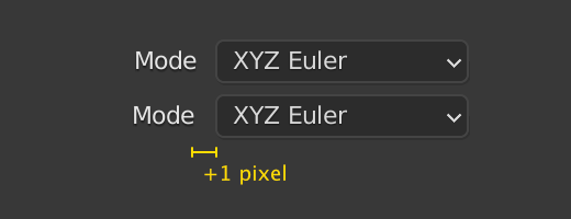
Split layout factor:
Split layout, text indent:
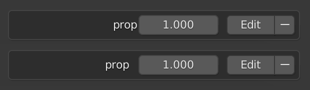
Here’s one. Looks like the padding was lost for right aligned buttons in list items:
It only really looks like a problem for text, other lists have icons aligned to the right and it doesn’t look bad.