When we manipulate the application layout it is very easy to add new window panels and in some configurations it can become very tricky to remove them. There has been some UI improvement over time with the addition of a semi-transparent arrow above the panel to remove and it works well in the most common cases and the “Joint” right click menu item. When the panels are small though when we try to make that arrow appear it often results in the creation of another panel, which becomes at its turn uneasy to close and so on, leading to some frustration.
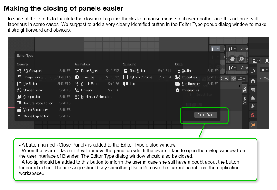
Since the popup menu is always available in a panel it would be very intuitive and efficient to have a button “Close Panel” in it all along with the list of the panel types
Can you flesh this idea out a bit better? You show the “Editor Type” menu open but show “Close Panel”. But you do mean to close that Editor right?
The difficulty would be in knowing what you intend to happen when closing it though. We can’t (currently) have an empty space. So presumably some other editor would take up that space, but from which neighbor? What if there is more than one? What if there are no neighbors that could be merged with the outgoing one?
I guess “View” - “Area” menu should be moved to “Editor Type”, somehow. Not all editors have the “View” menu, and “View” menu it’s about view of the content, not about the editor itself.
Instead of a “Close” button, it can be “Merge with the Right”, “Merge with the Top”…
My suggestion was to put the Close button into the “Editor Type” menu because it appeared to me, but I may be wrong, that the dropdown for the menu type was always accessible, even if the widget area was very little. And indeed pressing the button is to trigger an action that will remove the current widget, in other words the one we interacted with when we called the menu.
The question of which widget should get the space left by the closed one didn’t really appeared to me because I am seeing the whole window containing all the widgets the user created as a kind of hierarchy of layout components, so for me removing one widget just inform the layout component containing this widget that it should reorder itself according to its new content. This may be a too simplified point of view
So I understand the possible issue about the area that has to be chosen for the merge. I do think though that providing too much option for the user like Merge Left / Merge Right… is a bit overkill. The user just wants to kill a widget he didn’t managed to remove manually, this in order to simplify the current complex layout resulting from inefficient attempts based on the actual behaviors. She doesn’t really care about the new layout as long as it is roughly predictable, and she will probably change it afterwards anyway.
Whether it is this button or something else, there is something to be found to help the user to easily get back to a simplified layout.
But “reorder itself” is something that must be thought about and planned. Think about how blender looks in the simplest case, in the default general layout.
User “closes” the 3D View in this case. What do you expect to happen? Perhaps it becomes all Timeline since it shares an edge with it. What if that area were broken into two so that were not possible?
I’m sure it’s not that easy and things have to be planned. What I am just pointing here is that there is a real frustrating issue here (very localized and not impacting the production, I admit, but impacting the feeling of newcomers), and there is very likely something smart to be done.
Defining a suitable predictable behavior doesn’t sound impossible, does it? It’s just a matter of time and priority.