I just want to comment that I think concepts are not being well planned before approval, specially the topbar.
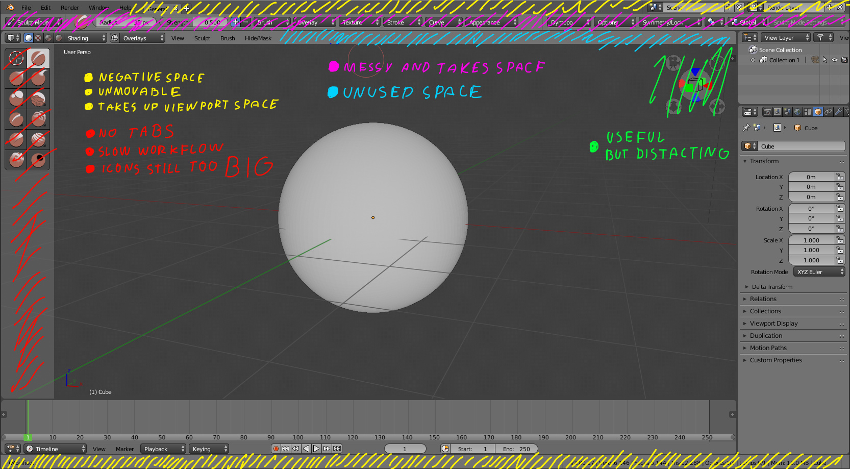
Its no suprize that the new top bar and status bar(yelow and pink) are taking precious space of the viewport and the fact that they are not hiddable makes things worse.
First replace the horisontal layout of 2.4 with a vertical layout on 2.5, okay…
Then reroll back the same stretched viewport that is wide but thin again?
Monitors are already wide and short…
Try to fit a standing character at full body and still not having to zoom to see details, CAN’T!!
I ain’t the first to complaint about that and almost every laptop user will complaint.
Small screens will suffer of having to work on a tiny viewport because a few bars dont like to be hidden.
And from my opinion, thats just a bit ugly.