I was just looking at today`s build, enjoying the huge progress Blender has made in the last year and how great the UI looks, when suddenly I had an idea how to clean up the top-bar.
Well, if this was discussed before or if there are technical limitations to this, please let me know.
However, here is what I came up with. The idea is to get rid of the white top stripe with the Blender-Logo etc, since this is unused real estate. Next, the different layouts like “Modeling”, “Compositing”, “Sculpting” could be put in a drop down menu. Together this cleans up the UI and even provides a bigger workspace/viewport!
I’m unsure if you’re building this and have technical questions (right place) or just have a great idea that you would like to share (that would be better on rightclickselect)
No that is a bad decision. It will be exactly like in the 2.7x version where the workspaces are hidden from the users view and hardly anyone uses them…
That would be the user not knowing their tool inside-out, and I don’t think that should be a deciding factor when designing an interface. I don’t mean hiding stuff for the sake of it, but at some point I think you gotta trust the user to ‘rtfm’ and know their way around. Well, it doesn’t matter much what I think, just offering some food for thought !
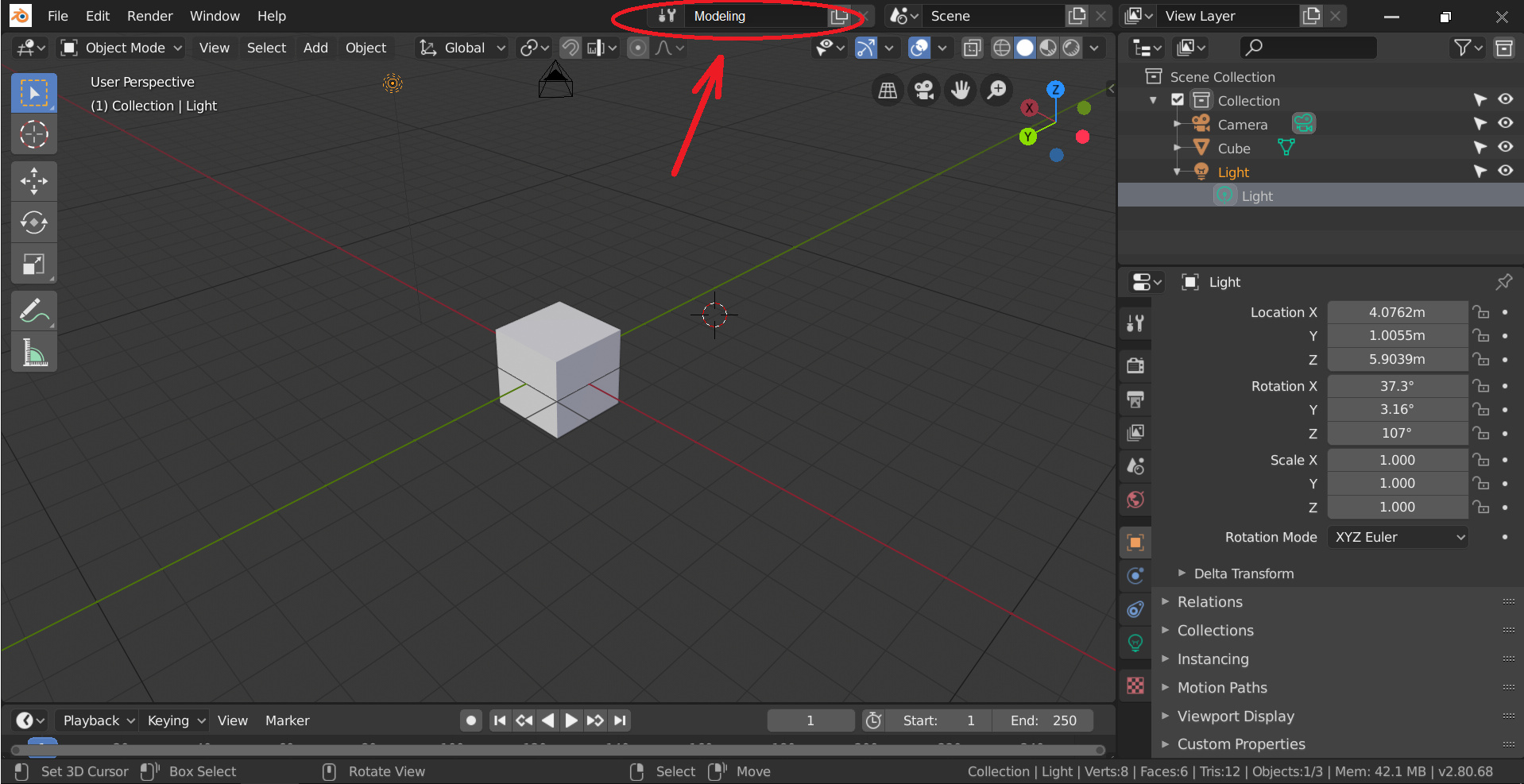
Please look at the attached pic. Nothing is hidden! How is this exactly like 2.79? It is just as easy to find as the drop down menu for the Scenes and the View Layers…
Using a drop down menu for the enivironment keeps the look and workflow consistent with the Scene and View layer handling. Using tabs is just a waste of space. Its not like you switch environments as often as you would switch between diffent tools, like Rotate, Scale, Move etc
Furthermore, depending on the amount of tabs and the screen size you even have to scroll through the tabs.
yes it is true … but a lot of wasted space is the same
(I refer to the fact that some spaces for writing texts could be halved)
the question is that in blender 2.79 it didn’t matter. there was a lot more empty space …
in blender 2.8 that space is precious
I prefer the new workspaces switch because with one click you switch from one mode to another
do you guys know why automerging and symetry editing are not on header ? is it because of lack of space ? They are in the N panel right now. This topic idea or other could make some space for these handy options