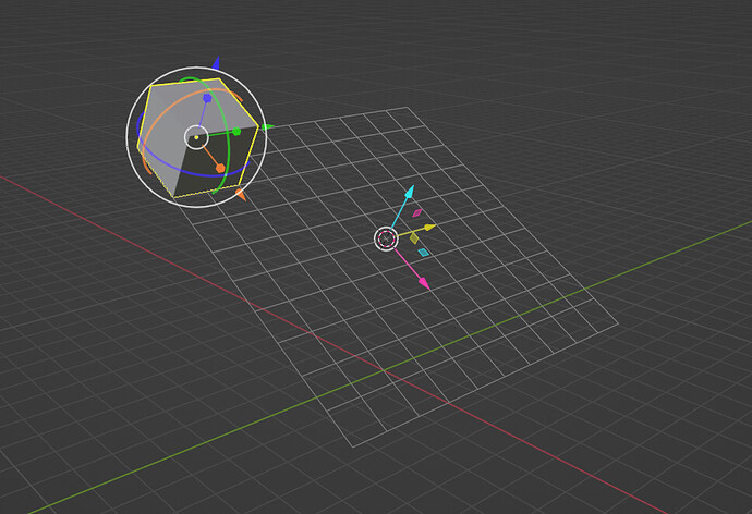
That’s a screenshot of the existing gizmo when the pivot point is set to 3D Cursor. I think there should be a visual difference for when you want to transform the 3D Cursor itself.
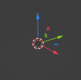
I think we should keep the RGB colors but have some other visual indicator, like for example, turn the white circle in the middle into the same red and white dashed line as the 3D cursor:
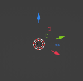
Other visual differences could include trimming the arrows and/or removing the filling in the little squares to keep only the outlines:
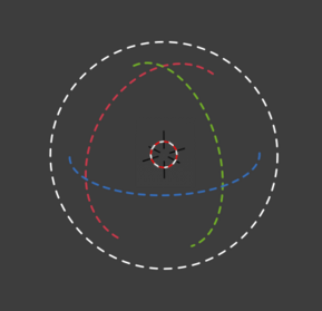
We could also just turn all the lines into dashed lines to stay in the 3D cursor style:
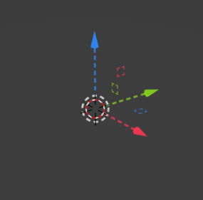
…which could also apply to the rotation gizmo:
I disagree, dashes make them ask for attention too much. And the 3d cursor shouldn’t be part of the gizmo, since you may confuse it with the actual 3d cursor. It’s much better to add a solid white dot at the centre. Also, no outlined planes please, the widget is so small, this further obscures the planes and makes them difficult to view.
