II’ll give it a try tomorrow evening - seems like a fun challenge.
2 Likes
Here are the 25 Suzannes
https://www.dropbox.com/s/jr64dx0z2mqx3ai/Suzanne%20Boxes.blend?dl=0
If you have the time, maybe go through the thread and see what else I did that could be interesting. (Should go quickly if you simply stop where ever there are images)
2 Likes
Should such blend-file be created in regular Blender/Cycles or in spectral Blender/Cycles? Are there any object-types to avoid?
Anything that’s not affected by Cycles lighting is kinda useless. Mostly that means no Grease Pencil and no Shader to RGB nodes.
There are no differences between Spectral and Regular Cycles except for the shader editor where you get extra options concerning spectral rendering. Presumably, if the idea is to compare regular Cycles and spectral, avoid those? But if the goal is to test Spectral on its own merits, use them?
That said, Spectral Nishita currently has different brightness output than regular Nishita so avoid that one even in spectral test scenes I’m guessing. (Apparently there’s gonna be a Nishita update that’s gonna make it more usable in a spectral manner within spectral Cycles)
I think the things I tested the least is hair, velvet, and SSS shaders.
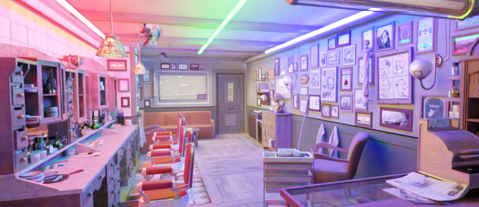
Probably there should be at least one scene that’s a fairly complex indoor room to really stress test it in that scenario. - A modified Agent # Barbershop scene (more saturated colors) could work for that.
Also, as an extra check if you’re gonna render them, try looking at like all of the passes.
I’ll give this a try, though I imagine there won’t be much difference considering the dominant direct light and mostly desaturated materials
Power norms are the most brain dead idea ever.
I couldn’t wait till today, so I made this yesterday already ![]() . I think it is seriously overdone though. Render time is about 20 minutes on my laptop-GPU which is obviously too long. But please let me know which elements you like, so I can build from that.
. I think it is seriously overdone though. Render time is about 20 minutes on my laptop-GPU which is obviously too long. But please let me know which elements you like, so I can build from that.
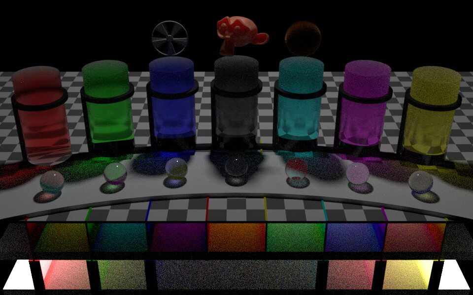
The theme is RGBWCMY from left to right. The isolated lower row has two point lights on either side with 6 thick smooth non-scattering transparent absorbing dielectric panes between them; the center section is obviously very noisy. The same materials are used for the 7 cylinders, but are adjusted with quarter-stepwise increase in roughness from 0 to 1 bottom to top. The cylinders have IOR from 1.1 for the red one to 1.7 for the yellow one. In front of these cylinders on the curved path are small dielectric spheres that do not have absorption but do have volume scattering and a smooth surface; the scattering is set to transmit the RGBWCMY pattern, but that seems quite difficult for cycles; at least their caustic foci have clear colors. The second row from the bottom consists of 7 isolated conduits which each have their own point light behind it; the point light do not directly illuminate the separating walls which are RGBRYCMY, the floor is white and the ceiling is black, such that light from the point lights has to reflect on one of the walls at least once before hitting anything else; the result is that we have strong possibility of color bleeding as is already apparent between the YCMY walls (perhaps the floor should not be white but follow the same color sequence?). The checkerboard helps to understand the scene. For fun, I added Suzanna for SSS, the wheel with high-speed-rotation for blur, and the hairy ball which needs some combing.
No denoising algorithms, linear RGB all the way, no depth-of-field.
Again: please let me know which elements you like, so I can build from that.
(edit: longer ducts on the 2nd row:
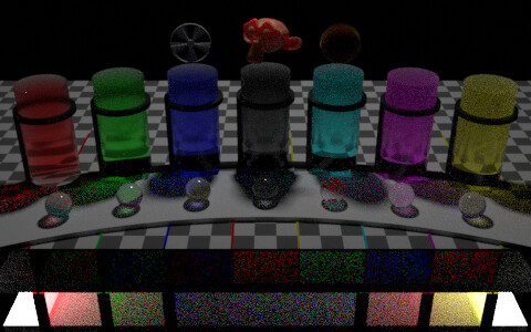 )
)
4 Likes
I quite like the second version. I think we can evaluate motion blur separately and remove it from this test, and I wonder whether we can more effectively use the top space in evaluating a number of BSDFs, the hair and SSS are great examples. Any other variations on that could be good to look at too, maybe different volumes under various illuminants?
Overall I think this is great. Maybe the density of the absorption in the columns could be increased at one end too, so that it’s much darker/more saturated. Bottom area is great. Noise seems reasonable, long-ish render times are probably to be expected.
We can always spot-render parts of this scene to compare individual aspects more finely. Nice work.
Could use Toon Shader (both Diffuse and Glossy), Velvet Shader, Translucency Shader, and Emission Shader.
And perhaps the three volumetric shaders too (though this would obviously cost render time, especially if you wanna propery evaluate volume scatter which will require extra volume bounces)
For that last one, if you rather had it isolated, there also would be my star example. I think that demonstrated quite well how scattering in particular looks quite different, even when using matched RGB.
1 Like
Your star scene was great for evaluating volumetric differences. Would you mind creating the same sort of thing with a number of variants in the one image, and maybe on a checkered floor so it’s a bit easier to ‘read’? That would be perfect and would take the need of testing volumetrics out from the scene by @Ivo
I’m thinking illuminant colour, density, and scatter/absorb colour. The volumes could just be spheres too, I think, or alternatively something like a strip with one property varying along the dimension. Whatever you think works well to evaluate the differences
can do that for sure
Thank you, I really appreciate you guys giving your time for this, something I don’t have a lot of to dedicate to Blender development.
Thanks for the feedback, @kram1032 and @smilebags. I will shorten the cylinders and move them backward, increase the density of the non-scattering volumes, add multiple light spectra (blackbody, and?) and BSDFs on some grid of suzannas (Hair, SSS, principled, toon, diffuse, glossy, velvet, translucency, emisstion etc) and remove the spinning wheel. Maybe curve up the checkerboard in the background (and reduce its contrast because it adds some noise too I think)? I think that it is indeed best to tailor dedicated scenes for specific tests you want to run. This one would still be useful to quickly see if anything is unexpectedly out of whack when you make a code-change.
1 Like
Maybe a few blackbody temperatures, white, and RGB?
Absolutely, that’s the sort of scene I’m after. It should be compatible with regular RGB Cycles too so that we can compare to RGB as well as between spectral versions.
If you want to use spectral versions of some elements, you can create a node group with 2 BSDF inputs named RGB and Spectral and just route one to the output (the other one is not used), and use that group with the RGB and spectral alternatives. That way a single toggle in the node group can update all your materials.

Extremely quick and dirty Volume test scene. I think I’d wanna tweak this further but just in principle.
Feedback welcome. In particular, is a colored checkerboard like this actually a good idea or should it rather remain neutrally colored?
And more specific test scenarios would also help. Right now:
- pure white emission (left)
- emissive ball within red scattering ball (back)
- diffuse white (0.8) ball within white scattering ball (front - I was hoping to get some visible volumetric shadows but I think for that I’ll have to tweak both the lighting and the number of samples)
- green-absorption glass with white (0.8) ball inside
I probably can fit more variations in there. Just gotta scale down / zoom out. Right now the only light source other than the volume lights is a point light above and behind the glass ball (as can be seen in the shadow)
Also this isn’t actually spectral Cycles yet. Just regular Cycles and Filmic. I’ll do that later when the scene is more finalized / I have more time
2 Likes
I think it is, that way you can see a number of different transmission colours through the volumes. I like it.
Great test scene I think. As you mentioned, just a few different volume colours/densities and I think this is a great test scene.
Hi, do you have a link to where I could find that idiff executable?
ships with the svn libs, it’s in the openimageio folder on windows, unsure for the other platforms
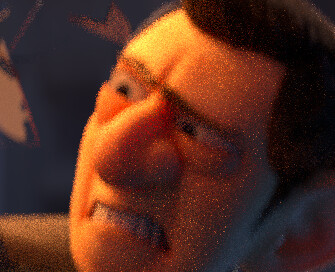
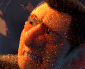
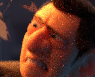
Here’s a quick test of an older splash screen scene cropped in on the face, with spectral, then spectral with a custom importance spectrum, then RGB. There’s something odd going on in the left eyeball but that might potentially just be a result of un-resolved values being initially somewhat biased. The spectrum sampling improvement is noticeable but not all that significant, which is about what I’d expect with this scene.
It’s interesting just how different they are to the RGB scene. I’m looking forward to when we have a spectral version of filmic ready to use because I feel that will hugely improve the visual appeal of the output images by default.
1 Like