Theoretically, sorta, yes. In that caustics could in theory correctly exhibit dispersion effects.
Practically, no. Cycles’ algorithm just simply isn’t cut out for caustics. And getting that right is a whole nother subject altogether. - Also, there isn’t yet a shader that would even attempt to take advantage of this. Two complex IOR shaders (one for metals, one for transparent stuff) would be really nice to have.
There are other methods that would enable caustic besides bidir btw. I think the main issue for not going that route, however, is Cycles’ flexible lightpath system. Making that work assumes certain things that bidirectional path tracing couldn’t handle, as far as I understand it. Maybe a more modern method somehow could but I’m not sure.
Perhaps this one? - It actually beats BiDir too.
But at any rate, this is sadly out of scope for this project. Would be its very own effort. And if the design choices of Cycles couldn’t be made to mesh with techniques like this, you’ll have to essentially write a third render engine for these purposes (or use an external one that already does this)
oh I was actually thinking of a regular glass-style shader - for instance, there is a complex ior thing for water or a variety of gemstones.
But yes, a thin-film shader is also a thing Cycles is missing. (Strictly speaking, that, afaik, doesn’t need a spectral workflow. But thin-film effects are gonna be more naturally simulated with spectral rendering I’m sure)
Yep, you can calculate pseudo thin film effects with 3 wavelengths mapping to the three channels but it tends to result in overly saturated and somewhat inaccurate results.
I’m considering adding new spectral effects such as this after merge/release, once the hurdle of getting everything working and bug-free is over.
So what, do you think, are potential showstoppers for getting this integrated currently?
One for sure is Filmic. We need a working Spectral Filmic or, if not otherwise possible, a small set of Filmic-likes that accomplish different things for different situations (kinda like the contrast variants but perhaps for saturation or hue-accuracy? I really don’t know what the challenges are here. Would love to see a demonstration of a few choices / experiments)
What are some other limitations or know/potential bugs?
Oh and then there is the design question of how to expose spectral input to artists. Brecht had some qualms with that iirc
Currently @pembem22 and myself have been discussing what is remaining to be done before requesting a review, thankfully the list is not very long. I’ve intentionally limited the scope of what will be introduced initially so that it reduces the already gigantic code review which will need to happen.
There are some user-experience related issues such as Filmic. The ideal case would be that I develop a new version of filmic with @troy_s which handles out-of-gamut colours elegantly, but this has proven to be an extremely difficult topic.
Current Filmic does the same thing to spectral images as it does to regular Cycles renders, so there’s certainly a benefit there, but unfortunately out-of-gamut colours will continue to be out-of-gamut after the Filmic transform, which will re-introduce some ugly artifacts. These colours are much more likely to come up in a spectral engine, likely leading to the additional complexity that @MetinSeven faced when working with Octane, and interestingly, one solution which comes to mind has been discovered.
I would ideally like the default configuration to be able to provide a better solution than simply desaturating all colours. Spectral images should ‘pop’, but we want them to do so in a controlled way.
The simple answer is that we won’t, at least not directly in the way I had initially intended. The ‘Spectrum’ data type should provide users with a reasonable amount of flexibility, and later down the track I will look into whether there are ways we can open it up without introducing other issues.
I believe the way we are handling things currently shouldn’t bring up too many concerns from Brecht. I recognise the concerns he had previously both from the user’s perspective and from a technical implementation perspective. We’ve separated all of the spectral nodes into a new ‘folder’ in the add-node panel, which should make it quite clear what is supported in Eevee and what isn’t. The other major concern I remember was with exposing the current sample wavelength directly in the node graph. This hasn’t been implemented and now that I understand the reason for his concern/warning regarding it, I doubt it ever will be implemented. I now recognise there are much better ways to achieve the same or better results.
If possible, it would be nice to get a once-over from him before going for code review but I know he’s incredibly busy so don’t want to pull him away from other things unnecessarily.
Oh glad to hear. Sounds like this may be happening somewhat soon then! (Or at least, the actual process of review can begin soonish)
Doesn’t Filmic already do this though? I mean, obviously just with in-Gamut colors, so definitely tweaks are needed. But colors that are very bright end up getting desaturated. What is stopping you from doing the same for super saturated colors?
(This is a genuine question: I literally know too little about this to already deduce a plausible answer. This is why I’d love to see some experiments, even if you already have completely ruled those out)
It sounds like what you really want is something like Color “Vibrancy” in Photoshop, which selectively boosts low saturation colors while not oversaturating already saturate colors. Except the goal instead is to keep mid-saturation colors nearly the same while desaturating super high saturation colors. But to me it seems like the idea is quite similar. It’s more of a perspective shift than a fundamental difference between Vibrancy and what you are trying to achieve.
For too-bright colours, yes, it desaturates them, but it won’t do anything for not-too-bright but out-of-gamut colours. You have the right questions.
Your general approach to the problem is pretty similar to what I had in mind, but the devil lies in the details. Believe it or not, current desaturation approaches have some significant flaws which become more evident in wider colour spaces (Abney effect is one, if you’re interested). On top of that, there’s not a well-defined way of giving any colour a saturation value from 0-1 across the entire visible spectrum; relatively easy to do so within a colour space, but significantly harder to do in the general ‘human vision’ case. That’s what I’ve been working on, but it’s a challenging problem.
This effect, I see. It compresses hues in non-trivial ways.
Somewhere between that orange and red there must be a cutoff where colors start looking increasingly pink instead of increasingly yellow…
oh one minor thing that still needs fixing (I suspect it won’t be too difficult?) is the material preview render, right? That just is completely off right now
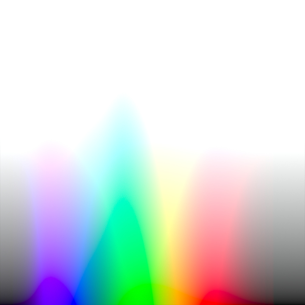
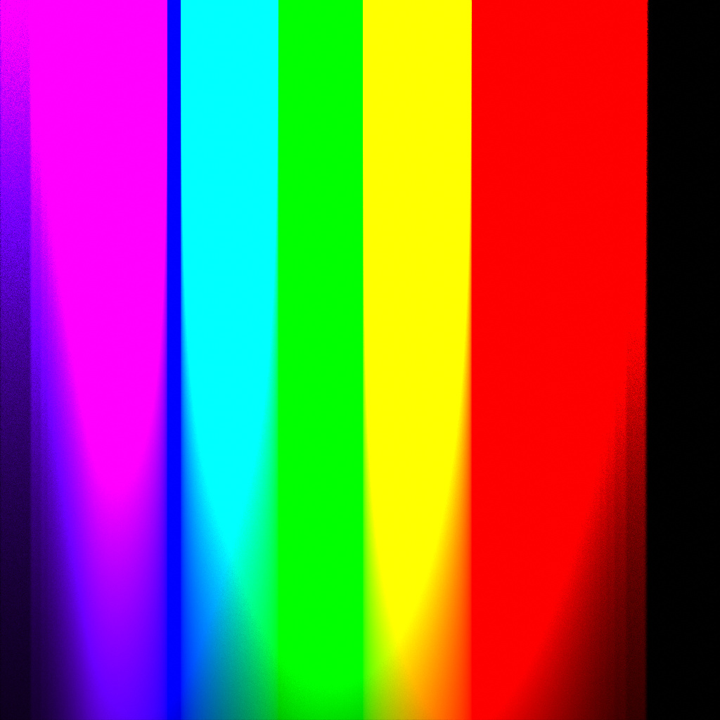
Not sure if these are of any use but I’m guessing these are demonstrations of where some of the problems lie. (By the way, the extreme ends of the spectrum seem to get cut off quite suddenly. These wavelengths barely contribute to the outcome anymore, and floating point errors may well be at fault here, but assuming that’s not the issue, I suspect that wouldn’t be wanted like this?)
Basically you are staring at the tip of the iceberg of all display rendering issues. While they are, at the core, aesthetic / creative questions, they also clearly have odd behaviour that some might rule as “completely batshit crazy wrong” output.
What is a sane output for a colour that is too intense to be mapped to the display?
How do psychophysical sensations such as Abney effect play a role?
How do historical technological solutions such as per-channel lookups for the gamut compression of high volume values play a role?
What should be the goal for output in terms of “accuracy” given that answers to the above questions are largely perceptual / aesthetic based?
It’s quite a fascinating tip-of-proverbial-iceberg that has gone literally unnoticed and unquestioned by the larger audience of image makers for a long, long time.
As a final note, if you roll the last test through a traditional RGB pipeline the results should skew radically worse. The delineating posterization band is out of gamut with respect to the display.
This is probably due to the wavelength importance sampling and potentially to the limited sampling range. Before merge the sampling range will be extended and that will likely necessitate a higher importance sampling CDF resolution
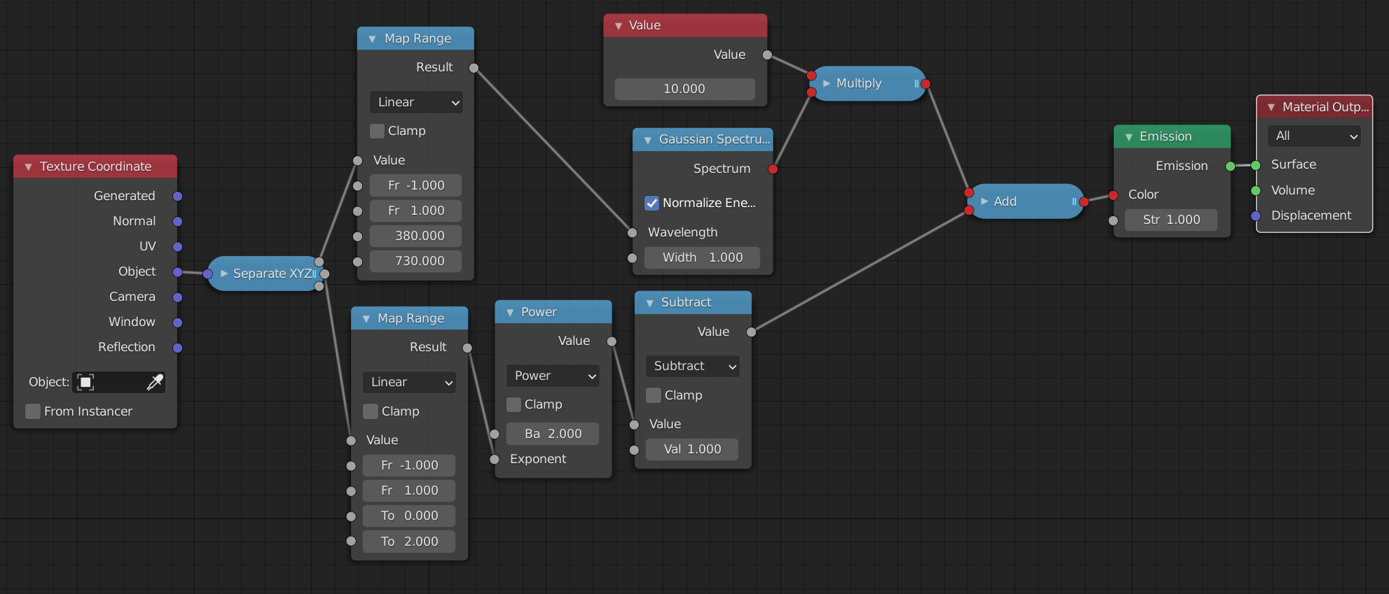
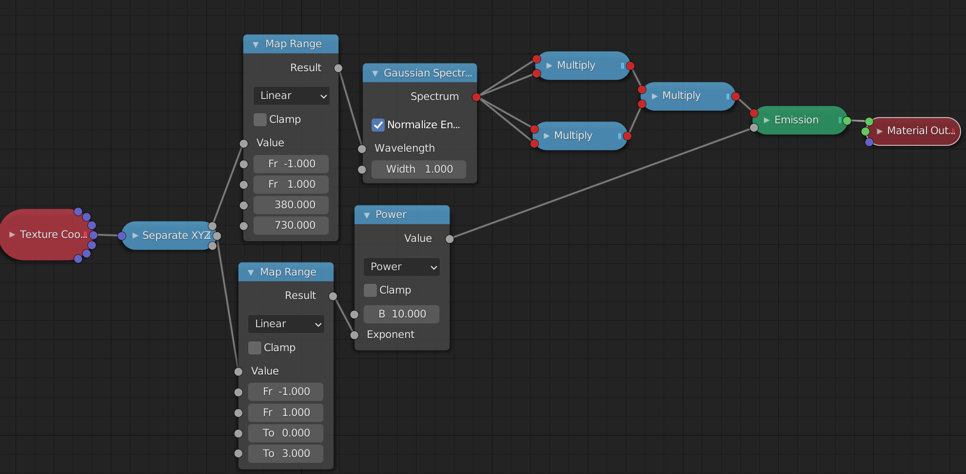
The sampling range should be 380-730, right? That’s also what I fit on that plane. (See the material nodes)
You can also clearly see that the purple end starts much darker and then slowly goes bright, suggesting it does sample light in that range, it’s just suddenly way darker.
On the red side, if I increase brightness by an insane amount (I’m talking up to near the limits of floating point numbers), I can get colors to be visible to up to about 706 nanometers. Anything past that remains black even at that intensity.
There’s an arbitrarily selected CDF resolution which is used for importance sampling of the wavelength - this is what I suspect to be the issue due to the variable ‘width’ of the regions of constant brightness. The sampling range you have is correct currently, but there are also non-zero responses outside of that range, so I will increase the sampling range along with introducing new CMFs which were sampled with the extended range.
I wonder if you make the calculation of intensity based on lightwave physics.Here as example the amplitude of a light wave is based on photons per second being emitted.(The last post in the link)
For the most part, that’s a shader question. No such base shader currently exists in Cycles. Polarization and interference are not taken into account by the base path tracing algorithm. And thus far, the full spectrum of light wasn’t either. It was merely possible, in principle, to write shaders that could approximate spectral effects. (No such shader was in Cycles by default though)
Polarization and interference effects very rarely matter in the end, and so it’s gonna mostly be limited to shaders. (Polarization is kinda faked by a glass shader where, technically, the light that’s reflected and the light that’s refracted should have different polarizations, but the renderer forgets about this information. Interference and stuff that relies on phase would be part of a thin-film shader which Cycles doesn’t yet have)
Right.I was asking,because i was thinking if the wave equation with the Planck constant gives a different Energy curve vs the exponential test ie (the test with the equation used vs not used) gives a different result.
The lack of possibility of Total internal reflections in the current Glass shader and refraction shader, makes the most different to Luxcore or other renderengines with better glass reflections out of the box.
There are some good Thinfilm shader groups for Cycles,these are pretty accurate within a few nm.Most devations are due different lambda/IOR values.
If you want to simulate a wave interference.you can make it with wave textures to some degree ofc,we have testet a bit some years ago at blenderartists.This can not replace a sinusoidal light wave ofc.