While squinting at stuff and flipping back and forth between images is fun, we actually ship a nifty OIIO tool in the svn libs called idiff which allows you to compare 2 images then output a third image with the differences (we use this tool for the cycles unit tests), however since the differences can be real small it also allows you to scale the error.
Difference between the two images posted earlier obtained with
No need to be envious at it at all, I too subtracted one from the other image using some imaging too. I should have mentioned that . Be aware though that you are probably looking at absolute differences here, so more blue in a diff image can mean that either of the two source images is bluer than the other without telling you which. You can circumvent this problem by initializing the result image with mid-gray, then add the first source image and then subtract the second source image. Assuming you have a floating-point calculation pipeline, that should result in a mostly gray result image with some brighter and some darker pixels. Use your image viewer to increase the contrast when needed.
this would suggest that, yes, the floor has the geatest difference, but also, the red channel in general looks quite different, right? - You can also clearly see the much stronger difference in red on the sofa and the chairs. And, which I hadn’t noticed, the one orange image on the wall right under the vertical bar and above the chair on the righthand side. - Interestingly that doesn’t actually seem that meaningfully different by the tried and true method of flicking back and forth compared to the other spots.
This is interesting because, just based on spectral overlap, I’d expect first and foremost the green channel to be somewhat affected. Although I suppose that works both ways: Red and blue light will be reflected quite a bit by green surfaces, but green light would also be reflected a relatively large amount by red and blue surfaces… (at least compared to red light on blue surfaces or blue light on red surfaces)
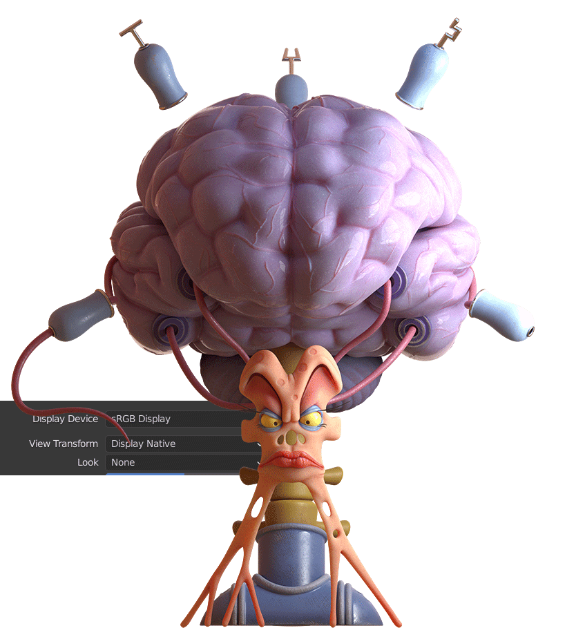
Wanted to see the difference between spectral and regular (filmic) color, with only 2 area lights and orange world.
The body seems more vibrant, the cyans get burning whites (Even with high contrast in in regular render didn’t get that) and the purple brain loose some redness.
Very interesting results!
Thanks for the test!
Sadly there’s not going to be a meaningful comparison between Filmic on master and the default transform with Spectral - 99% of the differences you see are coming from Filmic rather than from spectral vs RGB. Once we re-implement Filmic for spectral, there might be some very interesting comparisons to make between them.
Yeah really looking forward to that happening. When Filmic got into Blender, it was quite a game changer. Perhaps the feature the closest to a Make It Look Good button to be added to date.
Sadly gamut plays a huge role in evaluations, and there’s an entire rabbit hole to fall into.
It’s worth noting that in every render you see:
The working space ratios of light are never maintained due to per channel lookups.
The working space ratios of spectral lights are very commonly not representable in BT.709, which means gamut mapping comes into play.
When gamut mapping, similar to 1. above, the working space ratios are never represented accurately in the output, nor is that facet desirable!
Ultimately, spectral brings plenty to the table, but the subject of “good looking imagery” becomes a whole sidebar discussion as to what should end up in an image.
As far as direct comparisons go, it’s impossible to analyze from a colour standpoint given the current structures. Even in an idealized scenario, the evaluation becomes rather worthless from an analytical evaluation.
Alright, so now with the Standard version the results are much less dramatic.
The Standard is a bit redder mostly in the shadows of the body and brain, and a bit on the yellow spine. The blue tubes are harder to notice any difference.
Is this a good test? How can I help and improve?
This is what I was a bit afraid of: the differences in regular scenes are not very apparent.
I work with Cycles and LuxCoreRender a lot, and I recently figured to try Octane, to see if Octane’s spectral engine would give me just that edge in realistic light and color behaviour. I used to work with Maxwell Render in the mid-2000s, which I believe introduced spectral rendering, and it is still the most realistic renderer I’ve ever used.
I studied Octane’s settings, including the right Gamma values for all nodes and settings, turned off Blender’s color management, activated Octane Camera Imager and tried all LUTs, but I still get more visually satisfactory results from the (regular) Cycles and LuxCoreRender.
I guess my expectation of spectral rendering was too high, and I suspect the really visible differences between RGB workflow and spectral workflow will mainly become apparent in specific scenarios such as dispersion.
I think your attention may be somewhat misguided. Spectral will not and is not intended to make you think “Wow, it looks so different!”. It’s not like going from black and white to RGB.
The effect that spectral rendering will have on a scene will depend greatly on the scene. For simple situations there should not be a noticeable difference. If there was, it’s likely an indication of a problem. This is especially true when working with entirely RGB assets. This quote from the developers of Manuka Renderer (Weta Digital) is important to consider. While I don’t want to devalue your experience, I do feel like it may not be a representative judgement of spectral rendering altogether.
To be honest Fascione and the team were not sure how much of a difference building an end to end colour matched spectral pipeline would make. “We always suspected that there would be an advantage and it would look a whole lot closer to the footage. As it turns out, it was much more than we even anticipated” he comments. Weta Digital had hoped to notice a difference on human skin, but in fact they noticed a visible difference in a huge range of shots.
What should become apparent once using spectral rendering is normal, is that there will be less guess-work involved in getting things to look right and behave predictably. I do honestly believe that a spectral workflow with suitable tooling would be easier and more intuitive than an RGB workflow. Considering the almost negligible performance impact that it seems to have in many cases, it doesn’t need to be all that much better to convince me that it is worth it.
To summarise: there shouldn’t be really visible differences, but things will likely just look subtly better in some cases, and the workflow will become simplified.
I guess this is what @MetinSeven was hoping for. That little “something” that makes the difference, and that hardly people can really describe what it is.
Thanks for your reply @smilebags, appreciated. Good points.
That sounds good. Ironically, it took me much longer to get where I wanted to be in Octane, mainly due to several necessary manual Gamma settings, color management settings and LUT experimentation. In the end I had to decrease the Saturation value in Octane’s Camera Imager, because the result became too saturated.
I guess strong color management is also a key element for satisfactory and credible results, as @troy_s pointed out.
Good luck with the spectral Cycles project. I’ll definitely keep an eye on it.
The differences will be largest with very saturated colors which the three primaries model forces into the gamut those three primaries span, whereas spectral images can in principle generate all visible colors.
It will also most strongly change how green light works. That is, green objects that are lit with red or blue, or red or blue objects lit with green light.
The reason is, that the green receptor, being spectrally in the middle, has the largest overlap with the other two.
Though I find it interesting that, right now, it actually seems like the red channel tends to end up with the largest differences.
Another thing where it’s gonna matter in general is anything where bounce light or absorption is highly important. Spectral colors may shift in interesting ways as they go through more bounces or deeper absorption.
RGB colors, by contrast, will only ever shift towards the primaries as bounce depth increases. Eventually, RGB-based lighting will only meaningfully contribute to the most dominant channel as given by the original color. With spectral ones you could potentially see a shift from, like, red to blue as spectra slowly narrow on each bounce.
Or equivalently, objects that appear to have wildly different colors under different lighting conditions. Things like color change garnet or pumpkin seed oil. Materials like that would be very difficult to make look right independently of lighting conditions. (You could stick to a single kind of lighting and make it work under that, but as soon as you change from, say, a warmly lit indoor scene, to bluish outdoors daylight, you’ll have to adjust the material again)
As a practical example of this phenomenon in action, Weta’s benefits were especially strong with, say, fire or the like:
If you match the color of relatively cool fire (such as torchlight) using RGB colors, and render a reasonable skin model lit by such light, you’ll find the result to be way too saturated. An RGB-matched version of fire will essentially have too little blue / be way too concentrated in the red channel. With a proper blackbody-based fire, and skin that reacts to light like real skin would, you’ll get vastly more natural results.
This oversaturation is something you could fix in post with a crapton of arduous work. Or you render it spectrally and it already looks essentially right.
This corresponds to one of the few things that really impressed me in Octane compared to other renderers: I noticed a significant difference in SSS color richness when I used the Gaussian Spectrum node to input colors, as opposed to using the RGB Spectrum color node.
Not just that, this is exactly why the attenuation is so dramatically different with spectral compared to RGB; RGB has limited channels and the results have no option but to scale to zero while spectral can have energy remaining in other spectra.
The largest differences that should be apparent easily will come via indirect bounced light.
This!
It is very challenging to describe how much of an impact the colour pipeline has on the result. Consider what you are looking at the end of the pipe as the actual formation of the image itself. It’s gamut mapping all the way down! Currently, there’s no “this is the ground truth” rendering approach; every single rendering approach I have seen has huge problems in how colour is rendered. At some point it is purely creative, however there is a tremendous amount of ground to cover to get to “acceptable”.
I haven’t seen a single rendering pipeline yet that meets that “barely acceptable” requirement when we start discussing how “accurate” colour is. It’s all a load of rubbish. Hopefully more folks will start to appreciate the con job that has happened.
At low absorption depth it starts out pinkish, then goes green, and eventually, if absorption is really high, turns blue.
At least in sunlight (this is using the Nishita model. Though, for clarity, I did not use the spectral version of that in order to safe some time, so technically the spectrum of the sun/sky is wrong)
EDIT: here’s a render (I ended up doing the Spectral Nishita after all)

 . Be aware though that you are probably looking at absolute differences here, so more blue in a diff image can mean that either of the two source images is bluer than the other without telling you which. You can circumvent this problem by initializing the result image with mid-gray, then add the first source image and then subtract the second source image. Assuming you have a floating-point calculation pipeline, that should result in a mostly gray result image with some brighter and some darker pixels. Use your image viewer to increase the contrast when needed.