yeah you can build stuff that emulates it. But there isn’t a base shader that does it for you, perhaps with a variety of physical guarantees you might like to have
1 Like
Here a example i was thinking of,that could be interesting.The measured Dynamic Range of many Cameras in log2(EV)
https://www.photonstophotos.net/Charts/PDR.htm
this EV Electronvolts can be calculated to E photon Energy.Or from E to EV.
maybe this is a way for a better Energy calculation for display Wavelengths in Blender.
I guess this is related to blackbody color tmp?
The renderer already calculates the correct energy. The issue of how to display the result is very different from that and has a lot to do with
a) how we perceive colors (many effects are a result of the way our brain processes and interprets how the receptors in our eyes are excited by any given pattern of incoming light, rather than a result of the light itself) and
b) how monitors actually display colors (monitors cannot ever display all the colors we can actually see. Most monitors today even only cover a rather tiny range. So how to display colors that fall outside the range they can show faithfully?)
Like, if you look at the image I posted above,
literally none of the colors in this image actually fit on your monitor. They are extremely tight. Each pixel is very nearly a single wavelength. Like laser light. Except for very particular wavelengths on some very high end monitor (there are, for instance, projectors that use three colored lasers to create their images - so at least those three pure colors it could display faithfully), there is simply no way to display these objectively correctly. You can throw physics at it all day. Your monitor is just fundamentally limited.
So the question is, how to cheat as little as possible, keeping in mind how we actually perceive color. How to define what is a “sensible” way to display these extreme colors.
Right now, all it does, I think, is to clamp any color channel that would be out of gamut. Set it to full 0 or full 1, basically. (I’m simplifying here)
That causes, as you can see, the bands to become ever less smooth as you go further up the image. Which is certainly a valid choice, but probably not what you actually want. Intuitively, you’d perhaps expect the colors here to remain smooth and gradual, even at very high brightness, so you end up with more than just six colors at the top.
But how to actually turn that intuition into a reality is what the current problem is.
4 Likes
I think you have described perfectly, that it is not possible to display the whole dynamic range on a display.
There was that slogan “If you can make a Photo from it,you can render it”.And i think this would be a good starting point.Yes the energy might be right.As you know lightwaves are invisible most the time.What we see are mostly the blackbody tungtsen light ,the Sun blackbody,Stars blackbody in the night,Fire or welding ect.And the particles or objects that get the radiation from this lightsources,absorbing and reflecting/scattering the light.
From all this you can make a Photo.It should be treated like HDRIs i guess.You select the EV range within maybe 2 Stops which can be displayed,done.From Black to White.If its underexposed you go higher and so on.
Filmic was a great help to get a smoother look at higher dynamic ranges.Maybe this would be usefull for spectral rendering too.
Cameras are construced like the human eye,with the lens and the pupil.If you take a Photo against the direct sun,then you close the aperture,like the pupil, to get lesser light on the sensor.
If i am not wrong the spectral eye sensitive curve is allready in the colormanagment in use?
Here i found this interesting paper about Encoding High Dynamic Range and Wide Color Gamut Imagery
The ICACB and ICTCP colorspaces looking good
Yes, that is the point. That’s what the main missing component is.
The issue is that no matter what color space we may choose (including sRGB which is still the most commonly used one), the end result should look reasonable. What use is a wide gamut colorspace if you can’t display it?
By being spectral, internally, in a sense Cycles already uses the ideal color space: precisely the space of all perceivable colors.
Well, I guess, the thing next to ideal anyway. We can’t easily store exact wavelengths for every pixel. That’d be way too memory intense very quickly. So each wavelength is converted into XYZ color coordinates and then all contributions are added up in that space and finally converted to whatever desired display colorspace.
And that is where the struggle lies. How to sensibly make use of what you have in that final colorspace, throwing away as little as possible (in terms of relevance to human perception) of the full gamut full dynamic range image.
Frostbite is useing ICtCp too in they research.

And similar topic with Unreal engine

From what I remember from Troy_S’ detailed posts about how color transforms should work, I believe “smoother look” is a massive oversimplification of what the math does. Filmic impacts everything from how intense highlights look to the general saturation and/or hue of your materials. To manage everything in a realistic manner is like a lot of other things in Blender development, it is more complex than it looks.
@troy_s, @kram1032, @pixelgrip, I’ve found a new screen for you. ![]()
2 Likes
I wish. Bit beyond my price range, lol
2 Likes
This may not look as fancy but I tried to see what the colors of the Suzanne look like without fancy shading effects:
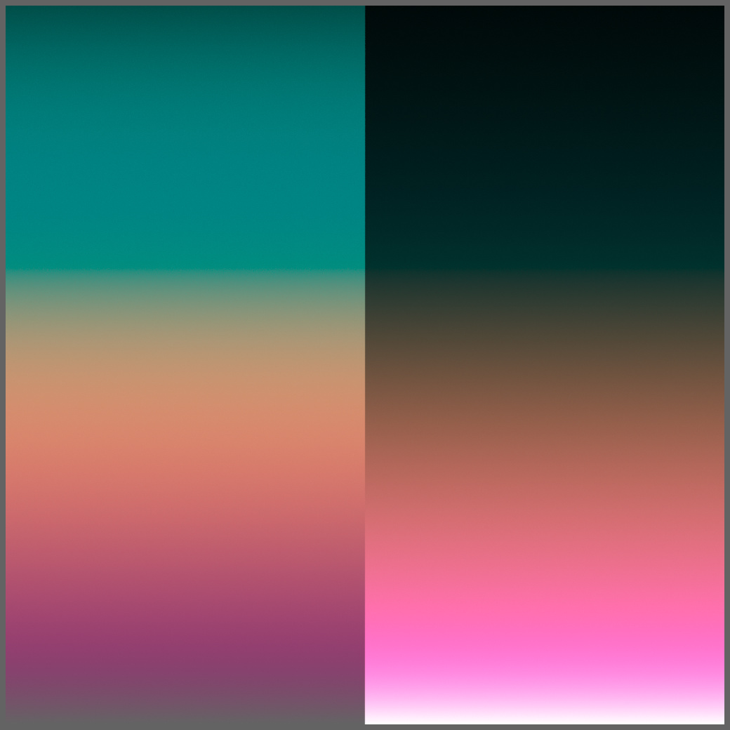
On the left side here, I boosted brightness of the plane such that it’d be roughly equally lit at each optical depth, whereas on the right side, the plane’s brightness is constant, so deeper depths appear darker.
Optical depth varies exponentially (minus 1 so it’s exactly 0 at the bottom) to 1000 at the top
I wonder if literally any gradient is possible with enough fiddling, or if certain orders of colors are off-limits due to how spectral colors are ordered.
If you just shift the blue spike or the yellow spike miniscule amounts up or down, the final behavior changes quite a bit. Like, I’m talking in the 0.1% range.
This isn’t that surprising though: I’m taking the spectrum to the 1000th power at the top (so near the bottom I’d look through 1mm worth of material, whereas at the top it’d be 1m etc.):
0.99^1000 = 4.317e-5 - essentially black
0.995^1000 = 0.006654 - juuuuust barely visible
0.999^1000 = 0.3677 - quite a bit of contribution still
At those depths, tiny differences at the beginning make a massive difference in the end.
3 Likes
It’s mind blowing to think that’s a ‘simple’ absorption spectrum. And yes I also noticed that very subtle differences in the absorption spectrum can make very large differences to the output. Interesting to see that effect in action here.
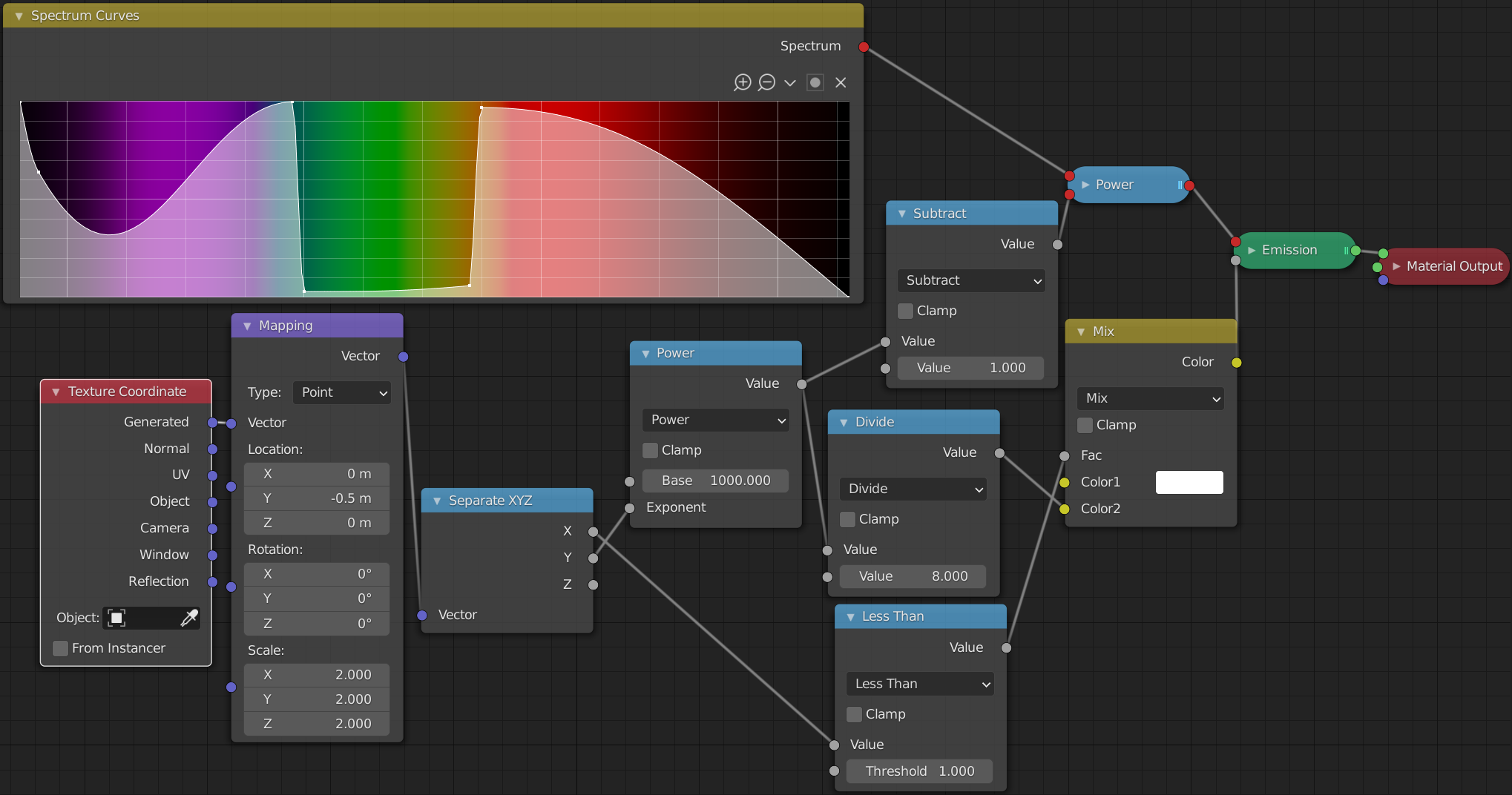
This is certainly something for later and not strictly necessary right now, but it might be interesting to have an alternate way to input spectra, where, effectively, you’re directly entering target optical depth or something. Not entirely sure how to best do this as yet. Like, I’m imagining a way of saying “at depth x BU this wavelength would be present to y %” or something.
I’d also love, if that’s somehow possible (there may not be any sensible way to actually do this), to have a remapped version of the wavelength input where stuff is scaled by how much it actually matters. Like, sure, this is the entire range, but at the purple and red ends, those near black regions almost don’t matter at all. Whether you minimize or maximize those colors barely affects the final color appearance. (This will only get more extreme if you switch to the wider range)
Meanwhile, the green region is somewhat unintuitive and rather tiny movements seem to cause rather large changes to hue.
So somehow stretching/compressing the space based on how sensitive our eyes are to it might make the behavior more linear. Not sure that’d actually help. This is one of those things where I think it’d need to be tried out first.
Yep looking at that I’ve been considering whether there might be alternative spectrum construction UIs that are more suitable to this sort of work, like if there was a slider which controlled the exponential ‘optical depth’ of the spectrum, essentially raising all values to a power but retaining the ability to edit the spectrum.
As for perceptual uniformity of the spectrum node, once my work on gamut mapping is complete I should have a hue-constant colour space which can be turned into a spectrally based HSL wheel, which will generate Gaussian spectra and allow users to select any ‘real’ Gaussian spectrum as a single 3-dimensional value. This hopefully should retain a much more perceptually uniform distribution of hues and be more intuitive to work with than the spectrum node, which I suspect will be used in more scientific cases.
1 Like
This will be great of course, but I’m specifically thinking for arbitrary spectra like the above.
Yeah it’s an interesting problem. It’s definitely something I’m interested in looking in to, but as you said it’s likely something which will come later, once we know what the biggest pain points are.
Some time ago bsdfs with roughness property have been changed to use roughness squared, which to our eyes look more gradual, whereas the old version (not squared) would appear to suddenly jump in roughness at some point between 0 and 1. So in effect artists had to fiddle with very small values if they wanted just a little bit of roughness.
The new system is more intuitive because it is made to match our perception, and that’s also the rationale behind the principled bsdf -I think your reasoning is in line with that : having some kind of a compensation for the spectrum curves that makes it “stronger” around the ends, and “weaker” (less sensitive) in the central, more strongly perceived colors, seems sane to me.
@smilebags Hi,I wonder if I can create triangular prism dispersion using this version. If the answer is yes, how should I set up the scene ?
There’s no dispersion support yet, so unfortunately this isn’t yet possible. We do plan to add support for dispersion in the future, so once it is in, it will be very straight forward to create a scene like you described.
At this moment it doesn’t support gpu so it’s really time-consuming to do some tests.
And to be clear, that means we get a BSDF that has wavelength-dependent IOR. Not that we’ll get a rendering engine that’d actually be any good at showing off caustics
3 Likes