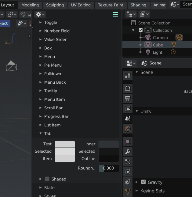
The color tab of the workspaces should be separated from the color tab of the property buttons
actually is unique color in Themes > user interface > Tab > inner
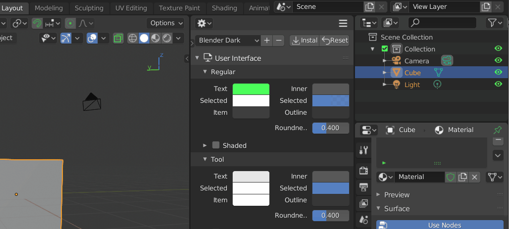
The color tab of the workspaces should be separated from the color tab of the property buttons
actually is unique color in Themes > user interface > Tab > inner
these elements are called Text, they should have the right name,
they also affect multiple areas, should be separated and moved to their right with a better recognizable name.
Currently they are a unique color located in Themes > user interface > regular
this, background color at the icon is not possible to manipulate it, and with certain themes it is ugly
(I’m not sure but maybe you can change between black and white, along with other icons, but I can’t no more find where it can be manipulated, and in any case it influences other areas that have nothing to do with and it’s a mess to change it without breaking other parts of the theme.)
if someone finds what manipulates it, highlight it.
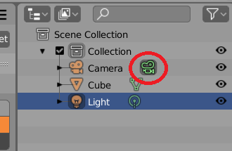
I think this background indicates the active camera. And I can’t find a setting for it either. Do you know if there are other scenarios for this background to appear behind icons in the outliner?
if you notice carefully, even the lamp and the collection has this “exaltation circle” …
and honestly I do not understand the purpose 
I find it only boring in some themes
edit:
better investigated
indicates the active Camera …
it should definitely be themeable
I agree this is confusing. I’d say the Collection Checkbox should use the User Interface > Option settings. The others seem like some sort of a regular icon color. And I’m not sure how happy UI developers are right now about renaming items. And it’s already theme-able 
meanwhile the list is there, then someone will have fun correcting these little mistakes little by little …
this is part of the same process of reordering and cleaning that has been done in general throughout the blender ui, this sector is clearly seen that it has not yet been touched
What if the Outliner > active camera icon background color is linked to the 3D View > Object Keyframe Will that be a good ‘use-what-you-got’ solution?
You propose, useless to ask me for an opinion, if you think it makes more sense in terms of cataloging and identifying the elements I think it’s OK…
Then we need to see what the Official ui desinger and the devs think.
I don’t think that’s a good idea. They are unrelated.
Yeah, you’re right, they are. I’ll put it as add Outliner > Active Camera rgba on the list.
Thank you Shiv0r, I’ve added it to the list!
This might need a new category. Not only cameras have “active background”, mesh got a “active background” too. Who knows what else?
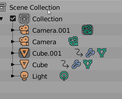
So those active backgrounds they could all share the same setting.
Thank you for this! The color behind the mesh icon is the Outliner > Edited Object rgba. Would this maybe a good color for the active camera?
good strike Regn, the gif makes the purpose better understood. 
and the bakground of the collection?
It would be nice to have all of them linked to that, but then the “Edited Object” name would need to be changed, I guess.
Yeah, I agree. We have to get some developers insight into this. What is the best course of action? Renaming existing properties or adding new ones. I’m not sure which impact is bigger. I would prefer a weird name over an un-theme-able element though.
Hi HooglyBoogly, I’m in the process of learning how to build blender and while waiting on my downloads I found this commit. And after seeing that 12 files need to be changed for adding icon color coding for different data types in the outliner, I can understand why UI developers are reluctant for new color options
Yeah, I guess simple changes even can often affect quite a few files. I’m planning on looking into some of the items in the list tonight. I’ll report back.
Good luck building Blender! What OS are you using?
Cool and thanks! I’m locked into osx for now