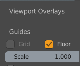
Don’t forget a value for defining the grid size/snapping increment. 
Wouldn’t it be a bit inconsistent? In the 3D Viewport for example you would find it here:

Instead they could add it next to the snapping icon from the node editor:

Yeas! I can build my own blender now  and I’m trying to wrap my head around it. For now, when I spot a static color in code I’ll reply on an issue with the filename and line number. Maybe we should start a new topic for how-tos and best practices in making Blender theme-able? Would you like to start one?
interface_widgets.c
- line 2216
immUniformColor3f(0.2f, 0.6f, 0.9f);/* text cursor */
node_draw.c
- line 911
float color[4] = {0.0f, 0.0f, 0.0f, 0.33f};/* shadow color */
Haha, yep! I just looked into that one yesterday.
Text Cursor
diff --git a/release/datafiles/userdef/userdef_default_theme.c b/release/datafiles/userdef/userdef_default_theme.c
index 80bed03debf..6375484787d 100644
--- a/release/datafiles/userdef/userdef_default_theme.c
+++ b/release/datafiles/userdef/userdef_default_theme.c
@@ -711,7 +711,7 @@ const bTheme U_theme_default = {
       .sub_back = RGBA(0x0000003e),
     },
     .shade2 = RGBA(0x5680c2e6),
-    .hilite = RGBA(0xff0000ff),
+    .hilite = RGBA(0x3399e6ff),
     .grid = RGBA(0x202020ff),
     .vertex_size = 3,
     .outline_width = 1,
diff --git a/source/blender/editors/interface/interface_widgets.c b/source/blender/editors/interface/interface_widgets.c
index 0ee2ed0f338..4d059ad4c90 100644
--- a/source/blender/editors/interface/interface_widgets.c
+++ b/source/blender/editors/interface/interface_widgets.c
@@ -28,6 +28,7 @@

 #include "DNA_brush_types.h"
 #include "DNA_screen_types.h"
+#include "DNA_space_types.h"
 #include "DNA_userdef_types.h"

 #include "BLI_math.h"
@@ -44,6 +45,7 @@

 #include "UI_interface.h"
 #include "UI_interface_icons.h"
+#include "UI_resources.h"

 #include "interface_intern.h"

@@ -2213,7 +2215,10 @@ static void widget_draw_text(const uiFontStyle *fstyle,
           immVertexFormat(), "pos", GPU_COMP_I32, 2, GPU_FETCH_INT_TO_FLOAT);
       immBindBuiltinProgram(GPU_SHADER_2D_UNIFORM_COLOR);

-      immUniformColor3f(0.2f, 0.6f, 0.9f);
+      /* Share color with text editor cursor color. */
+      float cursor_color[3];
+      UI_GetThemeColorType3fv(TH_HILITE, SPACE_TEXT, cursor_color);
+      immUniformColor3f(cursor_color[0], cursor_color[1], cursor_color[2]);

       tx = rect->xmin + t + 2;
       ty = rect->ymin + 2;
-
Cursorshould shareText Editor > Cursor[open] link
The default text cursor color in the text editor is red, and that doesn’t match with the rest of the interface. I’m not sure it needs to be red in the text editor though. It also might be controversial to share theme colors across space types. Maybe a global text cursor theme color would be better.
I started a local branch that will have a separate commit for each thing I make theme-able, that way each could be reviewed individually.
The colors seem pretty simple, except for finding the right names of the theme colors which can be confusing.
I’m looking into hooking up the N-panel roundness too, we’ll see about that.
I agree, User Interface > Text > Cursor would be better.
drawnode.c
-
line 3260…3270
/* maps standard socket integer type to a color /
static const float std_node_socket_colors[][4] = {
{0.63, 0.63, 0.63, 1.0}, / SOCK_FLOAT /USE TH_NODE_LAYOUT
{0.39, 0.39, 0.78, 1.0}, / SOCK_VECTOR /USE TH_NODE_VECTOR
{0.78, 0.78, 0.16, 1.0}, / SOCK_RGBA /USE TH_NODE_COLOR
{0.39, 0.78, 0.39, 1.0}, / SOCK_SHADER /USE TH_NODE_SHADER
{0.70, 0.65, 0.19, 1.0}, / SOCK_BOOLEAN /USE TH_NODE_LAYOUT
{0.0, 0.0, 0.0, 1.0}, /__SOCK_MESH (deprecated) /
{0.06, 0.52, 0.15, 1.0}, / SOCK_INT /USE TH_NODE_LAYOUT
{0.39, 0.39, 0.39, 1.0}, / SOCK_STRING */USE TH_NODE_LAYOUT
};
Nice, sound like a good plan!
And I could learn from your diffs. Can I see them somewhere?
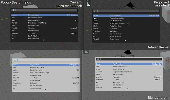
Ok, I found this one. It’s affecting more places. It looks like every place with a search in a pop-up. I think this change makes sense so I’m going to read up on how to commit code to Blender for review ![]()
diff --git a/source/blender/editors/interface/interface_widgets.c b/source/blender/editors/interface/interface_widgets.c
index 0ee2ed0f338..c8a2e7efc61 100644
--- a/source/blender/editors/interface/interface_widgets.c
+++ b/source/blender/editors/interface/interface_widgets.c
@@ -4639,7 +4639,7 @@ void ui_draw_but(const bContext *C, ARegion *ar, uiStyle *style, uiBut *but, rct
       case UI_BTYPE_SEARCH_MENU:
         wt = widget_type(UI_WTYPE_NAME);
         if (but->block->theme_style == UI_BLOCK_THEME_STYLE_POPUP) {
-          wt->wcol_theme = &btheme->tui.wcol_menu_back;
+          wt->wcol_theme = &btheme->tui.wcol_text;
         }
         break;
nice that you are starting to go a little deeper investigating the source code.
Currently what I find urgent is this , in some cases on my dark themes that I created,with dark mesh in edit mode, wireframe mode is also dark and not very transparent and is boring and makes the whole themes useless.
So if you have the ability to understand the code and make the change, it would be very useful to adjust it among the first.
Yeah, this is actually the first time I try to understand c and contribute to a project.
Adding new colours is way more complex than pointing to a color that already exists. I do think new colors are needed, pointing to existing colors is very limiting and most of the time not what you want.
So, I’ll continue learning while picking some low hanging fruits 
Actually I think beyond this, Blender theme options should have a picker to identify which element in the UI you want to customize.
But on topic: just yesterday I found Curves’ segments and normals display share color with the wire color of mesh wire. I don’t have a problem with that, but sometimes I have wished segments and normals had different color.
I can’t write code, my head messes up I try to do it …
but if I have to think about it, it should be an if else:
if we are in solid faces & edit mode, the color & alpha of the faces must be —> “This variable”
otherwise (else) if we are in wireframe & edit mode , the color & alpha of the faces must be —> “This other variable”
take a screenshot with a simplified and detailed description of the mess verifying if they are themable or not, where they are etc … and suggest a possible solution.
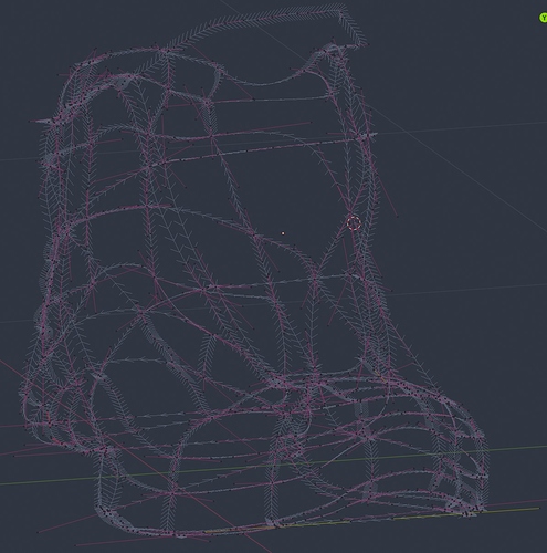
I am pretty sure they are not themed, because when you change the Wire Edit color in Themes/3D View, both curve’s segment and normal color change at the same time.
The solution, obviously is to separate the curve’s normal color from Wire Edit. Face, Vertex and Split normal have their own separate theme customizable colors, I am just saying curve’s normals should have their own color too to keep the coherence.
Here you go an example with curves normals size set to the minimum (1%).
Thank you friend, you made the problem clearer.
should be investigated if they are really un-themable
Confirmed. It’s un-theme-able.


