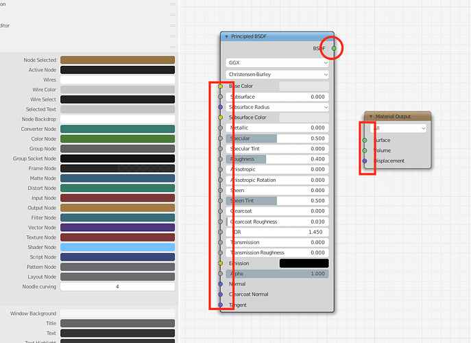
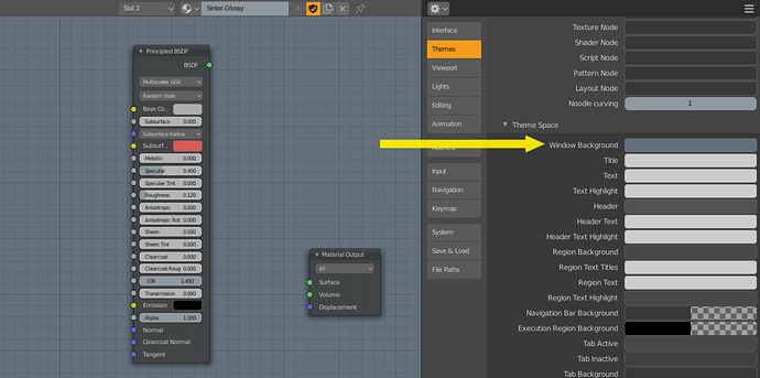
Thank you! I’ve added Editor Outline Width to the list.
Separate colors for Outline Selected and Wireframe, please. 
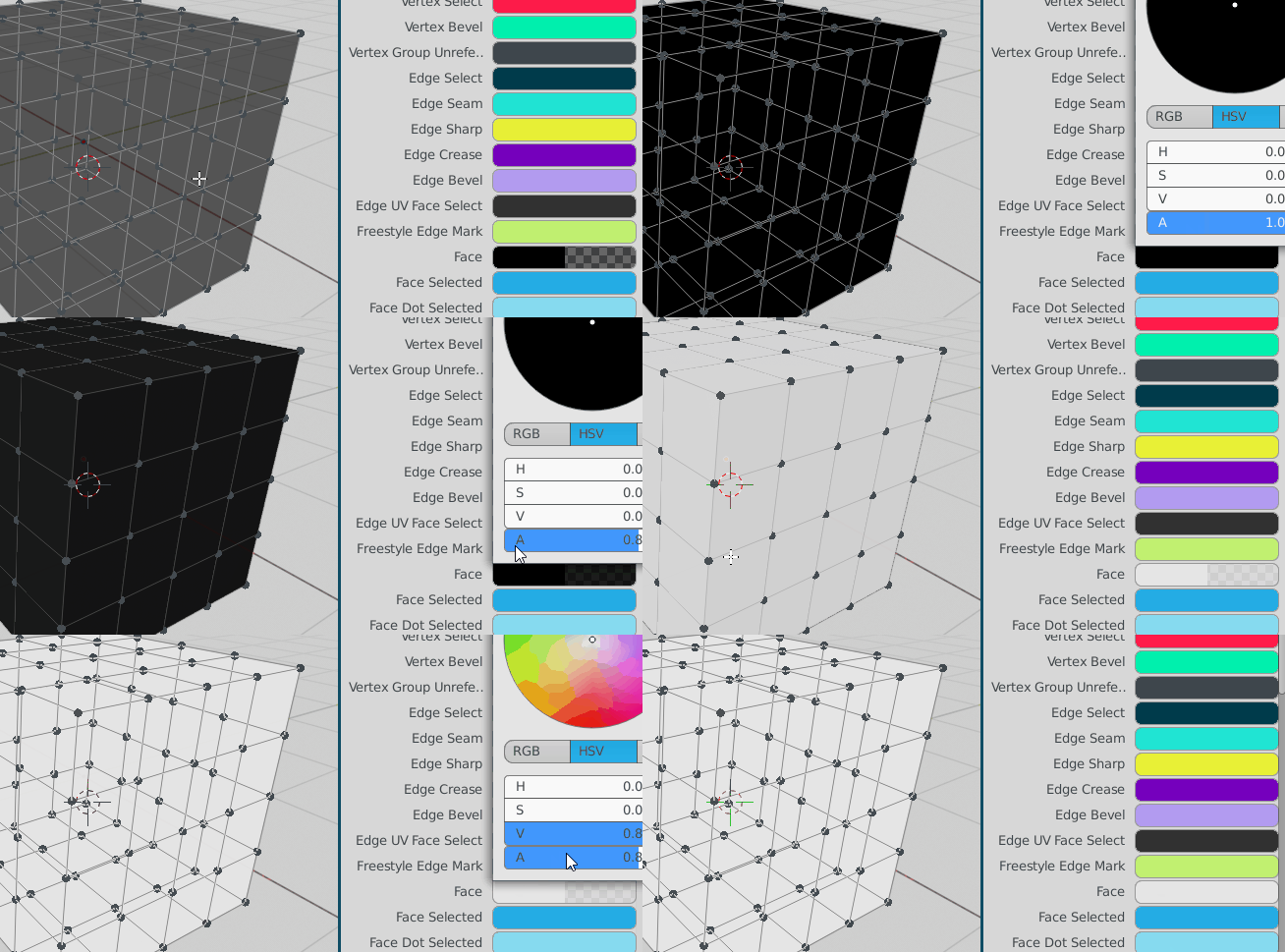
a problem that I find boring, is that I can’t create well selected faces colors (vertex and edge mode) with custom faces added colors, the alpha ignores the custom color of the faces … and so instead of creating “highlighted” colors it creates dark colors because the color of background is the gray color of object mode …
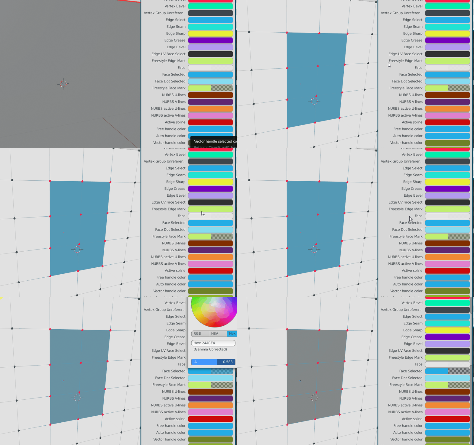
Holy crap. Yes please, that’s annoying as hell. I ithink I already requested that somewhere tho. ![]()
Another thing that is boring, and it would be useful to have separated, is to have the color overlay and the opacity of the faces in solid mode and wireframe mode combined.
Currently I can’t create faces that are too dark or too light because I have the problem of having the same results in wirefame mode (for modeling of course) …
Solid mode and wireframe mode, are two separate modes, and therefore should be themable with colors and opacities independent of each other.
I was talking about nodes, not links
A theme setting to adjust the roundness of those tabs.
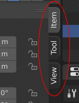
Is there one already? I can’t find it.
I can’t find it either, I’ll put it on the list. I think it makes sense to share the same settings as User Interface > Tab > Roundness
Could you please share a screenshot of the issue? Currently, we have:
User Interface > 3D View > Wire
User Interface > 3D View > Wire Edit
User Interface > 3D View > Active Object (outline?)
User Interface > 3D View > Object Selected (outline?)
[Object Mode]
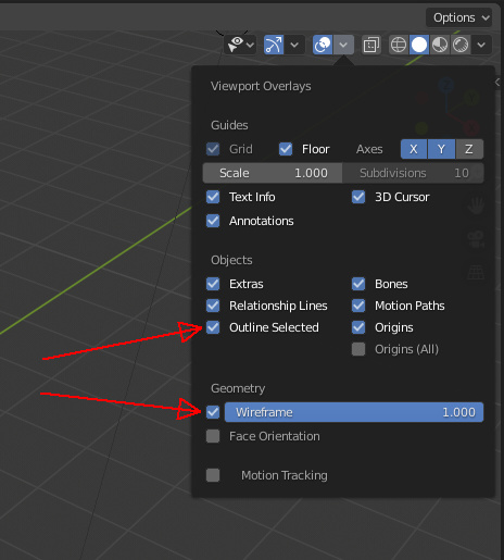
In the overlays we have those options “outline selected” and “wireframe”.
They are both linked to “3D View > Active Object” color
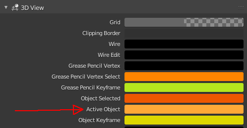
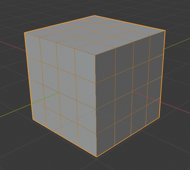
When you enable both of them, you get this:
Which is undesirable. People might be used to this in blender, but it’s not great.
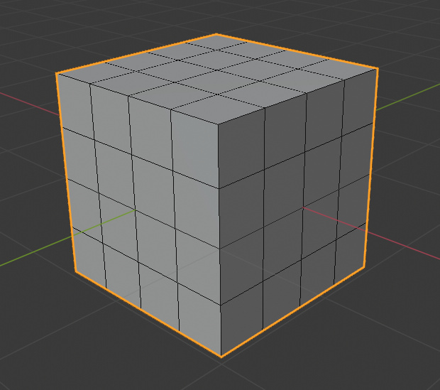
So, ideally, the “wireframe” overlay should have it’s own separate color property, for more freedom (set to black by default)
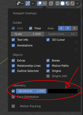
Or it should at least be linked to “3D View > Wire” color. (In fact, it is actually linked to it, but in a buggy way. Somehow the"wire" color is affected by the “active object” color. There’s some weird mixing happening there. Maybe this is the thing that needs to be fixed)

So, with any of the above done or fixed, we would have the more pleasant and expected result, which is this:
nice investigation dude
Thank you for explaining this ThinkingPolygons! And I think you are right that the Active Object or Object Selected should not affect the Wireframe viewport overlay color. It sounds like a straightforward solution to me. 
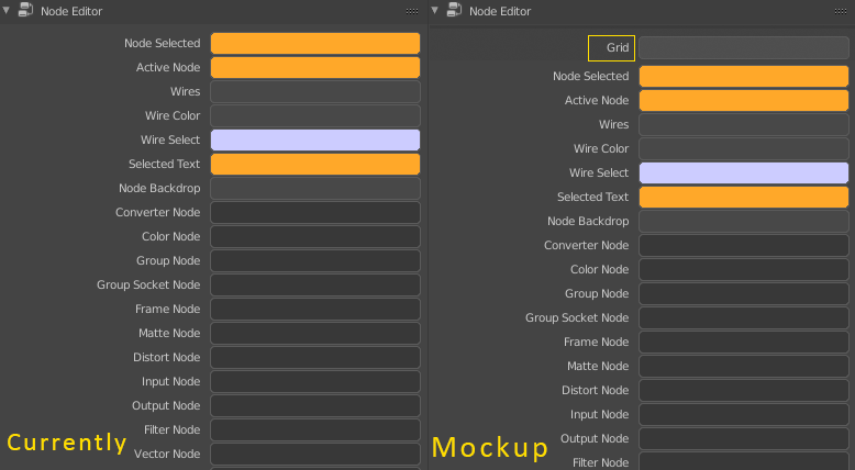
There is no option to adjust the color only of the grid in the node editor.
More detail would be helpful. A screenshot, and which existing theme color you think it should follow?
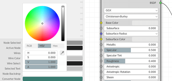
Unable to theme the sockets of nodes.
Please use map the sockets to the corresponding node colors:
Color socket to Node Editor > Color Node
Vector socket to Node Editor > Vector Node
Shader socket to Node Editor > Shader node
I don’t know yet what will be the best color to use for the Number socket since there is really no such node. I’m thinking the Node Editor > Wires color makes the most sense if we don’t want to add an extra option in the Theme Editor. Any thoughts?
And does anyone know what the Node Editor > Selected Text controls?
Unable to control the shadows of nodes.
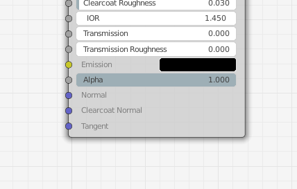
If no new settings are possible please use User Interface > Styles > Menu Shadow Strength & User Interface > Styles > Menu Shadow Width to at least have consistent shadows in the theme.
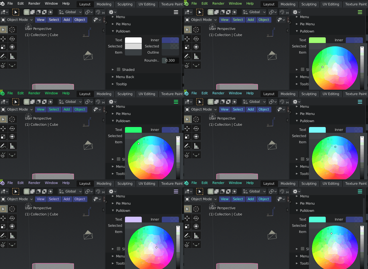
the text color of the top bar menus should be separated from the text color of the 3d view menus (and perhaps other areas)
it is currently an unique color and is found in
themes > user interface > puldown > Text
Currently the Background of the Node Editor is stored here:
You can’t change the color of the grid itself instead i think it is half transparent and changes with the window background underneath.
The Solution would be to add like in the 3D View section of the Theme Editor the ability to change the Grid separately:
