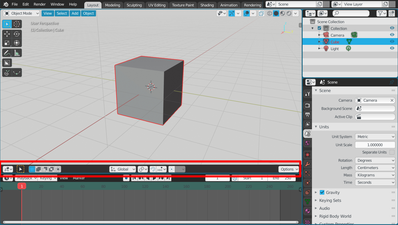
@JeroenBakker we are looking at your new patch on retopology overlay and we think it may be the right time to fix some parts of teming badly handled with face coloring in edit mode, and wireframe mode., take a look at the posts just above. here and here
1 Like
All fuchsia color attributes are useless and should not be displayed.
Outliner is an extreme case, but it is not the only editor with attributes that are not used for now.
I think someone should do a bit of cleaning and generalize common attributes among Editors, and optionally customize them.
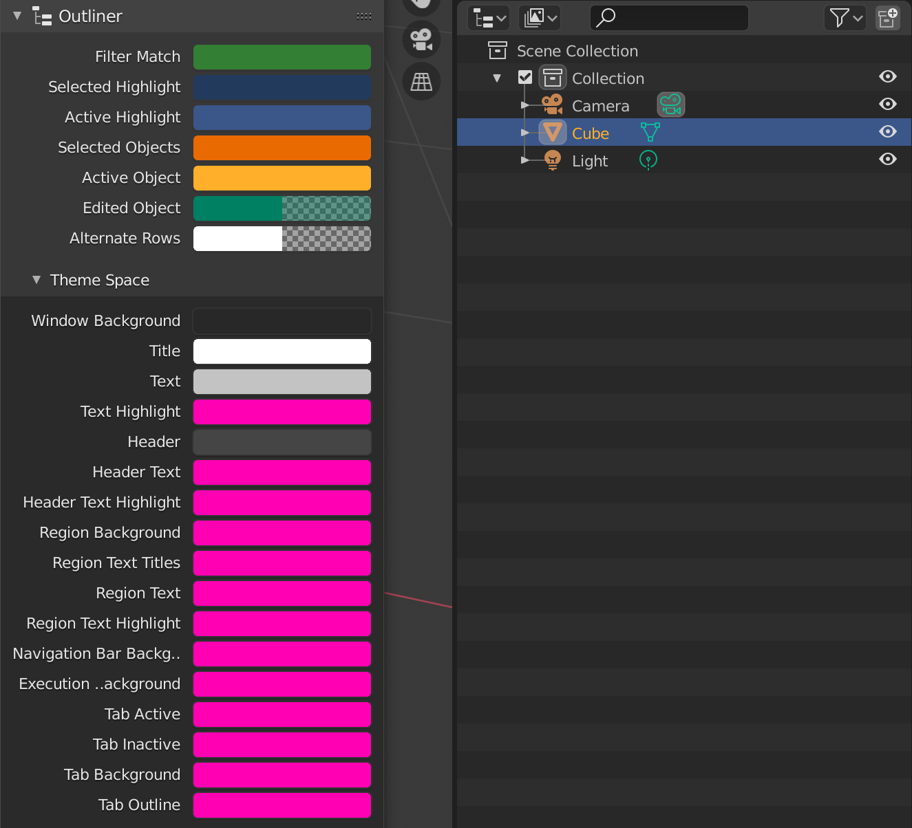
all areas have this theme space, but not all use it. they are dead zones, colors that are not linked to anything … it is a bit messed up at the level of user theming, but it does not create real problems. Certainly I consider it a low priority, if someone really wants to have fun cleaning.
My patch is not related to this topic. The retopology overlay color is an option that can be set per scene (tool option) as it is not useful as a theme option. But you’re looking at a 50% finished patch, so don’t make any assumptions. It clearly states that it is a prototype.
Papercuts are easy tasks for (new) developers to pick up. I am not up to speed with what has been approved and it is not clear by this thread also. It currently seems that there are more a collection of feature requests without a clear vision or design.
Thanks for the reply.
Only a clarification, these are not feature requests, they are small problems encountered during the creation of the themes.
They are a list of tiny problems, listed tasks to make life easier for some developers who want to solve them. They are not related to each other and can be solved separately from one another.
That problem of the colors of the faces in solid-edit mode, and of the opacity of the faces in wireframe mode which should be two separate and independent variables, seemed to us to be correlated with the prototype you are creating, that’s why I attracted your attention here, I apologize if I disturbed, I didn’t want to create noise.
and roundness of those elements
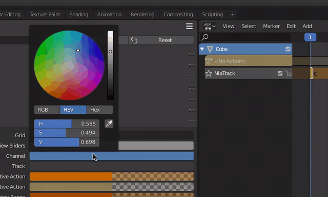
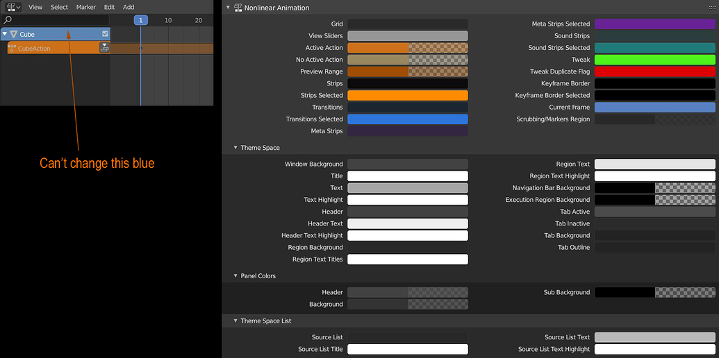
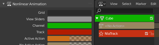
Yes, figured it out! I also found that the track got its color from the theme space header. Now with its own entry, I think it makes more sense. Let’s hope this makes it into the official Blender 
@ThinkingPolygons I think you also posted this request somewhere.
2 Likes
Nice! Did you fix it and submitted a patch?
Hi @Paul Are you already working on adding the roundness support where suggested? I’d like to give it a try
2 Likes
Hi a.monti, I’m not. So yeah, please do 
1 Like
Grazie Ale
your help is welcome
1 Like
Hi HooglyBoogly, Did you get the text-cursor and n-panel roundness to work?
I’m super excited! We got our first revision!
Theme: NLA Channel and Track
This revision is now accepted and ready to land.
3 Likes
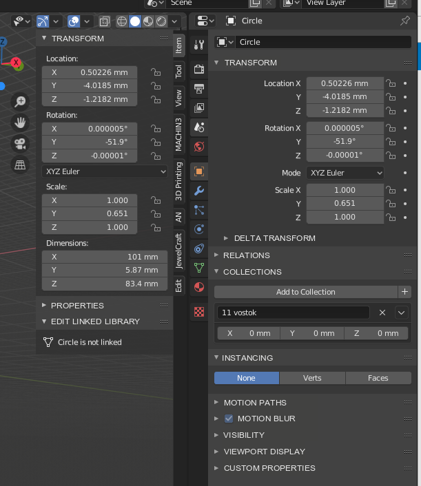
After a while looking it looks like the radius for the tabs is set on line 1933 in interface_panel.c:
const float tab_curve_radius = ((px * 3) * dpi_fac) * zoom;
This needs to be multiplied by the roundness value for the “tabs” widget theme. I haven’t figured out how to get a reference to that uiWidgetColors struct yet though.
For the text cursor color, I haven’t changed it since the diff I posted earlier. It probably makes sense to have a global text cursor color like we were talking about though.
2 Likes
Thanks, I did see that. 
I was also trying to change a bit the way they look, I’m not a big fan of that highlight on the border. I still need to refine the patch though.
2 Likes