Maybe the auto-offset feature could be changed so as to nudge the previous/next nodes in the direction they’re wired in, instead of just laterally. To that end it would take the vector between each node’s center of mass for example (or more precisely each node header’s center of mass, in order to compensate for the varying node heights), and use that as “offset direction”.
2 Likes
Yep. This is how I work. Hide everything I don’t need exposed on the node. Accessing them from the properties side-panel instead.
2 Likes
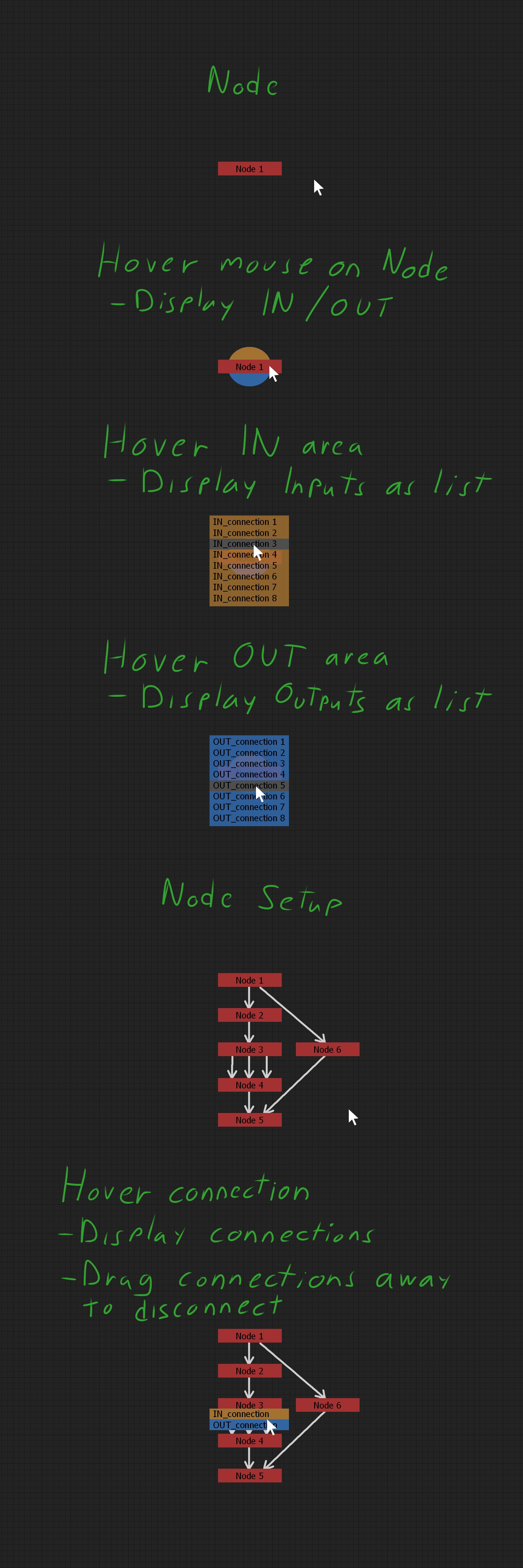
Adding here a sample image how I’d like the node graph to work for fast and comfortable use. Basic concept.
To connect nodes, user would pick OUT connection and hover on another node’s IN area to choose which input to connect. But would work also from IN to OUT.
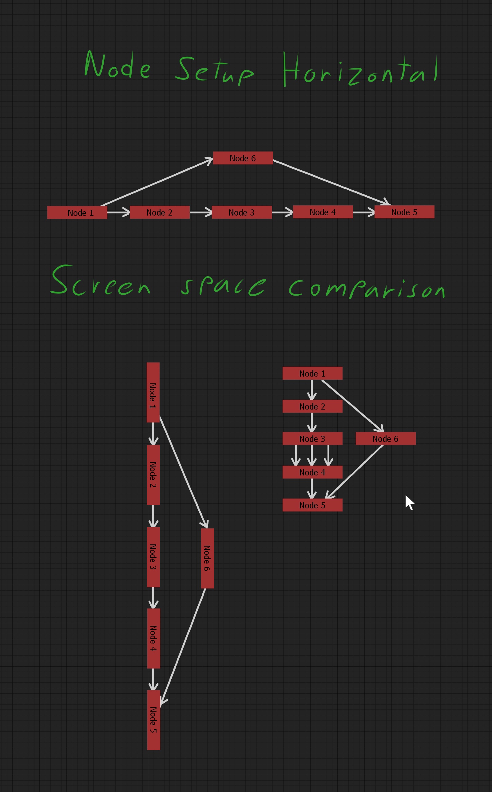
EDIT: I add here also comparison of Vertical and Horizontal node setups screen space requirement to see that Horizontal layout takes double the space. But if someone likes it, then can do that way.
I support our vertical brothers and sisters in this cause against the vertical oppression.
Fusion always touted vertical layout over horizontal (but both are possible and usable tho) under the guise of most people having widescreen monitors, and thus you could fit a larger working area horizontally.
Blender’s opensource brother in (dormant) arms; Natron is also following the vertical layout like Nuke, Houdini, Gaffer and Shake.
1 Like
What about slanted nodes?
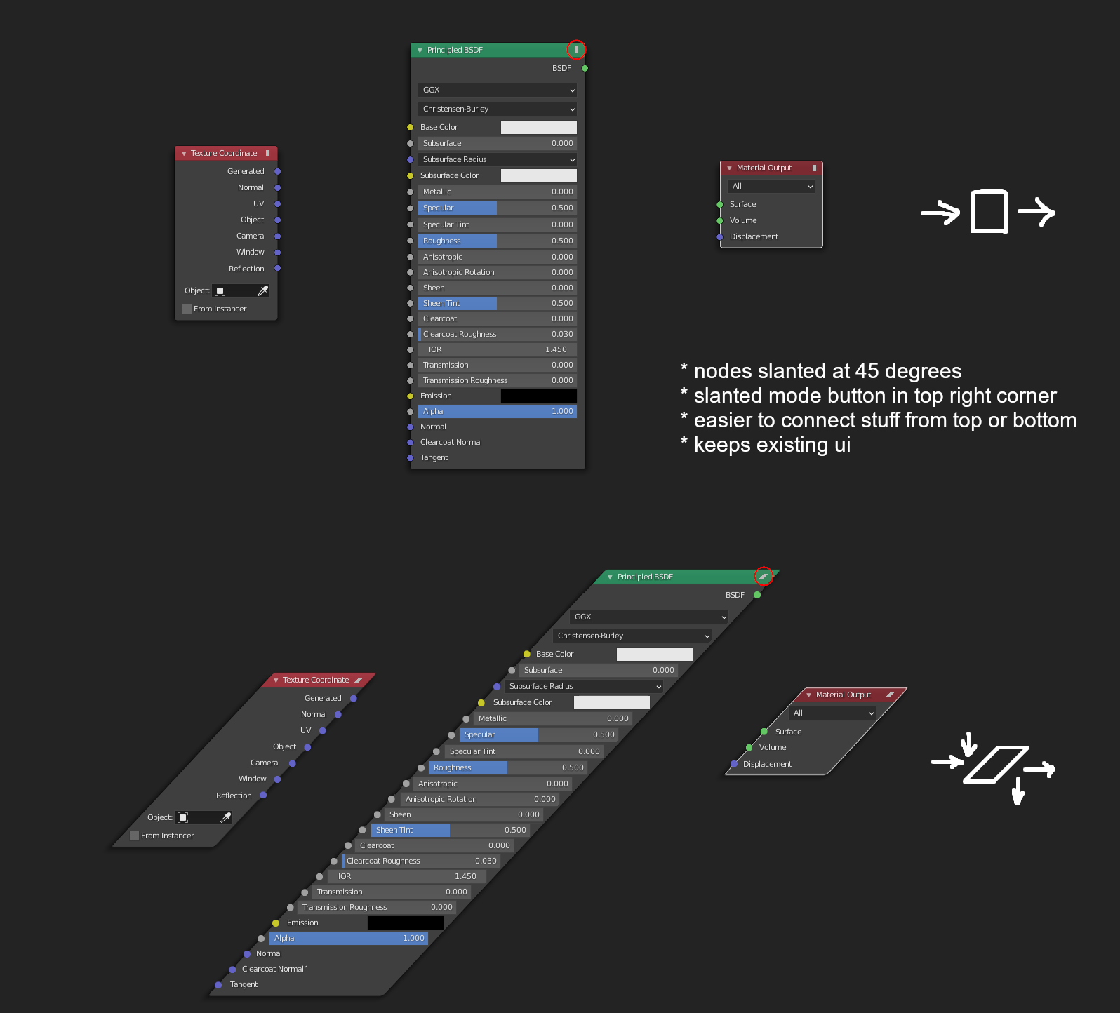
I remember someone suggested this idea before but can’t find thread so I made this mockup.
2 Likes
I think you’re referring to the Rhombus Nodes suggested by @3di ![]()
While the idea certainly is clever, I find it much harder to read and I feel like it’s not actually saving that much space overall.
3 Likes
I guess that wouldn’t hurt to have it as an option (it’s definitely more compact), but I feel I have to testify from experience (Maya) that I found this sytem to be mostly unusable, because you can’t see what’s connected to what unless you hover over the connection and it shows a pop-up telling you which attributes (properties) are connected together. This works for simple chains of deformers or shaders, but as soon as you begin wrangling those attributes and relationships become sorta complex, reading & debugging the tree becomes extremely diffiicult since this doesn’t show all the connections and doesn’t name them.
I think it would work with nodes like in Houdini, nodes that are somewhat higher-level than what seems to be getting developed in “Geometry Nodes” at the moment. In Houdini, as soon as you enter an attribute VOP SOP you’re presented with vertical nodes with all sockets exposed, same goes for SHOPs (shading networks), just like in Blender.
I don’t remember where I saw it, but there was an idea floated at one point of a ‘portal’ type input and output. Anything you plug into the input can be used anywhere else in the graph with the output, without any noodles in-between.
That could be a way of enabling people to work vertically without changing the current UI paradigm, because you could stack different sections on top of each other. It also would just be useful to not have to make super long connections way across the graph.
1 Like
It could take the form of being able to hide specific connections.
1 Like
As jonlampel mentioned long connections (usually in big setups), I’ll sidetrack slightly from the orientation topic, as improvement could be done with general user experience in node graph with small things. So, excuse me this time.
I mentioned in another post comparison to Nuke, but anyone can download Natron and see how user friendly it is to organise node setups. Regardless of the flow direction here are 3 individual features that would improve node graph. Seems quite unimportant things, but I assure that this kind of design decisions make Nuke/Natron pleasure to work with. I refer to Natron instead of Nuke and welcome everyone to test.
Dots - Blender: Need to use Alt -key to move a dot to another location (in Windows). Works if there are no connections, but if dot has connections, then the dot is disconnected and needs reconnecting (why is this?).
Dots - Natron: In Natron dot can be moved without a shortcut and connections are kept when moved. When having used this it makes wonder why Blender has shortcut at all to move.
Frames - Blender: Needs to use shortcut for moving nodes out of frame. The area to grab corner of frame for resizing is very small and needs unnecessary accuracy.
Frames - Natron: Nodes can be moved in and out of frame without shortcuts, very intuitive. Grabbing corner to resize is easy. (but I personally wonder why it has only one corner to resize?)
Notes - Blender: In Blender text notes can be added in node graph with frames by first creating new text in text editor and selecting that to be displayed inside frame, but it’s not as convenient as it should be. Also as a frame it “captures” nodes when accidentally node is moved over it.
Notes - Nuke: Natron don’t have, but Nuke has Stickynotes, which are really nice to label parts of node setups for own use and especially if complex setup has to be passed to someone else in production to take over. Easy and fast to drop notes in parts of node setup where are no frames that could include name/description. Stickynotes can be used as simple oneliner labels or make longer notes.
2 Likes
Looking over some of the notes in this discussion about the value of pin-labels and fields on nodes, it occurs to me that blender’s node system never really fully bought into a primary mode of data-entry for node properties.
The ideal seems to be that all properties for the object a node represents are displayed on the node along with controls to modify them. In practice there are some controls that you can only get at by using the n-panel properties (ie: frame-range and playback controls for video texture input).
I think the quick field access in the node graph is a great idea but, rather than showcasing the value of blender’s node design, cases like the PBR shader node with it’s guts hanging out sort of points to the fact that the node graph needs a more well thought out property editor that has a central place in the workflow.
Nuke/Natron both use a property sheet dock that you can use to collect controls for multiple nodes without cluttering the graph.
1 Like
Blender really ought to completely do away with it’s N-panel and as an entire Properties editor panel with a much more fleshed out UI. The 2.8 release got rid of the T-panel but mostly just migrated things to the N-panel. The continued existence of the N-panel is one of the remaining ugly, unpolished, unconventional parts left in the post-2.8 interface (the other being panel splitting/joining which is horribly unergonomic and needs a proper dockable panel system).
2 Likes
I like the N panel 
I like how, even when an editor view is maximized, it can be summoned or dismissed with a single keystroke. I just wish that we could commit to using it as the primary data-entry point, and could reliably find our ui fields for whatever we’re editing there. I sort of get the impression that the geometry nodes folks are putting some effort into better n-panel integration for nodes at least.
I also think that blender’s ghost gui toolkit has a really crafty flexibility that we really only see in other apps that do some deep stuff with qt. i do agree that the process of sizing, splitting and joining editor panes can be error prone and painful, but it seems like the sort of thing that is best resolved by making the ui better at detecting when the user is trying to perform those actions, and providing better feedback.
in either case, i don’t think i’m personally ready to throw the baby out with the bathwater.
1 Like
Honestly the sidebar is less cluttered than it used to be, and it seems to me like an ideal place to house node properties.
I’d recommend a read of this page https://docs.blender.org/manual/en/latest/interface/index.html which gives all the lingo for the UI (a panel is pretty strictly-defined, other interface elements being called differently).
Perhaps also this link:
https://wiki.blender.org/wiki/Human_Interface_Guidelines
not sure if this counts as a necropost, but has anyone looked at making the graph editor 3d? Surely there’s some open source 3D software somewhere that would allow graph nodes to be placed in space. Perhaps, some day, in the future, when we are more advanced, it would be possible for graph nodes to assume various shapes such as the Platonic solids!
Then it could be more compact, plus you’d have an excuse to buy a VR setup.
Naaaahhhh…
1 Like
it’s not more compact- just take a look at how some of the “code” looked in Doom’s SnapMap, which had a 3d node-based scripting system.
I think we should aim to have a better 2D graph editor before thinking about a 3D graph editor…
it certainly looks good. Some points:
- I was thinking exactly same but for: the folded/collapsed node, and in the opposite direction, i.e. the node header being left most…
- but yeah, that would force a bottom-top direction, not suitable…
- have you tried experimenting with reducing the slant angle?
- the 45\deg in your mockup seems way too much to the point of it being uncomfortable!
- while the mockup of
rhombus[rhomboid] node seems more pleasant (but the angle is not mentioned, so, can’t compare if that’s due to other factors like small size of the node etc.)
Other than that, if the slant still doesn’t work out then i think the slant/rhomboid will be a nice ad-hoc solution, and a better solution will be some way to have hybrid connections with normal rectangular nodes like in the screenshot quoted below. This would require thorough ideation from those who are familiar with the possibilities.
One more thing can be done in this sense, again inspired from that screenshot,
-
how about that the rhomboid node idea is tested for a “function” - that is, the custom node grouping with input/outputs, the input arguments come at top, the output goes at bottom, and the processing on a function is done horizontally…
-
other super-naive idea can be that the geometry flow nodes flow horizontally, and the field nodes flow vertically.
[screenshot of other software removed] see https://devtalk.blender.org/t/copyright-guidelines-for-devtalk/