Absolutely - there are many improvements to be made. Better auto-arrangement is one of them.
Unity’s blocks make sense for collecting things in a list - useful for our particle nodes.
Absolutely - there are many improvements to be made. Better auto-arrangement is one of them.
Unity’s blocks make sense for collecting things in a list - useful for our particle nodes.
I was not aware of that option and will certainly be using it in the future.
I think that some of my OP is being interpreted as a clamoring for being able to turn my graph vertically when, I really just mean to say that ideally, I could orient the flow of my graph in any direction I choose. Moving objects around during visual programming is a central part of the concept/flow loop for me. Blender’s left-to-right node pin-out creates an implicit-bias for graph layout. That’s not a crisis that needs immediate resolution (dramatic terms like ‘Tyranny’ notwithstanding) but, I don’t think that it’s something that should be accepted/defended because it’s already built that way.
Nuke doesn’t have floating panels for accessing node info in my experience. One of the rather nice things about it is that node parameter sheets are all docked into a stack on the right.
Unity has one of the sexiest graphs out there. Another personal favorite for me is Luna:
https://www.luna-lang.org/
I am joining this discussion, as there is more development towards node based workflows (geometry nodes, particle nodes, animation nodes) and also multiple addons which use node graphs.
Change towards vertical design is necessary, as in large node trees horizontal layout creates much longer setup than vertical and is less easy to work with. In example, if there is a small setup of 10 nodes arranged horizontally that makes it quite long already. But if 10 nodes are arranged vertically, those will take less space. To think the same with 50 or 100 nodes, then it makes big difference to work with.
Above Nuke screenshot is a good example of this, as it has nodes both ways which is needed in real situations. To get this benefit the design should also follow Nuke with nodes being just used to access their properties which are in separate panel and not to have properties inside nodes, which can make nodes very large if have many options. Small nodes without parameters allow larger overall view while working, as no need to zoom close to individual nodes to change parameters. Nodes itself don’t need to display inputs all time, but only when hovering cursor on top of node. Nodes could display possible output/input connections as a pop up on mouse hover.
This should be the standard way, but it is not limiting to vertical graphs, as users can also create horizontal if prefer. I am actually thinking that it could be possible to have current way and proposed way coexist by having a node editor option to choose either “compact” or “old” node graphs. Just to change which visual style to use. Compact to be described Nuke style and old just like Blender has now, so nodes are bigger and also display parameters and inputs.
Also everyone who has used Nuke knows that its node graph superiority is largely because of how convenient it is to work with. Everything is really easy to select and connect. Blender and some other software have very small selectable areas and connection dots. Blender works quite well even zoomed out, but output/input dots could “pop out” more clear when hovering mouse on top. Also framing nodes and reroute dots works much better in Nuke. To move nodes out of frame in Blender, user needs to use a shortcut to disconnect node from frame. In Nuke user can just move nodes out or inside frame. Also reroute dots in Blender are fixed in place, while in Nuke dots can be just dragged to new place as those are directly moveable. Dots have also much larger selectable area in Nuke. Nuke also does good job of aligning nodes automatically when close enough horizontally or vertically to other nodes to create clean understandable setups. Nuke’s node graph might look more ugly but it is very user friendly.
Lot of comparison to Nuke, but it has the best node graph there is. Houdini uses 2 types of node graphs. Nuke style in general, but shaders are similar to Blender’s. So combination of 2 styles is also possible.
I disagree. Take UE4 for example- the average gameplay blueprint is easily over 100 nodes, and with a competent developer (not a spaghetti artist) it is quite easy to follow. I’m not saying that vertical layouts are bad, but your main point that a vertical design is the only possible way to handle extremely complex node networks is just… well… wrong.
Sure. Maybe that part of the text is indicating quite strongly that I would like to have only vertical possibility. Actually I think it is necessary to have the option for it, which is difficult with current node graph. The mention in this thread’s first post of Nuke not having an in and out sides of nodes is relevant for this. And also I would like to have overall improved node graph with small improvements of handling nodes, frames and dots. Maybe this thread title (not mine) with quoted part of my text made it sound bit harsh.
As an example I have a Blender material setup with more than my mentioned 100 nodes and I can’t zoom out enough to see it in full, as for some reason Blender’s node graph zoom is restricted to some maximum amount. This is just an example affecting big setups in general. If my node setup would be with smaller nodes, I could fit the setup in one view by keeping very neat. Better in vertical for my liking, but also in horizontal. 
Though, I guess when I mentioned the problem with restricted maximum zoom out, someone will educate me and tell how to have infinite zoom in Blender.
I work in blueprint.
Massive horizontal graphs are just as much of a pain there as they are elsewhere. Usually we wind up managing them by breaking them up into functions, macros or custom event chains. In some ways maybe this actually encourages you to more aggressively modularize your code, but to @SakuP’s point, it just nice to be able to arrange things how they’re laid out in your head instead of being forced to lay it out left to right.
I was actually looking at some of the ui workshop notes on the nodes, and it seems like there is some notion of doing vertical linkages for certain types of relationships between node objects. This would be kind of like TouchDesigner, where data links are laid out horizontally, while hierarchical relationships are wired vertically.
I feel like the freedom of arrangement is definitely a value-add to systems like nuke and Houdini, but I don’t actually like how either of these systems have chosen to depict the ‘in’ and ‘out’ pins on nodes. So I see it as a UI-design conundrum. I would love to see what @billrey and other UI folks working on blender might come up with if the layout of node-graphs wasn’t considered a given.
As far as cribbing ideas from other apps goes I wouldn’t even say it’s my highest priority.
When I’m working in blender node trees, the two most common features I sometimes try to activate by muscle memory are ‘wiggle-out’ (Houdini) and ‘drag off pin for autocomplete’ (UE).
I think the main reason why graphs are horizontal, it is because it allows for all pins have their names right next to them. I agree that horizontal graphs are way too long, but imagine some node like principled pbr shader, with its input pins stacked on the top of the node, without labels next to them. I’ll lose my sanity as soon as I look at it.
And, the next thing, a lot of nodes are vertically bigger, than horizontally, they are tall and not wide, which means stacking them vertically won’t help and make things even worse.
In my opinion, nodes should get smarter and smaller.
You can hide unconnected pins (ctrl+h). What about node properties that don’t have pins? should they be displyed in the node graph, or should they be visible just on the sidebar, when the node is selected? The interesting thing, it is already present in blender node editor. It just needs some good defaults and “automagic”.
The bulkiness of nodes for me seems to be more fundamental. We kind of gave up abstraction for the sake of clarity, and went back from writing code line by line, to designing hardware-like printed circuit board layouts, but with nodes. And planning nodes layout can be a huge overhead.
As of now the design of graphs is 100% WYSIWYG, meaning that the entire graph is exactly what it looks like and all of the node properties are editable. Strong coupling between node looks and how the graph works.
The trap here is that as the node gets bigger every time, you would have to find ways to manage space more efficiently. Such as for example with grouping, or frames, these are some handy ways to pack things. You end up making the information more compact and concise so things are easier to understand from a high level view.
In the picture, this setup is known to experienced users and immediately understood. Is a total high level approach with only about collapse+hiding. However at some point if you try to remember what you did there, or read a graph someone else made. You would end up expanding everything and restructuring so is understood.
Since it takes too many steps to do so, no one end up compacting the nodes so much, they just get it as it is and resolve to lots of scrolling. Or perhaps split the viewport many times so you examine different parts of the graph each time.
So a new way will have to be utilized to make things work in both views. There should be a Default view as it is and Compact view which makes the summary. In some sense the Compact view will have lots of potential to be aligned either vertically or horizontally, according to what each user prefers.
Maybe the auto-offset feature could be changed so as to nudge the previous/next nodes in the direction they’re wired in, instead of just laterally. To that end it would take the vector between each node’s center of mass for example (or more precisely each node header’s center of mass, in order to compensate for the varying node heights), and use that as “offset direction”.
Yep. This is how I work. Hide everything I don’t need exposed on the node. Accessing them from the properties side-panel instead.
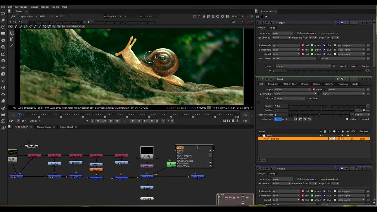
Adding here a sample image how I’d like the node graph to work for fast and comfortable use. Basic concept.
To connect nodes, user would pick OUT connection and hover on another node’s IN area to choose which input to connect. But would work also from IN to OUT.
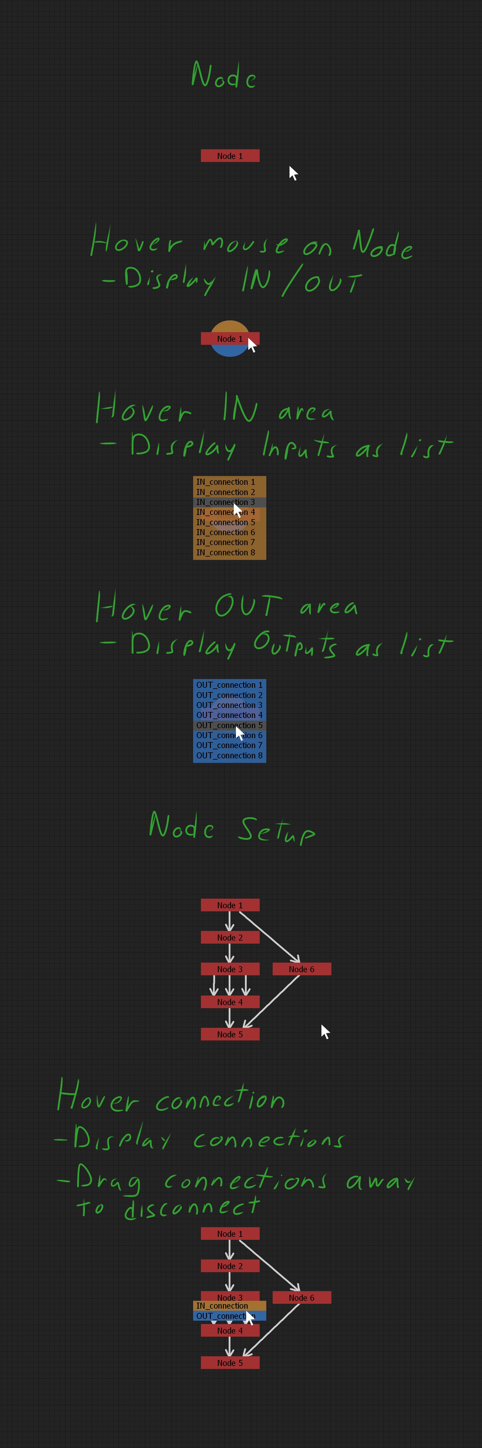
EDIT: I add here also comparison of Vertical and Horizontal node setups screen space requirement to see that Horizontal layout takes double the space. But if someone likes it, then can do that way.
I support our vertical brothers and sisters in this cause against the vertical oppression.
Fusion always touted vertical layout over horizontal (but both are possible and usable tho) under the guise of most people having widescreen monitors, and thus you could fit a larger working area horizontally.
Blender’s opensource brother in (dormant) arms; Natron is also following the vertical layout like Nuke, Houdini, Gaffer and Shake.
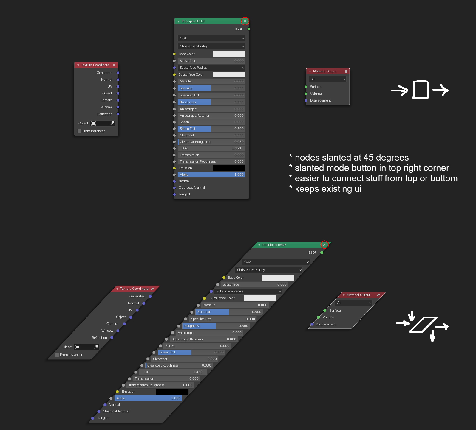
What about slanted nodes?
I remember someone suggested this idea before but can’t find thread so I made this mockup.
I think you’re referring to the Rhombus Nodes suggested by @3di 
While the idea certainly is clever, I find it much harder to read and I feel like it’s not actually saving that much space overall.
I guess that wouldn’t hurt to have it as an option (it’s definitely more compact), but I feel I have to testify from experience (Maya) that I found this sytem to be mostly unusable, because you can’t see what’s connected to what unless you hover over the connection and it shows a pop-up telling you which attributes (properties) are connected together. This works for simple chains of deformers or shaders, but as soon as you begin wrangling those attributes and relationships become sorta complex, reading & debugging the tree becomes extremely diffiicult since this doesn’t show all the connections and doesn’t name them.
I think it would work with nodes like in Houdini, nodes that are somewhat higher-level than what seems to be getting developed in “Geometry Nodes” at the moment. In Houdini, as soon as you enter an attribute VOP SOP you’re presented with vertical nodes with all sockets exposed, same goes for SHOPs (shading networks), just like in Blender.
I don’t remember where I saw it, but there was an idea floated at one point of a ‘portal’ type input and output. Anything you plug into the input can be used anywhere else in the graph with the output, without any noodles in-between.
That could be a way of enabling people to work vertically without changing the current UI paradigm, because you could stack different sections on top of each other. It also would just be useful to not have to make super long connections way across the graph.
It could take the form of being able to hide specific connections.
As jonlampel mentioned long connections (usually in big setups), I’ll sidetrack slightly from the orientation topic, as improvement could be done with general user experience in node graph with small things. So, excuse me this time.
I mentioned in another post comparison to Nuke, but anyone can download Natron and see how user friendly it is to organise node setups. Regardless of the flow direction here are 3 individual features that would improve node graph. Seems quite unimportant things, but I assure that this kind of design decisions make Nuke/Natron pleasure to work with. I refer to Natron instead of Nuke and welcome everyone to test.
Dots - Blender: Need to use Alt -key to move a dot to another location (in Windows). Works if there are no connections, but if dot has connections, then the dot is disconnected and needs reconnecting (why is this?).
Dots - Natron: In Natron dot can be moved without a shortcut and connections are kept when moved. When having used this it makes wonder why Blender has shortcut at all to move.
Frames - Blender: Needs to use shortcut for moving nodes out of frame. The area to grab corner of frame for resizing is very small and needs unnecessary accuracy.
Frames - Natron: Nodes can be moved in and out of frame without shortcuts, very intuitive. Grabbing corner to resize is easy. (but I personally wonder why it has only one corner to resize?)
Notes - Blender: In Blender text notes can be added in node graph with frames by first creating new text in text editor and selecting that to be displayed inside frame, but it’s not as convenient as it should be. Also as a frame it “captures” nodes when accidentally node is moved over it.
Notes - Nuke: Natron don’t have, but Nuke has Stickynotes, which are really nice to label parts of node setups for own use and especially if complex setup has to be passed to someone else in production to take over. Easy and fast to drop notes in parts of node setup where are no frames that could include name/description. Stickynotes can be used as simple oneliner labels or make longer notes.
Looking over some of the notes in this discussion about the value of pin-labels and fields on nodes, it occurs to me that blender’s node system never really fully bought into a primary mode of data-entry for node properties.
The ideal seems to be that all properties for the object a node represents are displayed on the node along with controls to modify them. In practice there are some controls that you can only get at by using the n-panel properties (ie: frame-range and playback controls for video texture input).
I think the quick field access in the node graph is a great idea but, rather than showcasing the value of blender’s node design, cases like the PBR shader node with it’s guts hanging out sort of points to the fact that the node graph needs a more well thought out property editor that has a central place in the workflow.
Nuke/Natron both use a property sheet dock that you can use to collect controls for multiple nodes without cluttering the graph.
Blender really ought to completely do away with it’s N-panel and as an entire Properties editor panel with a much more fleshed out UI. The 2.8 release got rid of the T-panel but mostly just migrated things to the N-panel. The continued existence of the N-panel is one of the remaining ugly, unpolished, unconventional parts left in the post-2.8 interface (the other being panel splitting/joining which is horribly unergonomic and needs a proper dockable panel system).