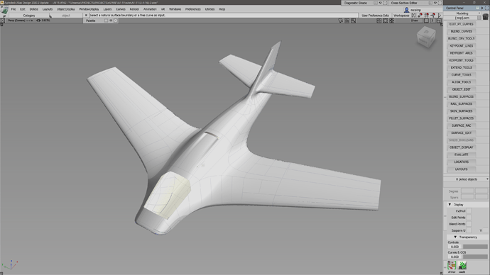
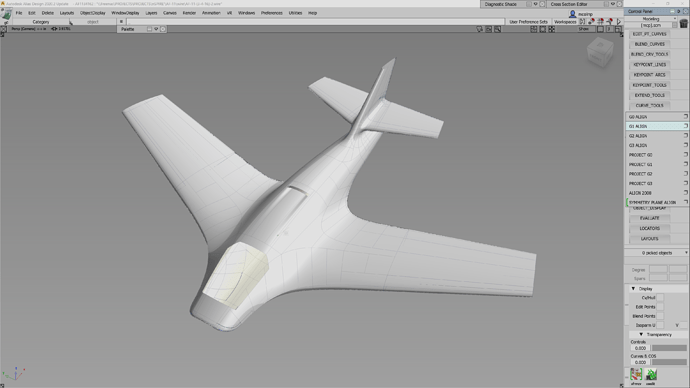
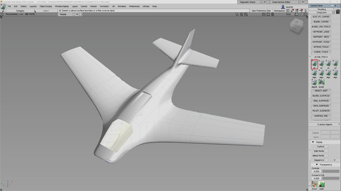
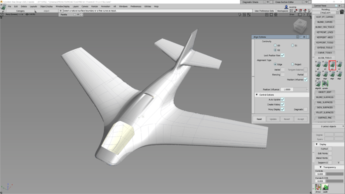
So these are the promised screenshots of Horizontal Tabs. (They are from Autodesk Alias; and they are referred to as ‘shelves’ both in Alias and Maya.) I’m really not trying to impose any of the exact UI elements as suggestions for blender; but the way that his setup gives the user flexibility to setup groups of tools to their own liking & logic; is pretty stellar.
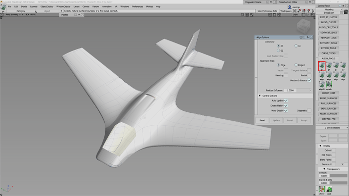
So the ‘shelves’ are sort of little groups of tools that the user can put together. This is done by dragging a tool from the toolbar into a ‘shelf’. The user can setup the desired options for that tool by double-clicking on it and using the options tab; much like the new interactive tool windows we’ve recently seen added into blender for many of the tools. The neat thing is that I can make several preset versions of the same tool; with distinctly different presets, and name them however I decide is appropriate.
In the screenshots; you will see I chose the ‘Align’ tool as a good example of this. In NURBS modeling, you can align to several different degrees of alignment: G0 = Positional, (Think and edge of a cube where two surfaces meet to a sharp edge), G1 = Tangent (The typical Parametric CAD type blend that usually leaves much to be desired in its highlights, G2 = Curvature (good transitional flow): ther are also even G3 & G4 as well; but that’s not really needed for this discussion. The point is; I may already know which of those options is will create the desired result, before i even choose the tool. These multiple version of the same tool speed-up the workflow more than you could imagine.
So if we are going to talk about completely changing the entire fundamentals of Add-ons and their use of tabs; I would suggest that we consider something like this. Where users have the freedom to create toolsets that could include add-ons, as well as native tools; with retained presets of tool options.
You can see in the screenshots as well; that when I right-click over the ‘Shelves’, it reveals a menu of all the preset tools in that specific shelf that my mouse is currently over. The little square box is a place to click and open the option dialog for that tool; same as I described as a result of ‘double-clicking’ the tool icon. It just makes it so you don’t have to open the shelf to do that.
How that sub-menu pops up could vary; and could be integrated to adhere to the standards already developed by the updated blender UI guidelines. The general functionality and freedom it gives the user is what I am focusing on here.
