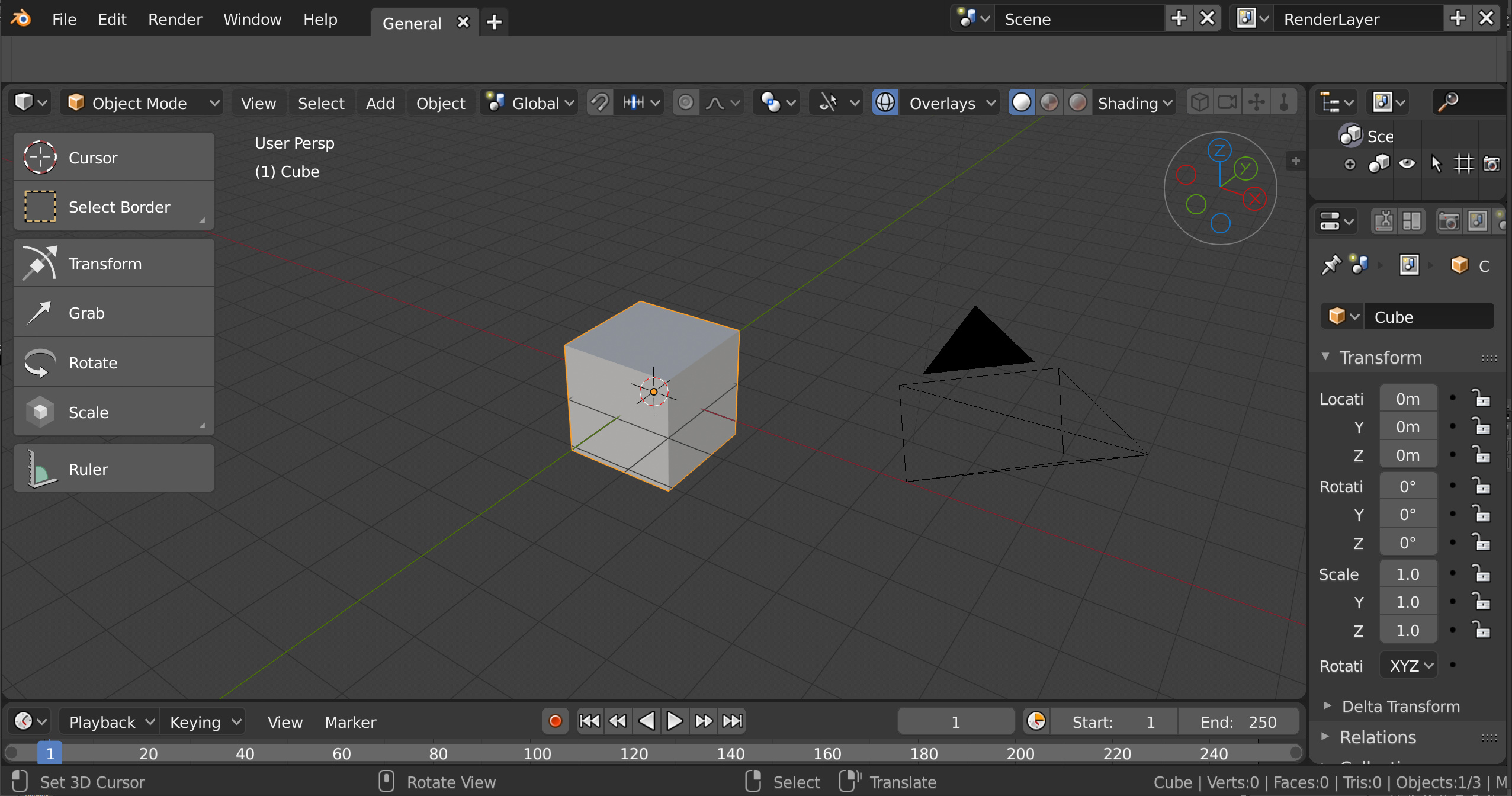
Hey guys, I was thinking of ways to enhance the viewport’s Axis Interactive Navigation design,
and here is what i came up with:
Animated GIF for comparison with current design
…
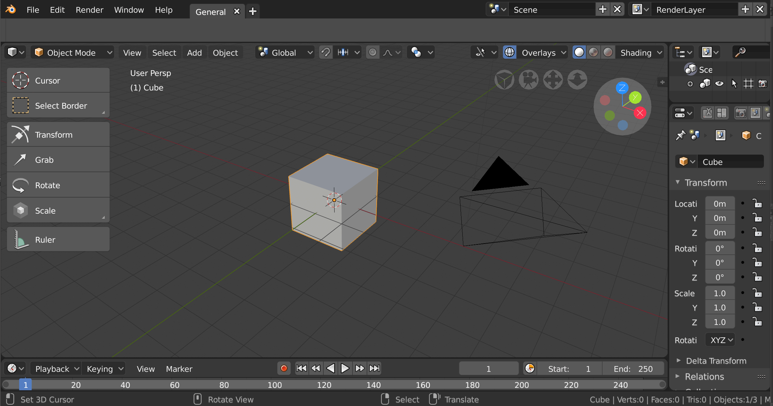
Hey guys, I was thinking of ways to enhance the viewport’s Axis Interactive Navigation design,
and here is what i came up with:
Animated GIF for comparison with current design
…
It’s a great idea to improve readability but:
I don’t think moving the buttons to the top is a good idea (makes it feel compressed).
If you look at the navigator and compare it with the other stuff in the 3D view, you’ll notice that with it’s thin lines its more comparable to a lamp or wireframe-object (could cause confusion).
Maybe leave the gray circle filled and try moving it to the bottom right corner
here’s an example from the software onshape
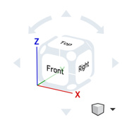
Hope that helps.