What Harley is trying to say is the symbols for windows are:
[Ctrl] [Shift] [Alt]
The text.
What Harley is trying to say is the symbols for windows are:
[Ctrl] [Shift] [Alt]
The text.
in fact stylized icons could be created with these three microscopic texts inside … so that they become icons, but at the same time they are identifiable
mac symbols could also be used. just as long as it contains the text, hybrids are easily recognizable by everyone at the end …
@jendrzych what’s your opinion?
Of course now William will chime in to say “but symbols are shorter”, and the cycle will continue. LOL
I agree with @Harleya that this is the wrong indicator, it took me a long time to stop paying attention to it. Yes, in some cases, the “three dots” cut off one letter more than “two dots” but is it important?
Moreover, there are cases when the last words are more important and should be left intact, which means there should be a more elaborate mechanism for shortening words, for example with some predefined abbreviations.
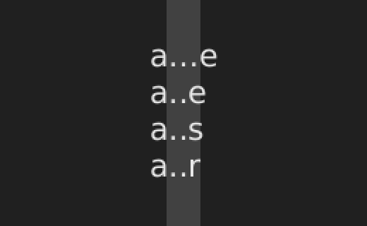
A simple example: “Delta Location X” becomes “Delta Location‥”,
although there may be “Delta Loc. X” since here X is important.
Obviously it would be nicer if ‘Delta Location X’ was shortened to ‘Delta Loc. X’ when the text is truncated. When it is even shorter it could go to ‘D. L. X’
Currently, the system isn’t smart enough to do that, as ‘Delta Location X’ is just a single string.
We could change .. to ...but just be aware that it has the downside of eating more of the text then.
A smarter, automatic smart way to do text truncation would be a nice thing to have.
One approach is to automatically turn each word into a single letter + a period until there is enough space.
‘Trace Precision’ would then become ‘T. Precision’. Even shorter would be ‘T. P.’
‘Jitter Threshold’ becomes ‘J. Threshold’, then ‘J. T.’
In your first example of shortening you removed letters from the second of three words, while in later examples you shorted by removing from the end first. Sometimes the earliest words are more important, sometimes the middle, sometimes the end, or in odd combinations.
And sometimes that order depends on the language used. Some languages are subject-prominent, versus topic-prominent, some use Subject-verb-object order, while others can be SOV, VSO, VOS, etc.
That story was used only to illustrate the folly of favoring a secondary characteristic, like length, over selecting the correct word or symbol.
And of course we’re not literally talking about the usage of either .. or ... as you quoted, but using the single character … instead of ‥ which, as you can see here can sometimes be the same width, depending on font used and kerning. This very paragraph text is using only one font but if you measure the white box used for those two characters it is possible that that the 2-dot leader is the same or longer than ellipsis. Again, depends on font and kerning.
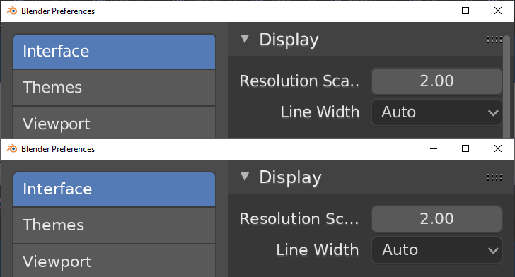
This is default Blender font, in the worst case, the difference is one letter:
In fact, in most cases here a one-word strings or the last word is less important, and the “smart text truncation” are not required. In some important cases, the additional shorter version of the strings can be specified manually. That is, store an array of strings, it will give the best result.
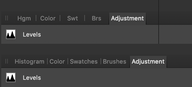
I have an example of a similar thing from another program:
In practice, the added width of that extra dot, even with the bad (wide) kerning in Blender, is only the width of a lowercase “i”…
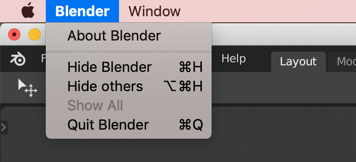
I really disagree that these symbols are better than ALT, CTRL, SHIFT. Whenever I happen to use a mac keyboard, i’m always confusing CTRL and CMD. Also that ALT symbol is completely unfamiliar to me.
For example, this page would be much more confusing to most people if symbols were used to denote the modifier keys:
https://support.mozilla.org/en-US/kb/keyboard-shortcuts-perform-firefox-tasks-quickly
It’s just because you’re not a Mac user. On Mac, the primary modifier is Cmd, and Control is very rarely used. (it’s just Blender is using the wrong modifier)
Mac users also see these symbols in the menu all the time.
Yes, on other platforms we should use text Shift, Ctrl, Alt.
If we talk about the fact that the symbol takes up less space, I do not see a big problem here. The menus in general looks good. The status bar can be improved without the use of symbols, I have already suggested one possible approach.
I have got to agree with most stuff @Harleya says.
Ideally, the use and display of keys would look like this:
| Key | Linux | Windows | Mac |
|---|---|---|---|
| Control | [Ctrl] | [Ctrl] | ^ |
| Alt / Option | [Alt] | [Alt] | ⌥ |
| Super | ❖ | ❖ | ⌘ |
| Shift | ⇧ | ⇧ | ⇧ |
[Ctrl] and [Alt] would be custom drawn icons using text (because nobody recognises the respective icons).
On a Mac, the use of ⌘ should mostly be switched with [Ctrl] because like @jenkm states correctly:
Yes, I think that’s a good plan that makes sense for the various platforms. I’ll add it to the paper-cuts task shortly.