True, B/W is okay. Unsure if the proportion change between logo and font is supported as well, but for this splash screen to work it is visually needed anyways, so go for it.
Speaking about splash screens. Any news about the console showing up when starting blender?
Are you guys still accepting submissions?
Since I’m here already, here’s mine:
Eevee + Grease Pencil.
1 Like
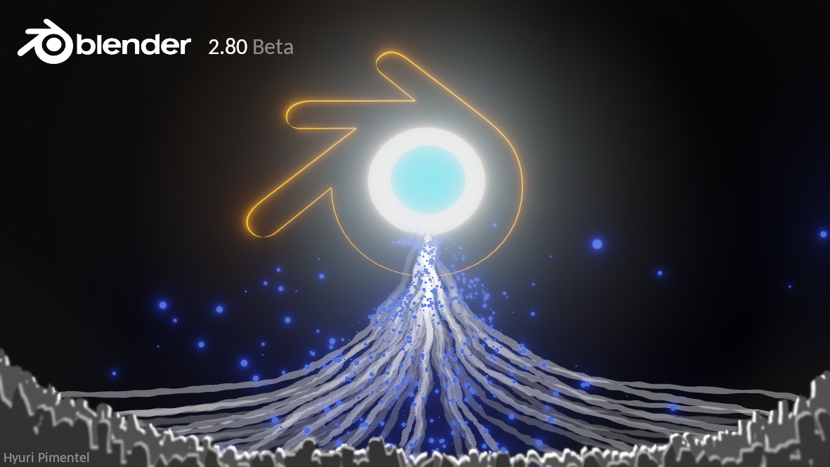
I started doing this for the Blender 2.8 Beta splash visual. Unfortunately, I didn’t check dates so it turns out that the challenge was over before I even started. No worries, not the first time. So what are you looking at? Well, I have a few stories about this image. The official one would go something like this. The Suzanne head (Blender monkey mascot) represents all the hard work that is put in something that can’t ever be finished, in this case, the Blender 2.7. Guys in the front are a new breed of developers who will finally unplug the old beast and everything that is connected to it. Unplug it, break it, keep what’s good and then remake it. Another version, happening in another dimension, is that these three folks, members of the Open Source Front, are fighting that big bad Blender Foundation which has taken control over everything (yes, even Autodesk). So now they have finally found the way to shut everything down. Stupid, right? Well, you never know what the future brings.
11 Likes
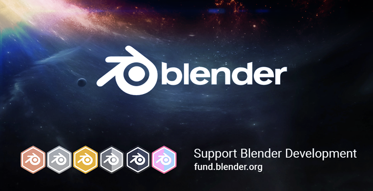
So… there’s a splash!
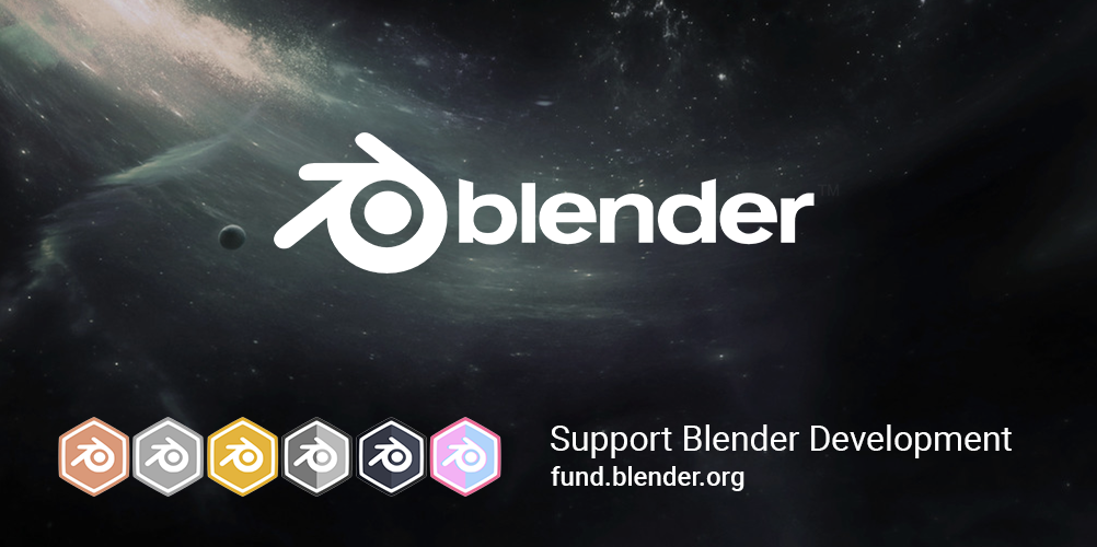
Thanks William Reynish for making it!
Selecting the right one was hard… a lot of great artwork was submitted, but the message “support the dev fund” wasn’t working out often. The choice we made was mostly to align the current campaign that runs on fund.blender.org.
But! Since the 2.80-beta will be daily updated for 3-4 months, we can also take the liberty to update the splash every other week. That means people can keep sharing ideas or artwork here!
-Ton-
19 Likes
Nice, congratulations!
Are there plans to share .blend file of the winning scene?
@Ton @billrey Ton said it, a lot of great artwork was submitted, but often the message of contributing to the dev fund wasn’t that clear… wouldn’t those be great for the final 2.8 release splash screen?
congrats…this one looks good, i wished that you get to badge’s page when clicking on them but that probably requires more tedious work and the devs are so busy,hey maybe in the future when the fund reachs the goals and beyond 
@billrey congrats man! Good job!
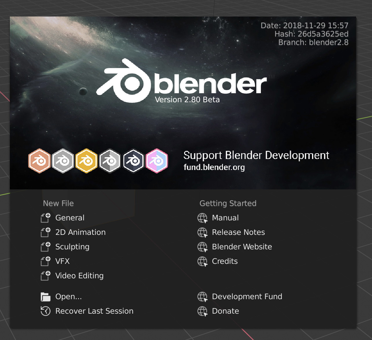
Hello, i downloaded the beta ( beautiful work ! ) but just to notice that text and icons of the Splash Screen seem to be with lower resolution or wrong antialiasing compared to the image reference posted by @Ton :
I hope this does not sound like a “I’m salty because I didn’t won” post, because it honestly isn’t. I’d probably not have picked my own submittion considering, what users have been posting. (my personal favorite being the ladybug) But I still want to adress the result.
Because for me it is not fitting for what you’ve been looking for. I think it’s a great calm, relaxing image, that kind of conveys a sence of greatness, wonder and distance and has an intresting theme of reaching to the stars.
But I wouldt not call it fun, engaging and positive …
It does unarguebly promotes the dev fund, but it does not seem to be celebrating it … and it kind of feels like an “annoying advertisement” for me.
Also the theme, that was mentioned in the video about getting rid of the final bugs and engaging people to participate in the bughunt is honestly not clear at all for me when looking at the image.
Also personally I don’t like, how it does not seem to promote any amazing new features of 2.8. Mabye it was done with Eevee, but I wouldn’t be able to tell at a glance.
Another personal thing I don’t like is it kind of lays too moch focus on the brand blender and too little focus on the artists creation itself and that was actually something I previousely really liked about blenders splash screen. Because the images were always played a huge factor in engaging me to get into blender and start being creative and that’s kind of not there with this screen, because now for the first time the logo is the focal element and not an artwork :c …
2 Likes
Can’t agree more. (Just that my preference was the fueled rocket.) The only thing I dedicated was the time to admire the masterpieces and even still am I disappointed at the result. I am disappointed because I read how the creators put thoughts in their works, like trying to use both EEVEE and grease pencil, trying not to say “FUND BLENDER” and other points everyone must have read for sure.
I believe
would be a great idea and will be looking forward for it.
1 Like