Snapping & precision modeling improvements

I’ve been trying out the new Snap Base feature and it’s a big step up! Thank you!

Is there any way the Snap Base could work with Absolute Grid Snap? It would be really useful for snapping the corners of an object to the grid without changing the origin.

Hello! Even if a bit late, I wanted to give some feedback, these features are extremely welcome!

I love that we now have dedicated icons for snapping, but I have to say that transform icons, particularly the move tool, get in the way of the snapping icons. It makes especially hard to distinguish the vertex icon from the face icon.

Screenshot_8

Screenshot_9

Maybe the size of the snapping icons can be made bigger or, only in the case of snapping, the transform icons could disappear?

@slowk1d, this has already been covered a few times. You can see the reasons at #106008 - Design: Support navigation for transform operators - blender - Blender Projects

Also, I commented on a video by Allan Brito where, if this navigation feature was used, it would help a lot in a situation:

1 Like

Hi @mano-wii, thank you for letting me know, I didn’t understand that snap base and this feature were basically conceived together, and sorry if I asked something it was already discussed mutiple times. This is a feature I kinda glossed over and had the chance to try only recently. I’ll edit my post to only keep the snap feedback.

No problem, this topic is big and it’s normal to get lost with so many posts.

I try to summarize the decisions at:

It can be used for consultation.

4 Likes

Hi everyone. Today at the UI module meeting I brought up the topic of the Snap Icons icon.

For Blender 4.0 we will revert the “minimalistic icons”, and bring back what was proposed by the original patch by Erik (so called “industry standard”).

Germano will prepare the patch in time for bcon3. And he is interested, after this is merged, to explore a theme option for the minimalistic icons. I will leave for the UI module to decide whether such an option makes sense.


I was away when the current “minimalistic icons” were merged and only now managed to catch up on all the feedback here (thanks by the way). I feel that we were in a situation with no consensus on anything critically wrong with the original proposal. In a case like this, we may as well have the tie-break going to the original design (or whoever is playing the role of designer).

For reference, this was the original proposal, with tweaks from Germano:
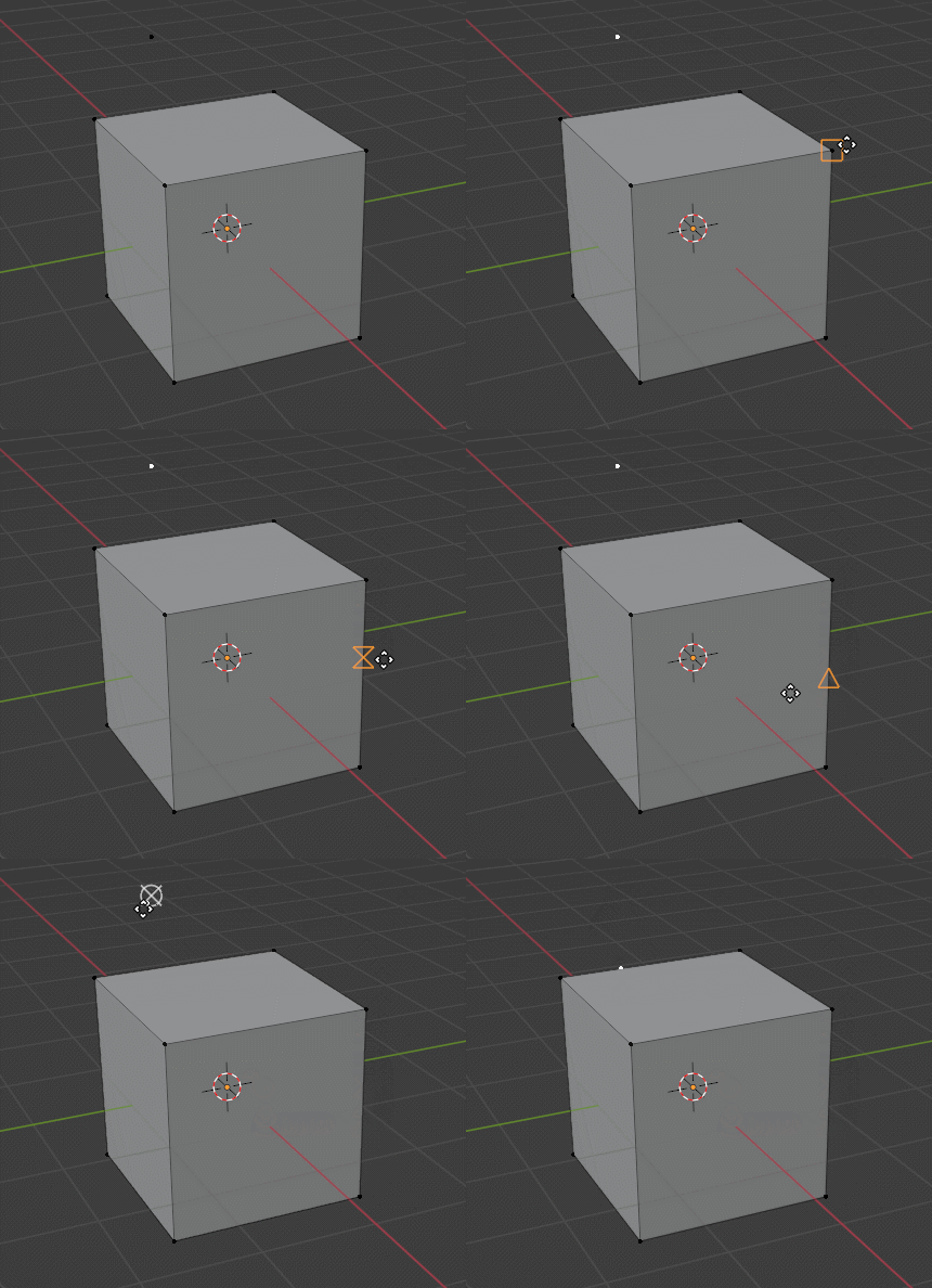
GIF.gif

For reference, I was involved in this snapping project for a few years already - 4 years ago I posted the Base Snap design proposal, and more recently was working as the “comissioner” for the Snapping and Polishing task.

My role was to help navigate the compromises between what I had in mind for a design, and the reality of seeing it implemented in Blender with all its quirks.

In that process Germano was a champion iterating over different scenarios to help gather feedback and for everyone (me included) to test the design in a working Blender.

As a former-CAD user, I know the icons will receive a warm welcome for everyone used to them. And I hope they will grow for new-comers as well.

I’m super proud of what the team (Germano in particular) made it possible, and I can’t wait to see Blender 4.0 videos showcasing the new snap features.

13 Likes

Is there a snap point on the center of a face as well?

:point_down:


1 Like

Whoa, back to the autocad icons? User opinions doesn’t matter after all.
Blender is not a cad software.
Oh well

8 Likes

This isn’t just biased, it is also arbitrary.

I could say the same about the minimalist icons.

But since the UI module feels this way why not ask more users? For example a twitter poll, blender artists poll etc and then see if there is a clear preference one way or the other.

6 Likes

Hi Dalai,

Thank you for pushing for this feature to be implemented !

It is disappointing to hear with little to no explanation that such a decision has been made after asking for feedback in this thread. Could you expand on your thought process and address the feedback that has been collected in this thread ?

The issues that are listed in the UI module Meeting notes don’t seem related to the icon set specifically (it’s rather the overlap of the icons with the four arrow icon). I’m also a former Autodesk user and I agree “the icons will receive a warm welcome for everyone used to them”; I don’t think they will from those not used to them. I also don’t understand what “owning that decision” means precisely.

Again, why align Blender with Autodesk and a particular subset of users rather than follow an actual standard (tooltips) and make Blender welcoming, comfortable and performant for the widest range of users ?

I can also imagine time is not unlimited to get all this in to 4.0. Is any more work on this planned for 4.1 ?

5 Likes

“CAD” stands for “Computer-aided design”.
Blender is most definitely CAD software.

2 Likes

I’m sure that you’re aware of the difference.

2 Likes

Whichever View 3D icons are finally chosen for the snapping behavior, the icons in this menu need to match those icons.

snap-icons

9 Likes

They don’t need to necessarily. Current icons are more intuitive in this menu, but they do not work on the mesh, and the “industry standard” icons are intuitive on the mesh, but not in this menu.
They do not match in other software either:
image

If you’re going to give the user a Circle, a Square, and a Triangle for telling them specific snap points, then the user needs to be shown (visually) what the Circle, Square, and Triangle mean in the menu.

I don’t know what RandomCAD does - or why their menu doesn’t match the view - but I do believe that the point of icons is to clearly communicate to a user what the tool is doing.

It was discussed prior to use icons that are somewhat related to the actual target; the decision has been made that the icons should be these arbitrary shapes that are familiar to people who don’t use Blender. It makes no sense to use CIRCLE for a vertex in the viewport, but “4 DOTS” as an icon in the SNAP MENU. The menu literally has the word VERTEX in it, so I don’t think we need to illustrate it with dots to lessen the confusion.

By the way, it’s ironic how people are all “Blender isn’t XYZ Competitor” when a suggestion they don’t like is made, but when it supports what they want - suddenly, Competitor is the Gold Standard. :wink:

(Not directed at you, FreeMind. Just a thought that occurred to me.)

8 Likes

Those icons make no sense, I prefer the current ones. Circle for vertex, square for face and parallel lines for edges.

3 Likes

There already was similar icons problem.

I will try to answer the different questions in a single reply.

Menu icons to match Snap symbols

The plan is to indeed to try matching them. From the commit message:

Also note that later we should also try to change the icons shown in the snap menu to match the symbols that the artists see in the preview window.

Help with this would be welcome:

  • Pull request with updated blender_icons.svg and tweaked viewport menu.
  • Remember to include screenshots in the patch to show how they look in the menu.
  • For the Face/Volume we only need to show the icon for the face
    • Similar to how in 4.0 we only show the first icon of the repeated Help url entries.
      image

Tooltips

“(…) follow an actual standard (tooltips) and make Blender welcoming”

I would also like to see a patch for that. But I suspect we will end up with something too distracting (with the constant changing of the tooltip text).


Decision Process

It is disappointing to hear with little to no explanation that such a decision has been made after asking for feedback in this thread. Could you expand on your thought process and address the feedback that has been collected in this thread ?

Thanks for wording your questions so nicely by the way.

I’m happy to do so. The days preceeding bcon3 were more hectic than usual (too many final decisions), leaving communication a bit behind indeed.

I will tell a long story here, please indulge me:

  • June 30, 2019: Germano starts a development grant to work on snapping and transform tools.

  • July 5, 2019: Germano, Campbell and I meet together to define targets. As a followup I prepared a design for base snapping.

From 2019 to 2023 not much happened. I was working full-time for Blender but I could not prioritize this project. Every now and then I would poke the module team about the state of things, but there was a lot of under-the-hood work that had to be done before we could have more “fancy” snap tools. Besides, Germano was officially working as a bug-triager - that said he never stopped helping with modeling-related development, but was mostly done on the side.

January 2023, I got back from a holidays visiting my sister. She is (also) an architect and we had a good time with me showing her Geometry Nodes, while she showed me what she had been modeling in Blender. The lack of (base) snap in Blender pained me. So, inspired and energized, I decided to once again stir that pot.

Around January I went over the snap patch with Pablo Vazquez, and brought Julien Kaspar into the mix. I wanted to make sure (non-CAD) modellers were happy with the solution. At the same time I cleared out Germano triaging duties to free him for a final sprint. The lack of “transform during snap” was considered blocking. So I relied a lot on Julien to help testing while Germano iterated on the implementation.

  • Apr 20: I see the original snap icons patch by Erik and promptly show it to Germano. Around that time we got into Blender 3.6 LTS bcon2. I’m once again saddened to see that we missed another window.

  • Apr 21: After seeing some concerns there, I add my first comment to that thread - basically I’m happy with the patch, it adds new useful functionality, and it does so with a tried-and-proofed set of symbols.

  • May 1: I start to notice that the patch is risking getting stalled.

  • June 5: Base Snap is in Blender and covered on Blender Today (you can see my joy there).

Even though Base Snap was merged :heart:, there was still work to be done to polish its behaviour and get the Transform while Snap functionality in Blender.

Around that time I wanted to look at the snap symbols patch again. Germano wanted to try a different solution, and I believe that around then he decided to ask here for feedback. I didn’t follow the discussions here, and continued minding my own business.

Finally in August I was again uneasy with this going anywhere and bcon3 approaching. So I suggested Germano that we wrap this up once I was back. I expressed myself poorly, because he didn’t realize I still wanted to be involved.

Two weeks ago I was watching a video about new snapping tools in Blender. And this is how I learned about the new snap icons being committed. I did some digging and asked around to understand why this was decided how it was. I then lobbyed to revert that decision on the UI meeting preceeding bcon3.


So what is my decision process?

  1. Listen to everyone.
  2. Work closely with stakeholders.
  3. Respect the different roles.

I make a decision considering everything, but the decision role is not “a consensus”, or “democracy”. Even though in some cases polling a large number of users can help to guide a decision.

In this particular case I tried to use a principle called Falsification by Karl Popper (I found about it on Black Swan by Nassim Taleb). The idea is not to try to find evidence to support my original thesis (that CAD symbols could work), but to try to disprove it.

In other words, I knew that I could make arguments to support that solution, but could I try to find anything wrong with those icons? And this is indeed where those thread can really help. And although I could find arguments in favour of the other solution, there was little to discredit the CAD symbols.

On the other hand, I did find a few things which I consider bad about the “minimalistic icons”:

  • We don’t do rotating icons in Blender - that could change one day, but shouldn’t be done lightly.
  • That and the variation in size of the icons produces considerable noise when hovering an organic mesh like Suzanne.

I don’t expect many to notice this (or maybe to get annoyed by this). But for me this raises a flag regarding how this was being designed. We could of course iterate over the design further, but given that the original design was working fine, I didn’t see the point.

I’m also very wary of the thin line between feedback and design by committee, and this was getting too close to the latter.

With all that in mind I used another principle. This one from Stephen King, On Writing. Stephen uses early peer-feedback to find what may be unanimously bad. If something is clearly bad, he changes it. If his stakeholders (his wife in particular) is adamant about a point, he tackles it. However, whenever there is conflicting responses to his novels he just get to be the tie-breaker.

I’m no Stephen King, but I was playing the role of designer and commissioner for the related snap improvements. As such I don’t mind making a pure subjective call, and here we are.

All in all I hope this paints a better picture for this (not so) arbritary last minute change.


Further

For anyone wanting to hear more about the design process and how we handle feedback, I cover some of this on The challenge of design in open source projects talk I gave at Penpot Fest this year:

I plan to give a rehashed version of this at Blender Conference this year. So if anyone still has any questions let me know. I won’t have time to spend here iterating over the snap symbols. But I would love to expand the talk to address any questions.

16 Likes

Yes I completely agree. I think having this discrepancy is harmful, the “mesh element” icons need to be redesigned in accordance in time for release. I don’t agree with the design, but since a decision has been made, keeping Blender consistent with itself is the more important thing. (Not just in the snap menu, but the three element icons in the viewport header as well, when in edit mode).

1 Like