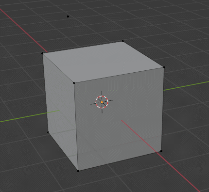
What you see in the image could very well be with both focused.
I like how unsure you are about what is happening in the image. I also am very unsure at what the image so supposed to show.
Although it does look like all the green are just instances of each other. So idk maybe hide the other collections? Or maybe hide the other objects in the scene? I’m sure there is a way.
Anyway my point is that I don’t think solving clutter was a design goal for the snap icons, and I don’t think it should be. If you do think the snap icons should solve clutter please explain why.
Eh? I am pretty sure about what is happening the image. It is some sort of structure consisting of a bunch of steel beems and similar elements. Perhaps a factory or something like that. It doesn’t really matter, though.
Correct me if I’m wrong but I believe the point of the image was to illustrate that a cluttered viewport might have different requirements to snapping symbols than a clean viewport with only simple models.
1 Like
There comes up your point where there’s so much clutter in the window, the one might have difficulty discerning an to begin with.
Certainly there are times where one needs to see the entire wire frame of a detailed car engine, but that does not mean that at any moment you need to be able to snap something to the positive lead of a fuel injector. Sometimes the artist should hide things, assign layers, etc.
1 Like
Well, obviously, but if the threshold of needing to hide stuff can be delayed by using different icons then why not?
1 Like
I’ve been trying out the new Snap Base feature and it’s a big step up! Thank you!
Is there any way the Snap Base could work with Absolute Grid Snap? It would be really useful for snapping the corners of an object to the grid without changing the origin.
Hello! Even if a bit late, I wanted to give some feedback, these features are extremely welcome!
I love that we now have dedicated icons for snapping, but I have to say that transform icons, particularly the move tool, get in the way of the snapping icons. It makes especially hard to distinguish the vertex icon from the face icon.
Maybe the size of the snapping icons can be made bigger or, only in the case of snapping, the transform icons could disappear?
@slowk1d, this has already been covered a few times. You can see the reasons at #106008 - Design: Support navigation for transform operators - blender - Blender Projects
Also, I commented on a video by Allan Brito where, if this navigation feature was used, it would help a lot in a situation:

1 Like
Hi @mano-wii, thank you for letting me know, I didn’t understand that snap base and this feature were basically conceived together, and sorry if I asked something it was already discussed mutiple times. This is a feature I kinda glossed over and had the chance to try only recently. I’ll edit my post to only keep the snap feedback.
No problem, this topic is big and it’s normal to get lost with so many posts.
I try to summarize the decisions at:
It can be used for consultation.
4 Likes
Hi everyone. Today at the UI module meeting I brought up the topic of the Snap Icons icon.
For Blender 4.0 we will revert the “minimalistic icons”, and bring back what was proposed by the original patch by Erik (so called “industry standard”).
Germano will prepare the patch in time for bcon3. And he is interested, after this is merged, to explore a theme option for the minimalistic icons. I will leave for the UI module to decide whether such an option makes sense.
I was away when the current “minimalistic icons” were merged and only now managed to catch up on all the feedback here (thanks by the way). I feel that we were in a situation with no consensus on anything critically wrong with the original proposal. In a case like this, we may as well have the tie-break going to the original design (or whoever is playing the role of designer).
For reference, this was the original proposal, with tweaks from Germano:
For reference, I was involved in this snapping project for a few years already - 4 years ago I posted the Base Snap design proposal, and more recently was working as the “comissioner” for the Snapping and Polishing task.
My role was to help navigate the compromises between what I had in mind for a design, and the reality of seeing it implemented in Blender with all its quirks.
In that process Germano was a champion iterating over different scenarios to help gather feedback and for everyone (me included) to test the design in a working Blender.
As a former-CAD user, I know the icons will receive a warm welcome for everyone used to them. And I hope they will grow for new-comers as well.
I’m super proud of what the team (Germano in particular) made it possible, and I can’t wait to see Blender 4.0 videos showcasing the new snap features.
13 Likes
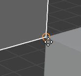
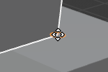
Is there a snap point on the center of a face as well?
![]()
1 Like
Whoa, back to the autocad icons? User opinions doesn’t matter after all.
Blender is not a cad software.
Oh well
8 Likes
This isn’t just biased, it is also arbitrary.
I could say the same about the minimalist icons.
But since the UI module feels this way why not ask more users? For example a twitter poll, blender artists poll etc and then see if there is a clear preference one way or the other.
6 Likes
Hi Dalai,
Thank you for pushing for this feature to be implemented !
It is disappointing to hear with little to no explanation that such a decision has been made after asking for feedback in this thread. Could you expand on your thought process and address the feedback that has been collected in this thread ?
The issues that are listed in the UI module Meeting notes don’t seem related to the icon set specifically (it’s rather the overlap of the icons with the four arrow icon). I’m also a former Autodesk user and I agree “the icons will receive a warm welcome for everyone used to them”; I don’t think they will from those not used to them. I also don’t understand what “owning that decision” means precisely.
Again, why align Blender with Autodesk and a particular subset of users rather than follow an actual standard (tooltips) and make Blender welcoming, comfortable and performant for the widest range of users ?
I can also imagine time is not unlimited to get all this in to 4.0. Is any more work on this planned for 4.1 ?
5 Likes
“CAD” stands for “Computer-aided design”.
Blender is most definitely CAD software.
2 Likes
I’m sure that you’re aware of the difference.
2 Likes
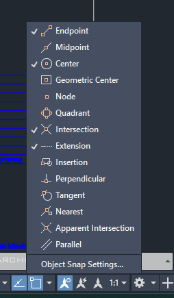
Whichever View 3D icons are finally chosen for the snapping behavior, the icons in this menu need to match those icons.
9 Likes
They don’t need to necessarily. Current icons are more intuitive in this menu, but they do not work on the mesh, and the “industry standard” icons are intuitive on the mesh, but not in this menu.
They do not match in other software either: