This build includes some changes that are still being discussed for Blender 4.0.
The changes are:
Removals:
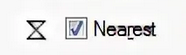
The option: “Snap With” Closest has been removed;
The option: “Navigate during Transform” has been removed from the Preferences - (only available in Blender 3.6);
The options of “Snap To” Default and Geometry have been removed from the Palcement tools (Add Cube/Cone/Cylinder/UV Sphere/Ico Sphere).
Defaults:
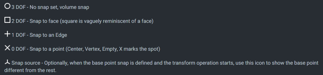
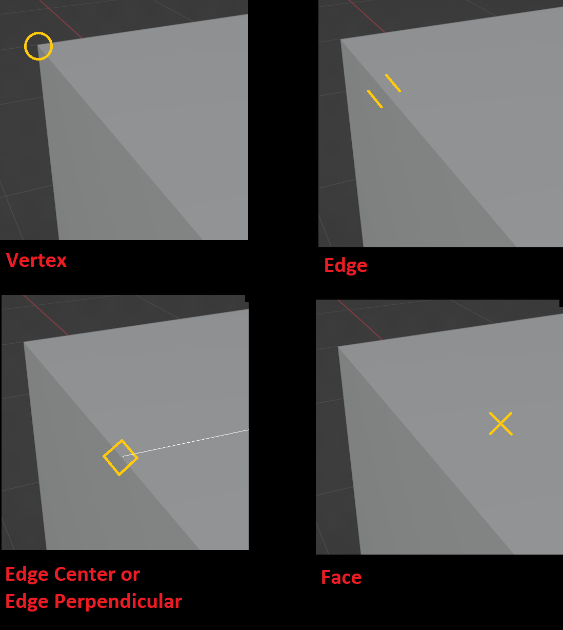
The default scene “Snap To” elements are now: Vertex, Edge, Edge Center, Edge Perpendicular and Face;
The default “Affect” options are now: Translate, Rotate and Scale;
The snap of the Placement and DragDrop tools now always follows the “Snap To” in the scene;
Navigating while transform is now always available, so the “Transform Modal Map” in Keymaps has been changed so that now it is necessary to press Alt to change the size of the Proportional Edit, change the length of the AutoIK or to enable Auto Constrain (axis or plane).
Additions:
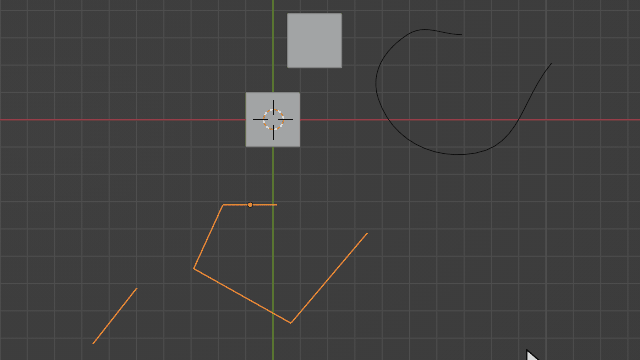
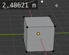
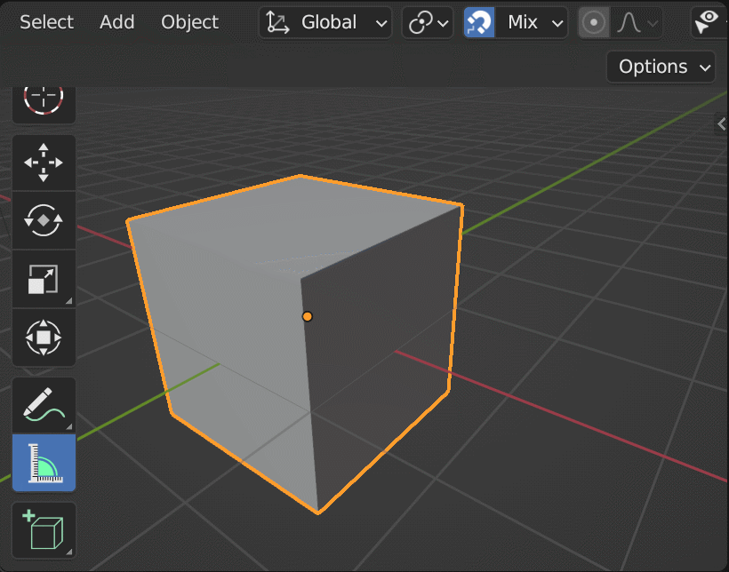
Specific symbols were added for snap elements Vertex, Edge and Edge Center;
Snap Base symbol follows the last confirmed element symbol;
Note that the current build status is not final, and things can change.
As already mentioned in the design task, I strongly oppose the removal of Closest snapping option, besides making things much slower than they need to be, it makes scale snapping not work well.
I understand the naming was confusing before. If I understand correctly how it actually worked under the hood, maybe a more fitting name would be snap to Bounding Box, though I think Closest would sound less “enigmatic”. Either way I hope it doesn’t get removed.
Latest build seems to have broken snapping to and from bezier curve objects. Snapping to a curve vertex jumps back to scene origin.
Setting base point with B also doesn’t pick curve vertex, only mesh geometry.
Those seemed more flexible and expandable down the road and more in line with Blender UI language. If ever in the future we get more types of snapping like “edge extension”, “intersection between two edges”, or other types of “composite” snapping, these could eventually show combinations of icons like Intersection between plane edge and cube edge extension or topological info like Cube 1 edge extension.
Feedback mentioned in the other thread, still applicable:
Mix is a poor name for the drop down menu. The term “mix” has particular meaning in both Blender, and other DCC software in general. (Mix a color, mix these 2 nodes.). A term such as “Multi” would be better.
It appears to still be lacking a basic “snap to center of a face” ability.
Adding snap options without a well-defined utility is not a good strategy.
This will just add more names for the user to read and look for every time they need to add a snap option.
I could be wrong, but snapping to the middle of faces is not something I particularly see as essential or basic. If I need to snap to the middle of a face, I can add multiple snap points with the A key.
Also rarely does a geometry have a well-defined center point. Often, apparent polygons are made up of quads and triangles. The user will get confused trying to snap to the middle of this apparent polygon.
Anyway, I suggest discussing this in the other thread as it’s off topic.
Very excited about these! Navigation during transform and pre-selected snapping were two of the main reasons that kept me from being able to use Blender for architectural modeling.
Maybe it’s just my familiarity talking since I’m used to them from AutoCAD, but these snap icons are so much more immediate and cleaner to me than the menu icons. I saw in the linked discussion that the design in the gif was meant to get the icons “out of the way”, but them being in the way, overlaid to the cursor, is the point: so you don’t have to constantly make small eye movements to check if it’s the right snap. Which is also why they need to be ultra simplistic–look at how many indicators are squished together in that gif: the move cursor, the dot indicating the snap point, a circle surrounding that dot, and a big, slightly overcomplicated icon to the right… It’s too much. I hope we keep these and not reinvent the wheel.
However, just to check: I vaguely, kinda sorta remember reading somewhere that these AutoCAD OSNAP icons were copyrighted and that’s why every other CAD program had their own versions. Is that possible? Couldn’t find anything via googling. They’re pretty universal shapes, and also used by other entities (like Playstation), but perhaps the context they’re being used in makes a difference in that regard (like how third party gamepads seem to avoid using those icons on their buttons because they’re trademarked)?
Even if this is the case, I’d opt to design our own simplistic icons rather than the ones in the menu. SketchUp uses simple dots with different colors, for example, instead of icons. The point should be simplicity.
The CAD sketcher addon constraint icons/ the FreeCAD snap icons could also be used as start. Those then become universal for FOSS snaps/ constraints, which I think is a good thing.
I definitely agree with the cursor icons for snaps, makes it a lot clearer when you have accidentally used a wrong snap in advance.
I also think that removing closest snapping will be a disaster, not only for mesh modeling, but also for UV editing. This should be avoided at any cost.
Nice to see “Affect” options enabled though, which are especially useful with closest snapping.
The UI descriptions of those options are not descriptive, so at the time it took a while to get what they actually mean and represent.
Not sure about so many snaps turned on by default.
I think that simple vertex snapping could be a better choice, especially for beginners.
I always thought that incremental snapping by default is a weak solution, and I am familiar with people who didnt discovered snapping by themselves when tried to learn blender because of it.
Speaking of a Navigation - feels smooth, but are not viewport icons supposed to be supported?
UPD, aw, forgot that using tools locks UI. My bad)
Also nice to see that fine Shift tweaking is preserved, works nice even with it.
Absence of a centering functions support brings some limitations though, but it was already discussed.
I did not follow this whole change, so I have a question. Was the closest option intended to be removed because we now finally have option to pick the “snap from” point before picking the “snap to” point?
If yes, then I can understand the idea of removing closest option, but if no, then I can’t understand why someone would remove the closest option as it’s literally only usable snap mode when snapping inside mesh edit mode.
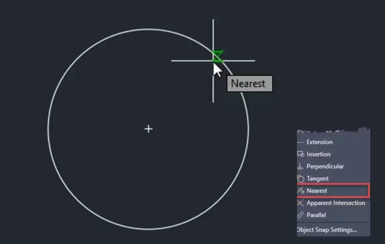
X sign better be an edge snap, because intersection of a lines defines a precise point on an edge.
This is the reason nearest snap icon usually looks like hourglass.
L+ sign is usually a “perpendicular” since it also has an intersection that defines a precise point // sign is usually a “parallel” - there are no intersection in both sign or intended action
Yes. It is a convention that was originally designed in AutoCAD and spread across the entire endustry - from CAD (like Revit) to ART (like 3dsMax, for example).
From what I could understand from the description of the X symbol, it indicates when the snap is made to the intersection of two lines.
Nearest’s Snap behavior more closely matches what Blender defines as Snap to Edge.
Note that even if land as it is, until Blender 4.0 release this could still change.
I also vote for icons that were in the old design. Remembering what those extremely generic symbols mean is going to be a pain in the ass, and for those who are not in the CAD and use snapping infrequently it means looking up meanings on every single use. With icons there’s also familiarity.
I understand those symbols are defined in CAD workflows, but in CAD softwares those symbols are everywhere and in the general context user is familiarized with them, it makes sense. In Blender they don’t make sense and feel out of place. They’re not used anywhere else and besides Blender already has its defined symbols for Vertex, Edge and Face which look absolutely nothing like those, in some cases look exact opposites in a way.
Blender’s icons are super clear about what you’re snapping to, they literally draw you a picture. I don’t know any easier way than that, especially for non-pro users.