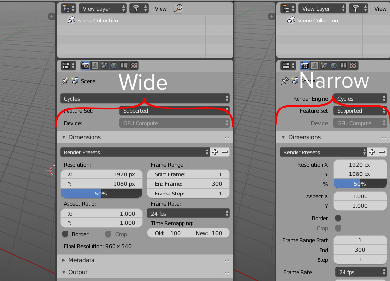
I saw a new single column layout in properties, and it’s cool for narrow properties area, but what about wide? Take a look at web-sites: if browser has wide screen site blocks will set in multi-column layout, but if you shrink browser’s width or look on website from mobile device the site blocks will appear at one column. It’s called responsive design.
What if we apply this principle in properties area? if you shrink properties to a special width, it automatically change layout from two column to one and vice versa?