Are there some real reasons for these changes or why are they even done? Time should be spent better than to fix what doesn’t need to be fixed, now with this new way, it’s necessary to scroll more and the choices that should be easily located are harder to locate because everything is in one big column.
Agreed, the right side looks much cleaner and more organized.
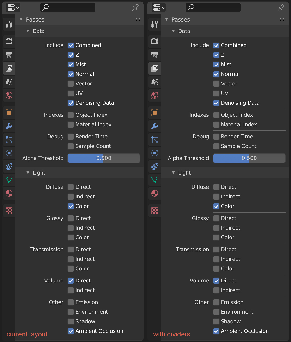
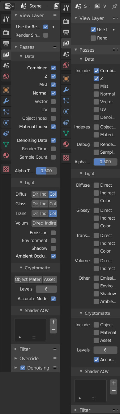
Hah, I understand this is personal, but I don’t think it’s so obvious like you say. In 2.90 these panels use clear headers, and checkboxes to distinguish the properties from real radio buttons. The alignment and hierarchy is much better too. It also works much better at smaller widths.
Yes, the downside is that a bit of scrolling is necessary to reach the bottom panels. That’s worth it in my opinion.
Really?
Just having everything in one column is not good UI in my opinion.
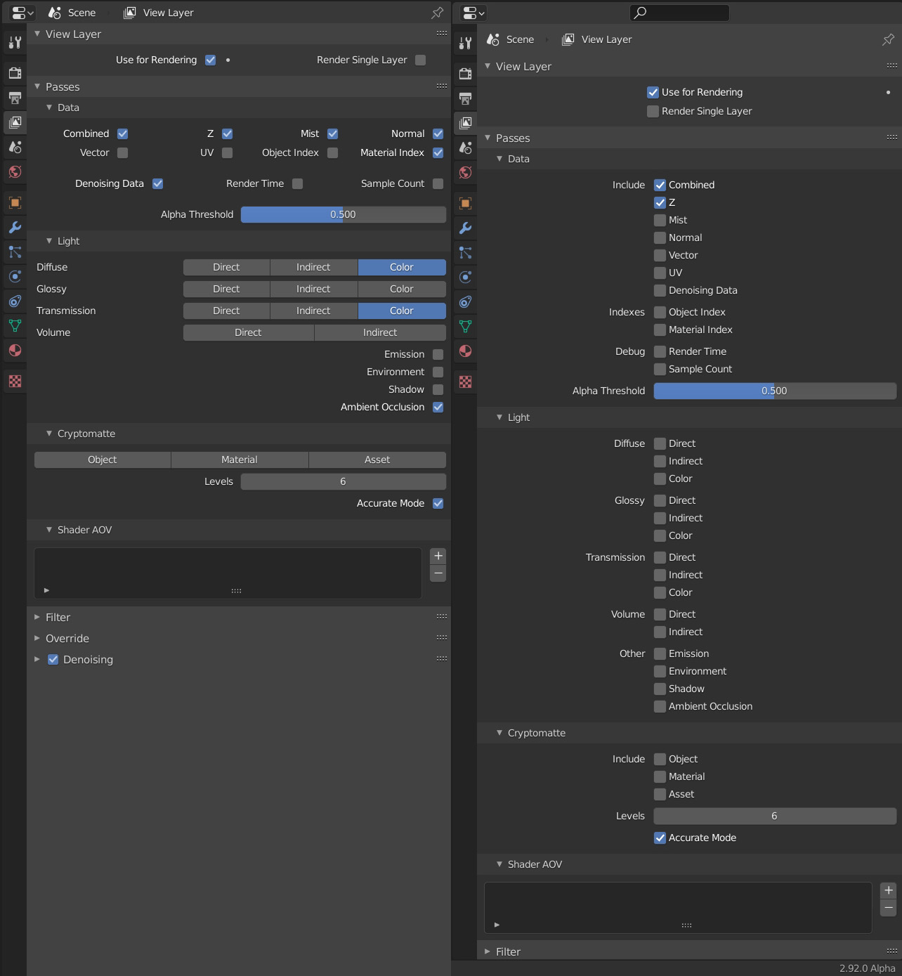
Before the Direct, Indirect and Color were next to each other which worked better because they are related, it also saves a lot of space and you can navigate faster.
Also the first options were in a table and not underneath each other. Now it’s just one big line of words while before you could remember, yeah that’s 2nd row, 3rd column. You’re not going to remember that something is on the 7th or 8th place…
I don’t want this dumbing down of UI… If everything is in one big column imagine how worn out our scroll wheels are gonna be.
I just don’t think this is a solution and I don’t see sound reasoning behind it.
Why the sudden hate of radio buttons? I see them disappearing all over Blender.
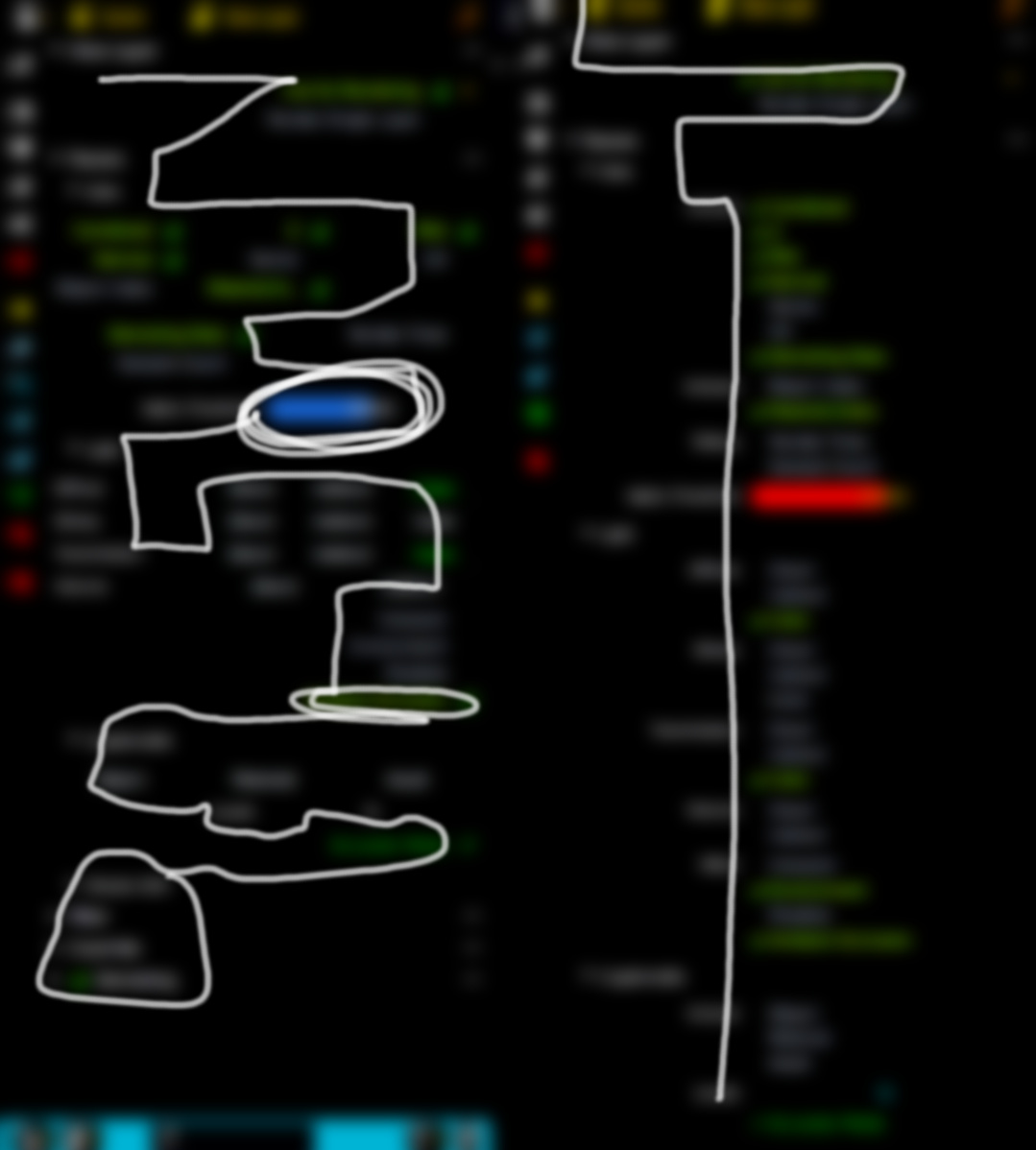
On the left, the path the eye has to follow across the panel’s UI layout in 2.8.
Can you see why 2.9 is much better?
Mind you, I’m not saying is perfect or can’t be improved. I’m only saying is a step forward toward clarity and better organization. Then we can discuss how to improve but going back to 2.8 is a no-no for me.
That being said, I think - once you’re used to it - you can actually find some things faster with the old layout. Everything being so visually distinct makes it easy to pinpoint things pretty quickly, when you know what you’re looking for.
With long lists like the render passes (or the modifier add menu, though that’s a completely different context) the items kinda blend into each other, when trying to scan them quickly.
Maybe giving long lists more structure with horizontal dividers could help - like with the context menus.
I know, that the groupings with the title and a little padding between them are already creating this structure, but I’m not certain it’s strong enough.
Don’t really think that’s a fair comparison. You make a lot of whacky lines on the left while on the right you make one straight line, even going over the alpha threshold which stayed the same in both at you circled it like crazy in 2.83. But that is not the point. For me that actually proves why the previous layout was better. It was more distinct. Yes maybe the first time you use it it’s worse but over time it gets better.
I would at least like to see the Direct Indirect Color go back to what it was but unfortunately there’s this push to get rid of everything that’s distinct.
Can we have an opinion from someone from the UI team. @pablovazquez?
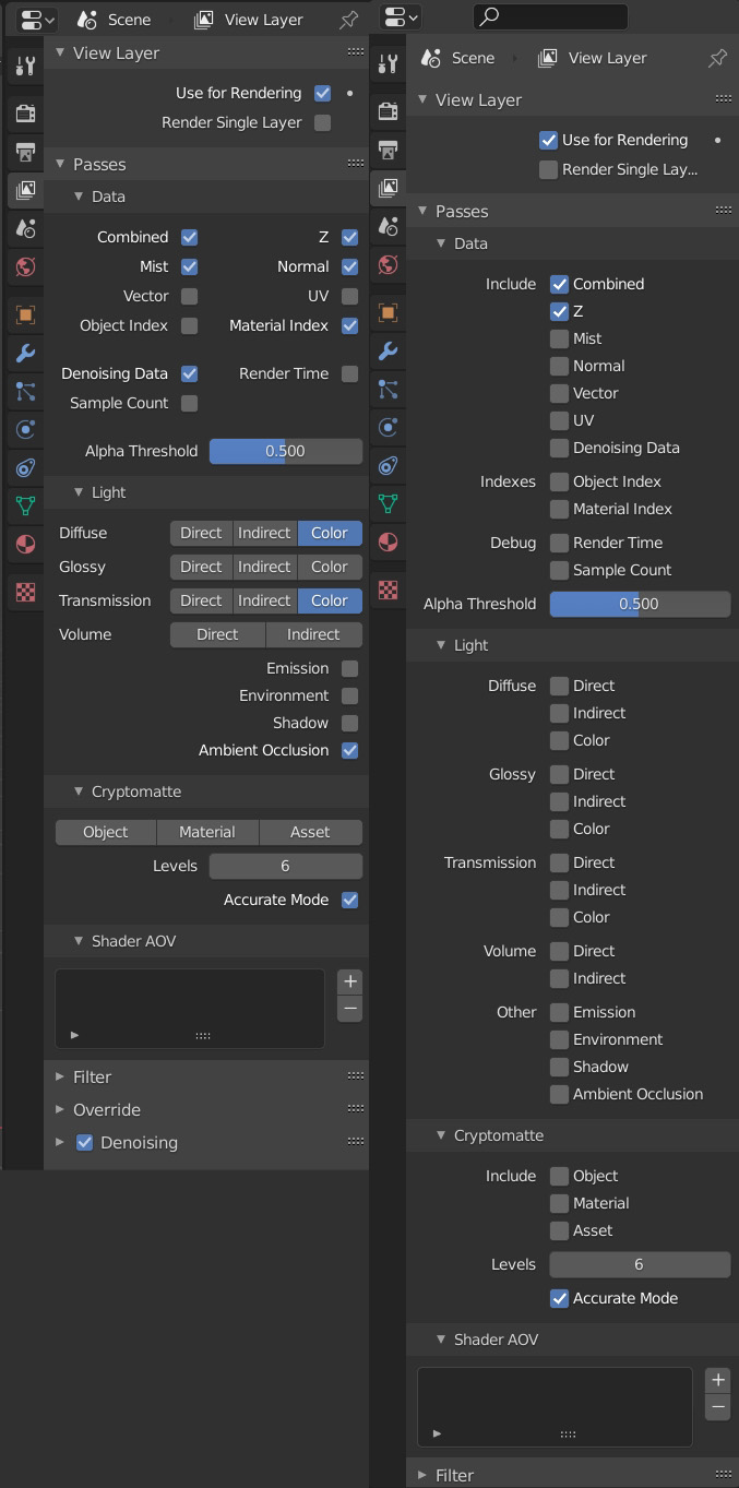
Here is also a comparison of different widths of the panels, 2.83 left, 2.90 right:
Think what really made the old way stand out is how well it adjusted to different widths. And I myself can say that often I have the properties window at different width, always moving it around.
The difference in height is quite massive, starting at about 60% old way, then 70% old way, then like 85% old way.
I’m not saying go back to what it was but the new way is not thought through at all. It’s simply “put all in 1 column” thinking.