The new dark theme is really bad, there’s not really contrast between buttons in some areas and it just looks bad in general. Not everyone likes rounded node lines… I prefer them straight.
(yes, I am aware I can customize that myself but it’s just a hassle considering they changed almost all colors.)
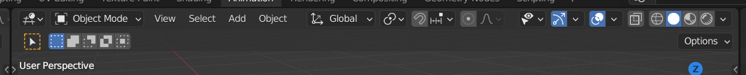
Also, I absolutely hate the fact that the viewport buttons were relocated… it’s really annoying now, having to constantly scroll to the right to change the render mode and back to the left to change the object mode if the viewport window is small… I really don’t get why they changed it. I think it was perfectly fine the way it was. Also, I noticed if you save a file in 3.1.0 and open it in older versions (before the ui change), the buttons glitch out and get on top of another.
If you’re gonna drastically change the default of something, please make it optional!
I must say I don’t really like it either. It’s not the end of the world but still…
I especially dislike the dark background behind the ‘second toolbar(? don’t know the right terms)’ because it takes away vertical space in the middle where ther aren’t even any buttons. I think the dark background, if it’s wanted at all, should only be behind the actual buttons. I often work on a ‘lowscreen’ (monitor makers call it ‘widescreen’) laptop and I can use all vertical space available.
I don’t really know what you mean with this? The viewport shading buttons? They are already on the right side in 2.8?
I get the ‘think I’m stupid’ part. I always ignore people calling me stupid. But pre-emptively shutting down any discussion doesn’t really feel constructive and is not really scoring you points with the theme makers…
When you have windows split vertically, you have to scroll between render mode buttons and object modes, which is hugely inefficient (plus you lose some vertical height as someone else mentioned above):
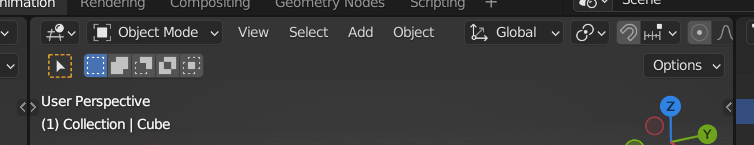
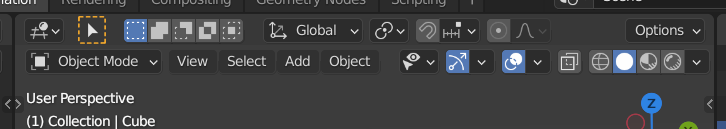
It wasn’t an issue at all on older versions since they were anchored to each side:
I think they’re still anchored to the side. It’s just that too many buttons have been put in between. So there’s no empty space to shrink if you make the window smaller.
It works exactly the same in 2.93 if you make the window even smaller. But because now the Transformation orient button, the snapping button and the proportional editing buttons have been put in between the viewport buttons and the mode buttons there’s now not enough space.
I agree the scrolling is rather annoying. The same problem existed for ages in texture painting, which always had too many buttons to fit on my screen. Especially since I always set the gui scale/ font size a tad higher for my nearsighted eyes.
I think I’d even prefer if it would wrap (and take even more vertical space) than the current system with scrolling.