Proposed Font Changes

Minimal Version: I want to replace our default font with a prettier one. Current font on the left, and Roboto on the right:

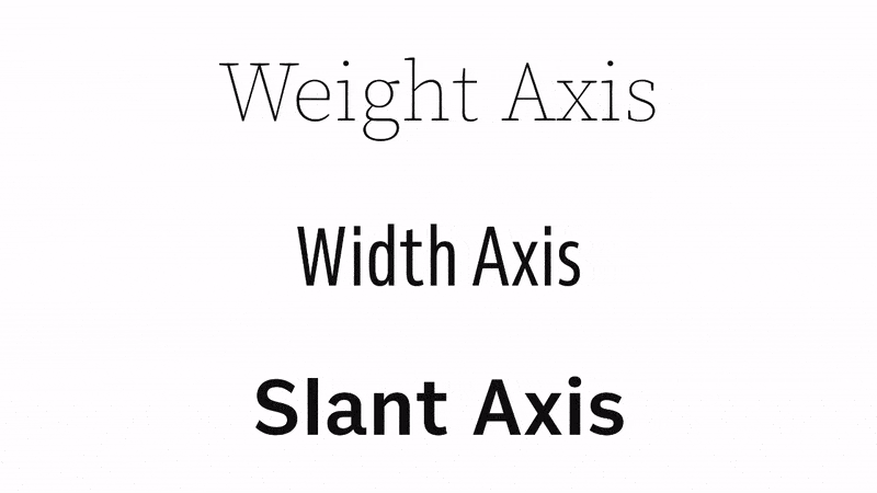
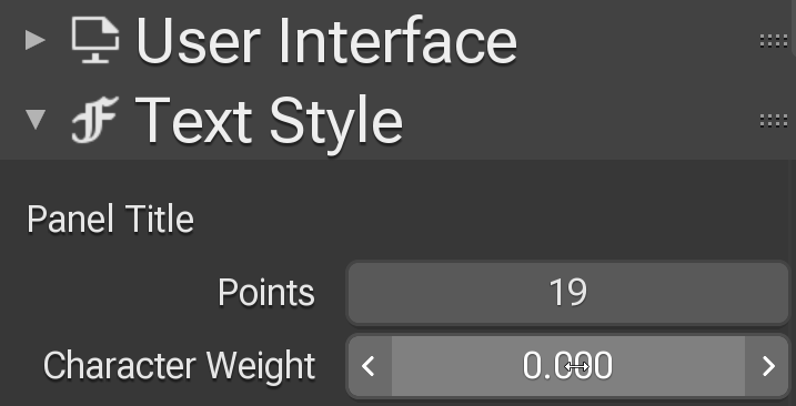
TL;DR Version: I want to replace our default font (Deva Vu & Droid Sans) with Roboto Flex and multiple Noto fonts in a fallback stack. This will allow better customization for replacing and/or augmenting the fonts. Allow us to support more language scripts at once, up to all of them. Increase performance, decrease RAM usage, decrease our maintenance costs, and give us new output features. These new features include Variable fonts, which allow a single font file to change its appearance along multiple axes:

VariableAnimated

Long Version:

We currently ship with two font files, one that is fixed-pitch for the text editor and another that is proportional for most of the UI. Each font file contains approximately 54,000 characters, which is a large portion of the characters needed for many different languages.

We allow our users to select other fonts they may prefer or that handles their language better. However, when they do so it replaces ours, which means they lose access to all the other languages’ characters. In fact, there are many language-specific fonts that contain nothing but that one language’s characters and do not even contain Latin (A-Z) characters. The ideal font for their language could be completely unusable with blender.

Our font is also an old design and it is getting more difficult to add new characters to support more languages. In fact, there is a limit of 65,535 characters in a single font file, which is about half of the characters currently encoded in Unicode (143,859). Which is why I want to move to using multiple font files that work together.

At this point I can hear the odd reader saying “Wait, I’ve heard of the font called Noto that contains all the characters from every language”. No. Noto is a collection of fonts that are designed in a harmonious way so they can be displayed well together, but comprise hundreds of different font files totaling gigabytes in size.

What I’m proposing is that we support a font “stack”. If a character is not found in the first font we then look in the second, then the third, and so on. This process can actually be more memory efficient and more performant when using multiple fonts than one big one. Each font includes a table indicating which Unicode blocks it supports, and a font can be loaded only when needed. Therefore languages in our stack would never be loaded if you didn’t use them, the search for the characters you do use is faster, and your memory usage is decreased.

In our datafiles/fonts folder we currently have the two big font files, just over 11MB in size. I’d replace those with two versions of Roboto, one proportional and the other fixed, about 340k instead. Then we’d add a “Fallback” folder containing Noto fonts for each of the languages we now support, plus symbols, and icons, and then possibly a “last resort” font.

We’d no longer have to edit and maintain our own fonts. We could easily add new languages and they would stylistically match the others. And users could select any font for any unsupported language with any number of characters yet still see all the others.

Yes, this implies that while using the Text Editor we’d fallback from a monospaced font to proportional characters. This font is used almost entirely for Latin characters with occasional non-Latin characters in strings, no matter what language you are using. I have coded “proportional to mono fallback” and it works great. Narrow characters are simply centered while wide ones have their curves transformed to fit before rendering.

Any comments or concerns?

48 Likes

That alone is worth a shot, I guess… :smile:

8 Likes

Good proposal!

Mainly commenting to say thank you for your dedication and time spent on improving those little things that often get overlooked by anyone else most of the time.
Those things really add up and at the end of the day you make Blender a lot nicer to use for everybody.
Thank you so much!

20 Likes

Regarding the font readability - some versions ago, someone implemented font hinting in Blender, and it is amazing. On Windows specifically (the most used platform for Blender), it turns quite blurry font into a very sharp and readable one:
image
The problem is that by default, this setting is set to Auto, which is very misleading, because Auto in Windows means just Disabled:
image

So before changing the default font, wouldn’t it be also worth it to finally have hinting enabled by default? I suspect most users aren’t even aware this option exists, and even those who do probably don’t know that “Auto” default option actually means it’s disabled.

5 Likes

Yes Harley, hinting first as per the designers kerning tables and then switch to another font, preferrably the Inter as created by Rasmus Andersson, fully Open Source and especially designed for digital displays! :grin:

https://rsms.me/inter

3 Likes

Hinting is unrelated to kerning, which we already do correctly. The reason hinting is off by default is because it is currently implemented incorrectly. This is best seen in the horizontal expansion of the text when you select “slight”, which should not do so since FreeType Slight hinting only moves features to align with pixels vertically. This is caused by us using integers for glyph advances. I’ll get get back to that too, but this is all completely off topic to the subject at hand.

1 Like

While it may be technically off topic, from the benefit to the user point of view, sharp and more readable font is IMHO more value than slight reduction in memory consumption and performance improvement (relative to everything else that happens in Blender).

I am not implying hinting should have priority over this, just that it should not be forgotten. Mainly because so much work will go into improvements like these, yet the average end user won’t see much benefit compared to if hinting just worked out of the box, as most people don’t even know it exists.

Anyway, if you are already aware that hinting needs finishing, then nevermind my comment.

I kinda like the current font more when it comes to the letter shapes. But the new version is not dramatically different, and will easily become familiar after time. New font could have a little more letter spacing I think, just tiny, tiny bit more.

If what you are saying is true about backend problems with the current font, then as a user I have no objections.

4 Likes

If I can move us to using floats for advances (distance from the start of one character to the start of the next) then I would add a “letter-spacing” float that you could use to make them tighter or further apart from what was designed. This would be added along with the new options for Variable (and Multiple Master) fonts for weight, width, slant, etc. Letter spacing would definitely be needed if we correct our wonky hinting, but all would come in handy for artistic effects.

9 Likes

I don’t mind the font change, but the Roboto font seems not good to me, it feels taller without a reason and more compressed, more uncomfortable to read.

8 Likes

Sorry for long list and how looks.

Also Harleya if You touching Front… try to look on this proposal.

Please don’t spam development topics with off-topic comments

The default main font (Latin characters) could be something different, but would need to mix well with the Noto family. Regardless, I want to make it easier for users to replace that font anyway without losing access to all the other characters. So you could select a very minimal display font and still see Chinese, symbols, icons, etc.

3 Likes

It’s more clear than actual font and we could change the width and weight with a slider?

1 Like

Yes, my preferences is that the current text sliders (Edit / Preferences / Themes / Text Style) “Points” would change from integer to floating point (so you could select 11.4 for example. And I would add sliders for letter-spacing, weight (boldness), width, and obliqueness.

For example, changing letter spacing:

LetterSpacing

13 Likes

Another example…

Weight

12 Likes

Really neat how much control it give compare to the current implementation :slight_smile: !!!

Which I think you can only control size…

I have using the font by default in blender 2.93, it works really well (not so well in windows 10 like in mac but better than default font).

I hated the blur effect of default font

1 Like

I dislike roboto too

1 Like

Current font seems easier on the eyes, so I wouldn’t enjoy the change