In truth we don’t strictly need this kind of control in the the UI, but this is more about adding more tools to our font output that we can use in VSE, 3D Text, Text nodes, etc.
10 Likes
Oohh I see… vse, 3d text, text nodes
That would be really awesome !
I appreciate your clarification 
I would preffer a global config for the font. BLender have a lot of problems with same parameter repeated 25 times in different menus that at the end have same value.
Currently strips(including proxy) are upscaled to render resolution and then downscaled to preview resolution, afaik, partly because there is no good/implemented way to match the font size with preview using just math. Does your proposal deliver an accurate way to solve this without the upscaling to render resolution?
I’d have to know more about that specific problem, but fairly certain this would neither hurt nor help. This is all at a code level (FontBLF / FreeType) where outputting text of any size is possible, and this is just adding more features, more granularity, and better typographical correctness. Other areas of blender that output text might have specific problems or needs though, so if you need something specific just ask so I can keep it in mind. Like if you need to know what font size to use so a particular string would completely fill a bounds, for example.
2 Likes
@Harleya I don’t get why we should use Roboto as the first font, if we fall back to Noto sans. why not using Noto at the first place, with the mono on the script editor, and fall back to another languages (of Noto sans) when missing.
in that way we have more consistency. no?
(or maybe I didn’t get the concept at all?)
We could use any first font as long as it matches well with the Noto family. An easy choice is just Noto Sans, although that is not (yet) available as a variable font.
Another easy choice is Noto Sans Display, which is variable. Although originally designed for larger sizes, it actually works really well as a UI font.
But using Roboto as the first font works very well as it also stylistically matches with Noto by design. In fact this is exactly what you get on all Android devices since 2013. So currently about 3 billion Android devices use Roboto and fallback to Noto.
Following Google here takes advantage of their expertise. Both Roboto and Noto fonts are still under active development. It was fairly recently that Google commissioned the work to create a variable version of it called “Roboto Flex”
4 Likes
This idea seems similar to the font fallback mechanism on Linux, which IIRC is provided by the FreeType library. Have you looked into how they handle font fallback at all ? The solution implemented in FreeType seems to work really well, it is open sourced with a fairly permissive licensing model.
FreeType is exactly what Blender uses for text output and I’m very familiar with it. Being a low-level library, it doesn’t directly provide such a feature but has functions needed to implement it any way we wish.
Ah, I wasn’t aware of it, sorry !
These proposed changes are great news for people who like customizing their interface ! 
I do agree the font system in Blender needs modernisation. I was surprised about how well slight hinting improves legibility on Windows (display dpi of about 120) and was wondering why it’s not default.
@Harleya, Why does it have to match Noto?
Is there a way to follow the platform instead of choosing a fixed font? When I design websites I like using the platform’s default fonts, since they are top quality, have very broad support for characters and are literally designed for interfaces.
Our slight hinting is slightly broken. This can be seen in how you get a horizontal expansion of the text when you enable it. FreeType “Slight” hinting is a vertical hinting only so should not change horizontally. I hope to fix this as part of these changes.
Because we support users in many languages and Noto is family of fonts whose glyphs can be harmoniously mixed using almost any human language.
No, because we are multi-platform we are more like an operating system on our own in the case of font output. But I will make it easier - easier than it is now - to select a different font of your choosing without losing access to all the international characters.
I see. Something about macOS’ (my display dpi ~220) font handling seems to be superior, then? Things are perfectly legible there without hinting. I also don’t see a difference between slight and full hinting. And compared to none, it does seem to only change letter spacing or width. I don’t perceive a change in sharpness.
So if I understand correctly, Noto is always the fallback? Might be best to keep things simple and use Noto sans as default. If not, might I suggest Inter as a better alternative to Roboto as another commenter did as well?
I also don’t think variable fonts benefit anyone for the interface. It would of course be nice to support it in the 3d text tool for creative uses, but I would stick with fixed weights for the interface. You could of course use a variable font for simplicity and only expose fixed weight options in the interface settings.
Lastly, a big improvement would be auto-detection of a family. Where you just load a font, and it’s weights and variants (like italics) get detected and can be selected in the interface. It’s cumbersome having to find the exact file you need.
This is about adding improved features, options, and typographical correctness to Blender that can be used for 3D text, text nodes, VSE, and to help non-English users, etc as mentioned earlier in this thread.
6 Likes
If you compile and can test some of these ideas, there are a couple experimental patches to try.
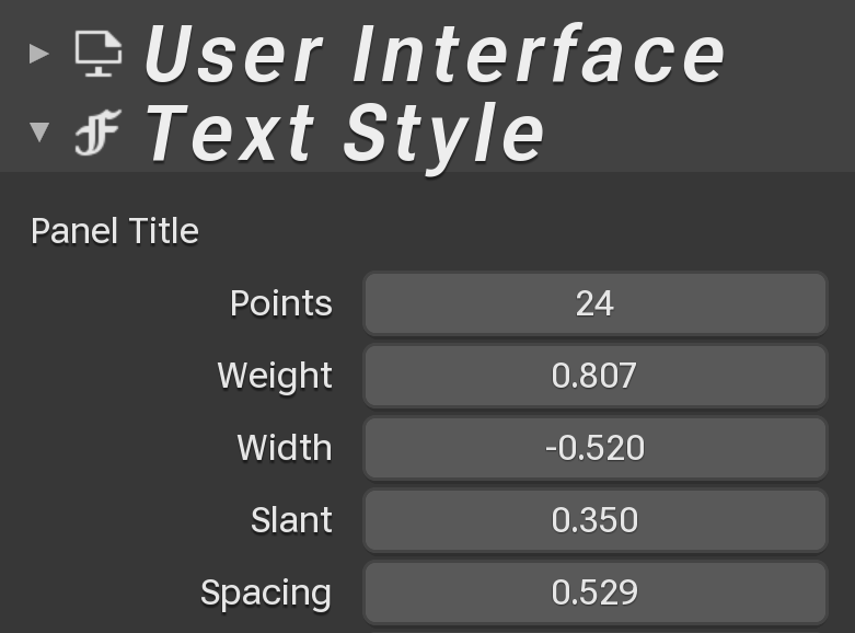
D12977 - Allows you to select Variable fonts and then change weight, width, slant, and spacing.
D12622 - Allows the interface to fallback from whatever fonts you select for Interface or Monospaced font. So you can select fonts that contains a small subset of characters but you still see all the symbols and language characters that we get now.
3 Likes
fixed link: https://developer.blender.org/D12977
Thanks! And I updated it in the earlier comment.
While not being strictly needed i’d very much like to have that spacing slider to smush the letters together a bit more. My monitor is not too large, and I could use the space gains even though it might look bad ;-D (edit: changed so → to)
1 Like
My only concern with having letter-spacing control is that it could screw up languages with complex layouts like Arabic, Devanagari, Khmer, etc. So letters that connect to each other (properly after we add text shaping with Harfbuzz) would no longer touch right. But I think I can deal this now that I think about it.
As long as it’s optional users can choose to trade legibility for space. Though I must admit I don’t really know if arabic, for example, completely screws up if you change the spacing or if it’s just that it’s ugly.