Hi,
a few months ago, a new layout of properties panel was introduced during code quest, resulting in significant regression in terms of space utilization. Now, with further changes to the properties panel, this inefficiency has reached obscene levels.
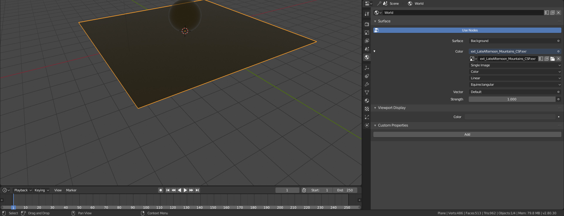
Here’s an example of loading and environment map as a world background in 2.8 with default properties panel width:
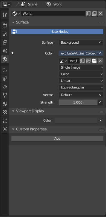
There’s tons of blank space completely wasted on the left, with all the UI controls squeezed on the right for no rason. At default properties panel width, data block field for the world texture map is so narrow it manages to display just 5 characters, despite using a screen that has resolution of 1920 pixels horizontally. It requires me to extend my properties panel almost half way across the screen to even be able to read relatively short texture name:
I hope this can be reconsidered before final 2.8 shows up.
Thanks