The meaning of what?
Yes, there is a bug there, but it’s not actually related to the Preferences - it exists throughout Blender if you resize the window, it will do this until you let go.
Hi William, I apologize if this is the wrong place to ask.
Is there any plans to add an option (or feature) to allow the sub-categories that we open in the preferences to persist? I feel like this is a middle-of-the-road option which will still keep the organization but allow some of us who prefer to have everything already open and would save some of us time (and avoid frustration – especially beginners) looking for that one option hidden somewhere in one of these sub-categories.
Hi William. In my opinion, the preferences window has become much more convenient and readable.
But the resizing of the window and open panels is not remembered and each time you need to open the necessary panels and resize the window for yourself. That would solve the problem of 100,500 clicks. And it will save time.
1 Like
Yes, the window size is reset every time you open the Preferences. This was always the case in past too. Ideally it would remember the size you gave it.
The same goes for the panels. Just like panels are stored as open or closed in the Properties, we could do the same for Preferences. The tricky thing is, I suppose, where this gets stored. It makes no real sense to store it in the blend file - makes more sense to store it in the Preferences.
3 Likes
the meaning that is a work in half, you can do much better, perhaps listening to the perplexities …
there is a need for more columns

2 Likes
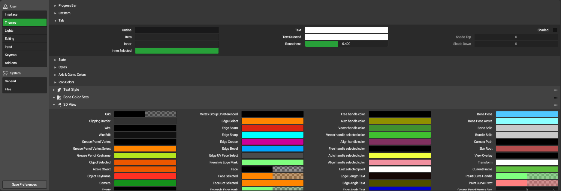
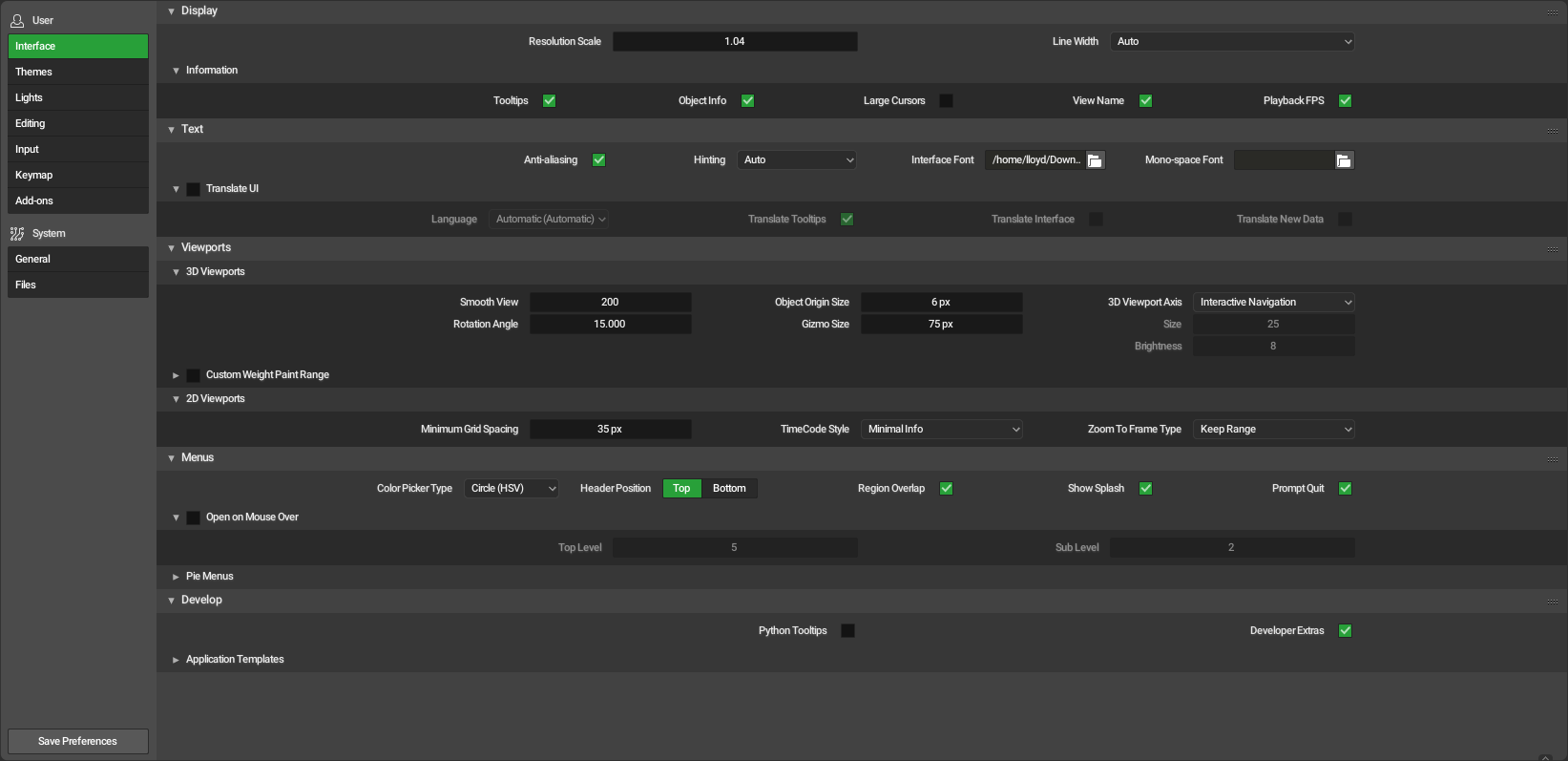
@billrey “Color Picker Type” is inside the menus category. I actually had a hard time trying to find it.
Seems a bit odd to have it there, no? Also the “Region Overlap” kinda feels out of place there as well, imo…
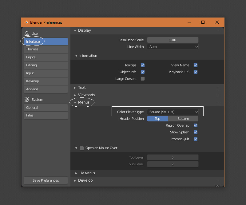
This comes from 2.7x, where these were also grouped with menus.
Do you have a suggestion for a different way to organize these specific preferences?
Uh!? Only Show Splash was near (Interface) Menus, and the separation is bigger than other menu related controls, like 2D Viewports to Rotation Angle. Prompt Quit was clearly marked as Warning in other corner of Interface with the previous layout. Color Picker was in System, a completly different section than Interface. Region Overlap was in System too, under Window Draw Method. Header Position is very recent IIRC, more than Prompt Quit.
More logical places:
-
Color Picker to Editing > Miscellaneous. There seems to be no specific place for color controls. Maybe a new place that can group other similar things will appear, but until then Miscellaneous.
-
Show Splash to Interface > Display (but not inside Information). Because it is a general thing that appears in front of user at first.
-
Region Overlap to Interface > Viewports > 3D Viewports. Because it affects them (view angle changes when toggled). If it ever applies to all kinds, just Interface > Viewports.
-
Header Position to Interface > Display, or Interface > Viewports. Because headers are part of areas that can contain menus, but not always have them and contain more things than menus (and menus appear in other places too).
-
Prompt Quit to Files > Save & Load, full line below Recent Files. Because it affects file saving and (full line, more important than the other toggles because) it can mean data loss.
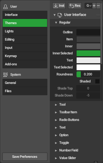
I’m not sure how people interpret those settings, but for me those are pretty much interface options/customization. Same goes for the language settings. So I guess I’d rename the “Text” panel to something like “Interface Options” and try to organize all those options there. Some of them under sub-panels etc…
Some of those were previously grouped with menus before too. I’ll take another look at them to try and find a better place for those.
Hi, it’s been a few weeks since i’ve downloaded a build of 2.8. And when I opened it this morning and needed to adjust something in the preferences, I am completely lost.
On one hand, I understand, the need for a better sub-organisation. On the other, as many have mentioned,there are too many dropdowns, that need to be expanded and endlessly scroll, while the columns while there is way too much padding, that could be utilised by extra columns.
So, is it better to have one page with quite a few categories that takes a little to get used to or a rudimentary organised dropdown, and expandable tabulation that, while inherently more organised could lead to more confusion as to what is where?
vs
Suggestions
If we are to have tabulations, they should be highlighted easier and they should be grouped into fewer categories, and live underneath the main menu. However, it is essential to think about the default landing page of each category and make the best possible use of this prime real estate with the most essential options. Only of everything doesn’t fit in the primary category do we need to create subcategories that are neatly separated.
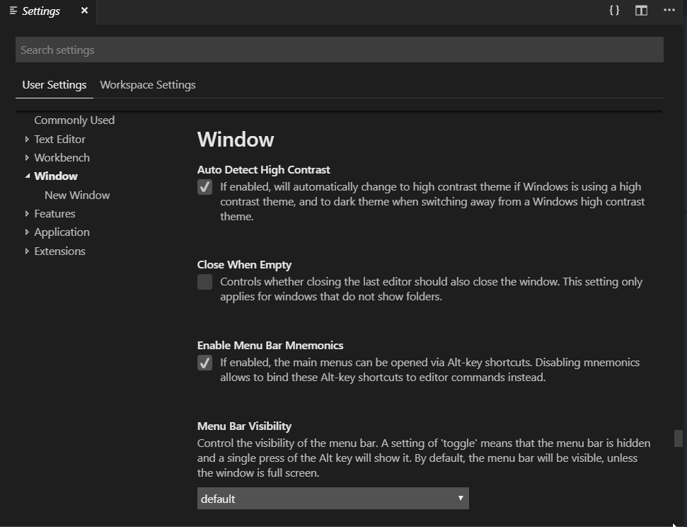
Here is an example from Visual Studio Code that I think works quite nicely:
7 Likes
I’d rather just scan my eyeballs across a few different tabs than play “Guess where the developer thought this option belonged”
Plus having all these tabs and then “General” is a red flag.
1 row, 3 rows, then 2… no thanks
I really think that a search tool at the top (like on the IDE gif example), sorting only the matching settings names, would put everyone together though.
2 Likes
I agree. What’s going on with Blender preference window. When Editor layout was changed. We were told that Single column layout will give more screen space. What benefit we are gaining with changing preference window layout. Old preference window was not cluttered. The new one in the name of cleaning up is cluttered and use less. I was searching for turning off auto prospective check box but after a half hour long fight, I gave up. We don’t need such mess. Please bring back old preference window.
New preference window is anti good interface. It’s a hide and seek game built-in. 
Some designers preffer to call this “better” and “organize”
No Sir, at it’s current state, Preference Window is a mess. It’s not organised or better than previous. Sorry for being rude here. I have hopes of blender becoming a better software. This layout is not helping blender.
You don’t have to convince me, there have been many of us who have criticized all the changes that have included the new layout of single column. And it is the most voted request about interface/UX in RCS. In the case of preferences the solution is especially bad.
But apparently utility and pragmatism is the last thing that matters at Blender2.8.
Kindda OK with the new layout ( we are almost there ) It adds a lot but introduces a lot of scrolling ( like the Properties Editor which IMO the breakpoints need to be tweaked or at least user settable )
I have 2 small suggestions. one to make the Preferences a little more manageable and two to fix the Theming problem which makes blender difficult to theme.
I feel we can accomplish this by a larger default (at least 2x) horizontal size and adjusting the break points when the items split to multi-column.
Currently the break points are too far apart . Expanding the Preferences horizontally we get …
One Column View
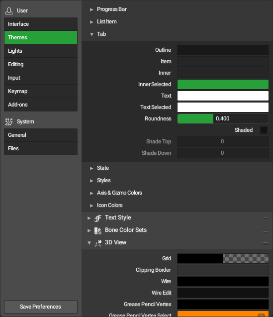
Two Columns View ( Note Editor is still in 1 column )
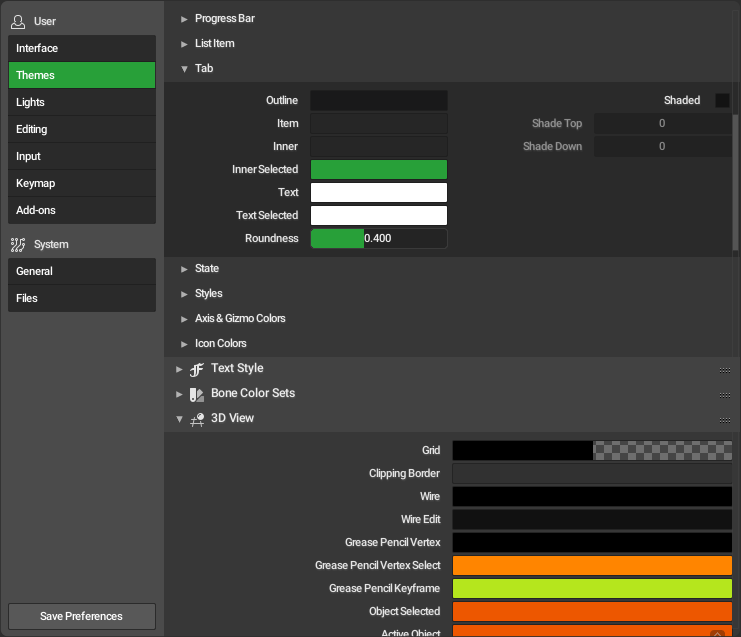
Three Columns View ( Note Editor is now in 2 columns )
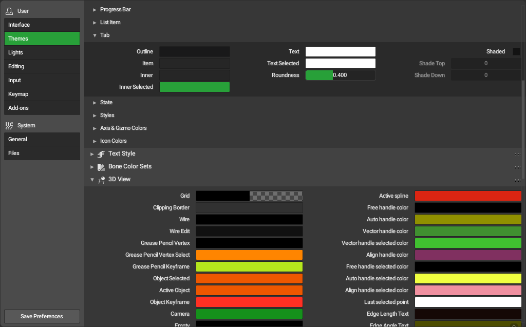
Three Columns View ( Note Now the Editor is 3 columns )
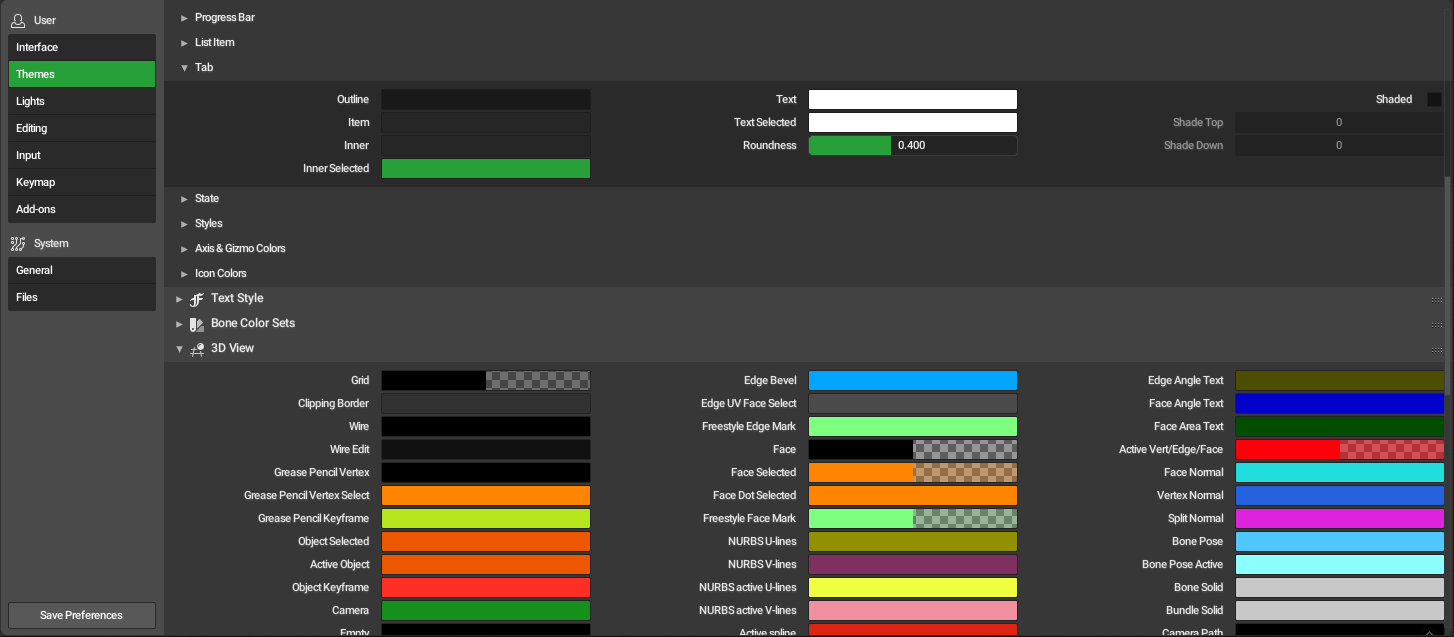
Four Columns ( Note Now its across the screen )
Ive checked …the minimum width of the columns before it wraps … approx
At this approximate size we can easily fit four across a window that’s around 2.5 times the current default width. I feel even without adjusting the column width we can get 4 with proper break points.
With a four column layout we can see 3 editors at a time … this is a HUGE difference to 3+ pages
A reduction of the column width and adjusting the break points can fix a lot.
BTW this will also fix the other preferences as they fit on one screen with everything expanded.
Theming
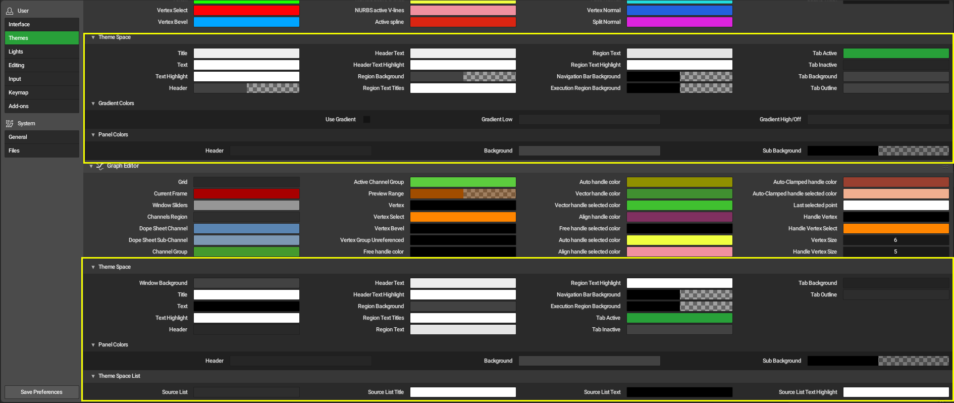
Theme Space settings in every Editor
As most of blender’s theme can be adjusted within the User Interface Section of Themes I suggest adding the Theme Space Settings to this section with possibly an override in the individual sections if a user wants to change any specific setting. This will change the time it takes to theme blender to a couple of minutes from a couple of hours 