Please write up more bugs and suggestions, and I will too. That will help us discuss which issues are most important to work on, and gather together examples and links to other relevant pie menu implementations, prototypes and research papers, to compare alternative approaches, and come up with new ideas.
It’s important to air the issues and hear from people are actually using them in Blender (including people who don’t like them), especially for me since I am new to using Blender itself! But I can help avoiding mistakes of the past and highlighting ideas that worked well. I want to help programmers and users understand the design issues and have the tools so they can make their own pie menus.
In response to your suggestions:
First: What do you mean by remove common artifacts? I agree that warping behaves differently not just according to the platform but also according to the input device, mouse sensitivity and acceleration, screen size and resolution, and OS settings, so it gets pretty tricky.
That suggests pie menus (and Blender’s interface in general) should support optional features that users can enable/disable and adjust for different platforms and input devices, since you might have any number of very different devices attached at once, and it would make sense to use them all together. But I don’t understand enough how Blender’s input system works to know if per-device settings would be possible.
Bill Buxton wrote an excellent paper on input devices in 1983, called “Lexical and Pragmatic Considerations of Input Structures”, which categorizes input devices and how their unique properties map to the problem domain, and discusses a lot of important concepts like pragmatics, chunking and closure, device independence, taxonomy of devices, and the nulling problem. These are very important issues for thinking about designing user interfaces for multiple kinds of input devices:
https://www.billbuxton.com/lexical.html
lexical: issues having to do with spelling of tokens (i.e., the ordering of lexemes and the nature of the alphabet used - symbolic or iconic, for example).
pragmatic: issues of gesture, space and devices.
Figure 1: Taxonomy of Input Devices.
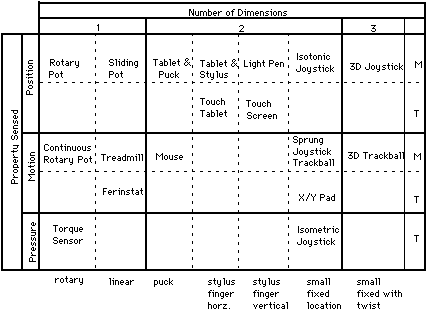
Continuous manual input devices are categorized. The first order categorization is property sensed (rows) and number of dimensions (columns). Subrows distinguish between devices that have a mechanical intermediary (such as a stylus) between the hand and the sensing mechanism (indicated by “M”), and those which are touch sensitive (indicated by “T”). Subcolumns distinguish devices that use comparable motor control for their operation.
Second: Simon Schneegans’ beautiful work on Gnome-Pie, the Coral-Menu, and the Trace Menu will blow your mind and inspire you with his organic, dynamic, yet practical designs, especially his easy to use user-editable drag-and-drop Gnome-Pie application launcher design tool.
I can’t understate how much I like Simon Schneegans’ Gnome-Pie: This page has moved
Not only is it all slick, beautiful, and elegantly animated, but it’s properly well designed in all the important ways that make it Fitts’s Law Friendly and easy to use, and totally deeply customizable by normal users! It’s a spectacularly useful tour-de-force that Linux desktop users can personalize to their heart’s content.
Simon Schneegans’ Gnome-Pie: Gnome-Pie is a slick application launcher which I’m creating for Linux. It’s eye candy and pretty fun to work with. It offers multiple ways to improve your desktop experience.
Check out the amazing demo:
I also love his bachelor thesis work on the Coral-Menu and the Trace-Menu:
Simon Schneegans’ Bachelor Thesis: For the same reason they are effective. But by far the most remarkable advantage is their continuous learning curve. Users may become extremely fast just by using the menu. Every time they make a selection, they get faster and more accurate. At some point it is not necessary to read the labels anymore, because the user remembers the direction of an entry. With “normal” linear menus that is not possible. The maximum selection speed with a mouse is very limited and soon obtained.
The Coral-Menu: The first prototype is targeted at users who often search for items due to their manifold menu usage. It displays hierarchies with ease. Even very deep hierarchies are easy to explore. Many items are displayed by increasing the pie’s radius and stacking the labels which are displayed next to their sector on top of each other. The following clip demonstrates the behavior. As you can see, the items of sub-menus are indicated by little dark blobs at their parents. This menu is quite fast to use because of the mouse making a smooth movement.

The Trace-Menu: The second prototype addresses itself to users who often make use of the same menus. Thus they know where to find an entry and want to select it blazingly fast. In contrast to the Coral-Menu each sub-menu is a complete 360-degree-Pie-Menu with one entry being the parent menu. The hierarchy is visualized by a path between the visited menus. This menu features a so-called “Marking-Mode”: The user may draw the path (the “trace”) to the desired entry with one continuous gesture. Watch the following clip and you will understand this behavior — the Marking-Mode is used for the very last selection.

Third, that is the holy grail, indeed! Check out how Gnome-Pie works with drag-and-drop! I think it’s also important to balance having good defaults, with having too many options and no way for users to discover the purpose of those options or to know when and how to use them. I think it’s important to educate users in the issues around pie menu design, and also for the tools to promote good practices, yet be configurable enough for knowledgeable users to make exceptions to the general rules of thumb when they’re appropriate.
For example, eight is an ideal number of slices for many reasons, but sometimes it’s appropriate to have a dozen or even more (using the menu more like a dial or channel changer, like selecting from a circular palette of discrete color samples around the outside edge of a continuous brightness/saturation/hue color wheel).
But seven items (or any odd number, but seven in particular) is a horrible number of slices, and you should throw in an extra empty slice to bring it up to eight.
Here’s another paper called "An empirical evaluation of some articulatory
and cognitive aspects of “marking menus” which measured the performance of marking menus with different numbers of items, which determined that 7 slices are actually slower than 8 slices:
https://d2f99xq7vri1nk.cloudfront.net/legacy_app_files/pdf/93-p1-kurtenbach-empirical.pdf
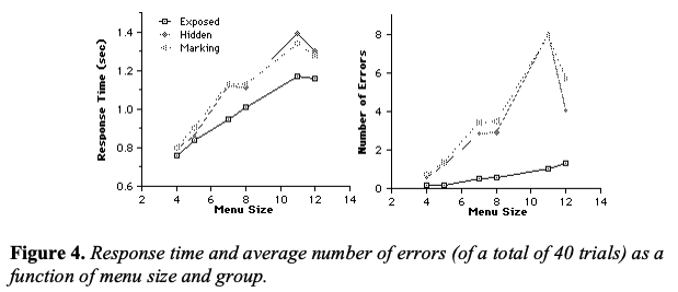
Notice how in general the more items a menu has, the slower the response time and higher the error rate, except that 7 items is actually a little bit slower than 8 items, and 11 items is a little bit slower than 12 items, and 11 items has a much higher error rate than 12 items:
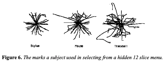
It also compared different kinds of input devices. Check out the “Stroke Analysis” section to see the graph of how different the marks with stylus (most accurate), mouse (less accurate), and trackball (very inaccurate) were. Each of those input devices should have different “click detection distance”, “inactive radius”, “motion stop detection time”, and other tracking parameters, as well as different screen edge handling (because the stylus is an absolute positioning device that you can’t warp, but you can warp the mouse and trackball since they’re relative positioning devices).