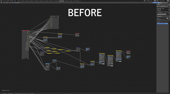
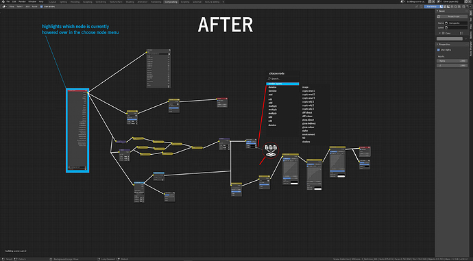
node trees quickly become an illegible mess. I think that all nodes should have one input and one output. The wire will carry all information from all downstream nodes, and then instead of each parameter having an input socket, they would instead have a choose data button, which when clicked on would open up a multilevel menu where you could choose the parameter from any of the downstream nodes.
When you hover over items in the choose node popup, the actual node would also be highlighted so you can easily find the node/parameter you need.
It would be a lot tidier and infinitely more legible, and for anyone who loves the mess, there could also be an option to toggle between the two modes.
Additionally there should be a way to toggle all wires on and off, apart from the wire of the selected or hovered over node.
images are 4k, so open them in a new tab for a closer look.

