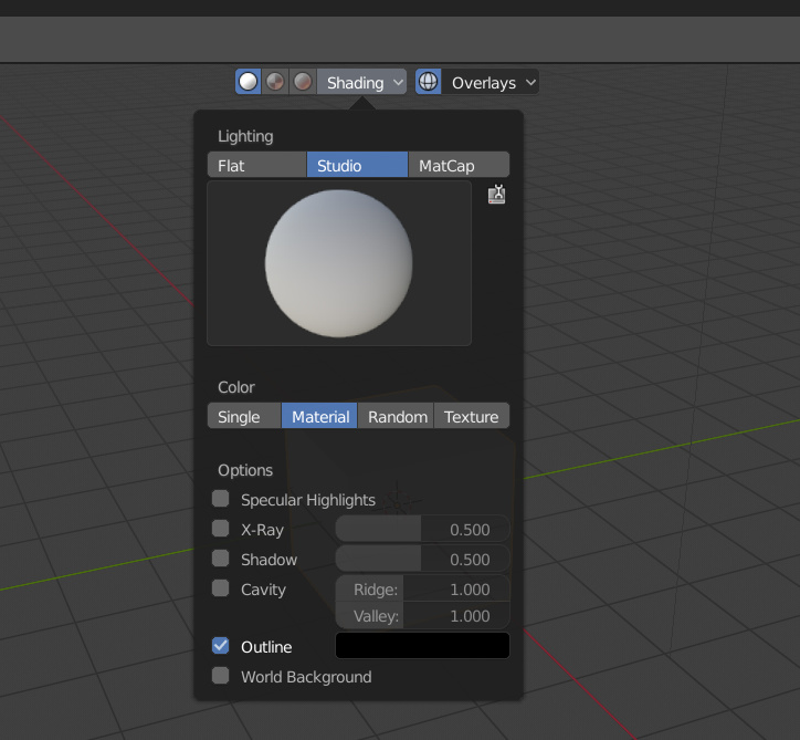
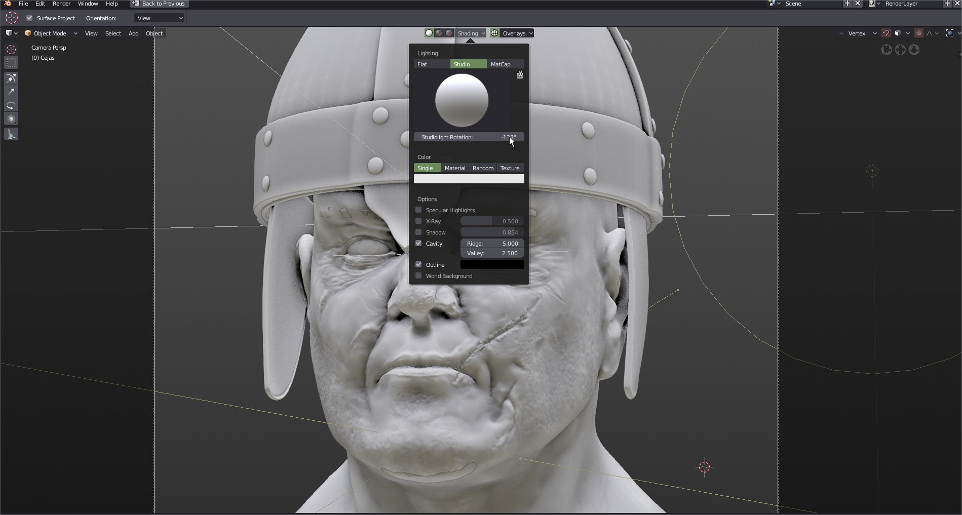
I would love when developers would think once more about the position of the shading+overlays menu in the middle of the upper menu bar in 2.8. On smaller screens (even on 17") the opening windows overlaps with the object(s) which you wanna look at, and from my opinion this is more a disadvantage.
Even every beginner (and many of your changes are considered to address beginners too, as mentioned in some of Pablos videos and other sources ) sees just this effect when opening blender with the default cube and selects one of theese menus.
Generally a popup window in the middle of the screen is not convenient from my opinion, especially for changes which the user want’s to see instantly and should be avoided with exception of small ones like the pie menus.
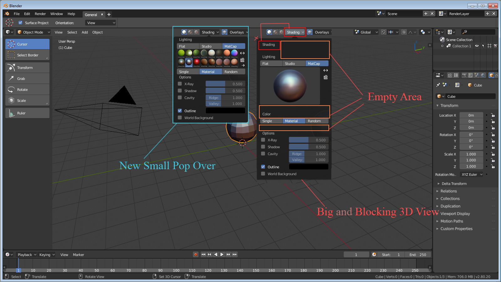
I feel that the previous implementation of the layout, (with the snap-pivot in the middle and the overlays on the right) was more logical and convenient, mainly because pivot-snap-soft selection are direct workflow tools, not just visualization options; By that I mean that you are going to want to access and change them more frequently, so it makes more sense to me that they would be in the middle, being more accesible. And you wouldn’t have the popup problem that you are now pointing out.
I agree 100%. The snap and overlays should be swapped out. Snap is fine in the center, but the overlays dropdowns cover the thing you are trying to adjust.