I made a quick draft of a new design:
-
I made the entire top bar grab-able, minus the icons obviously, but anywhere there is blank space on the top bar you can grab it.
-
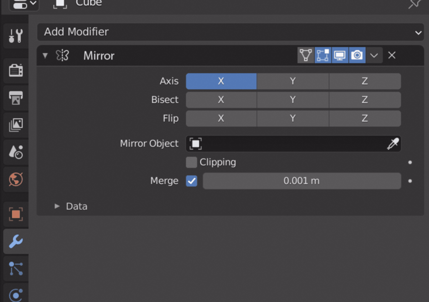
I also changed the top bar to be a different color, deeper gray here. I think this might help show that it is grab-able, or at least sort of a separate entity from the parameters. This would also probably help book end things in longer lists of modifiers when the parameters are open, you could easily tell where one modifier starts and ends.
-
You can double click the modifier name to rename it. Since the whole top bar can be grabbed, you have to click on the text, not the empty space near it.
-
I made the modifier name highlight when hovered over. Since the whole top bar can be grabbed there is no longer any constant text field, because of that, it is important to give some evidence to the user that you can rename it. I think just the highlight might suffice.
-
I gave the whole modifier block a subtle highlight on its rim when hovered over. This highlight also turns black, like it does now, when being grabbed. This is good for showing what modifier the hotkeys you press are pertaining to.
I didn’t go with the open hand closed hand icon idea after all, maybe a bit ham fisted haha. But you could just as easily picture this mock-up with that, it would just show up when you are hovering on the top bar.