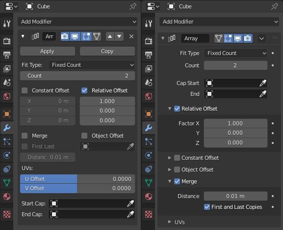
That picture is representative of a usercase that does not exist.
Nobody needs to open all sub-panels of an Array modifier.
You never need to expose 3 types of Offsets because you never use 3 types of Offsets for the same modifier.
In practice, you don’t adjust UVs at same moment that you focus on generating more geometry.
It is true that you have extra clicks to open/close subpanels.
You organize your stack to expose important settings. And then, you don’t open/close anything during a long moment until a need to reorganize stack happens.
Subpanels, here, are clearly helping to avoid some scrolling.
So, a fair comparison between 2.83 and 2.90 layout should be something like that.

The modifier only displaying useful settings while modeling does not take more space.
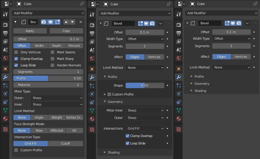
Another example with Bevel modifier.
This modifier is long in 2.83 whatever setting you want to tweak.
But in 2.90, only hiding shading settings is sufficient to make it as long.
In 2.83, if you use a custom profile; you can’t close profile curve. You have to close the whole modifier.
But with 2.90 layout, you can minimize a lot modifier size and free space to tweak settings of another modifier.
You can tweak some settings of bevel modifier and settings of another one. Without closing/opening the whole modifier or scrolling at each change.
If you neglect issues that should be solved by proposed recent patches, the idea that layout in master is worst to work with multiple modifiers does not resist to reality.
By removing row of buttons repeated in each modifier, HooglyBoogly made us gain space for useful settings.
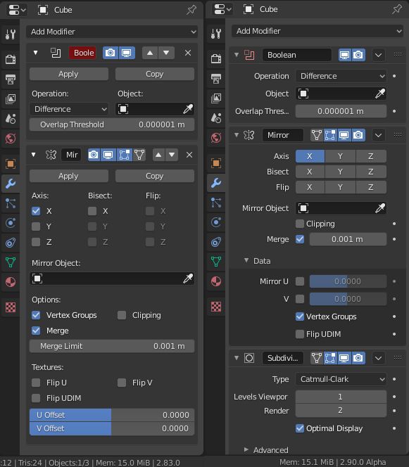
Layout of 2.83 has flaws that are visible with Mirror Modifier.
HooglyBoogly did not strictly follow a one line per label / per option / per slider.
Line of Merge setting has 3 elements in one row.
He made us gain space for a third modifier.
So contrary to what is suggested by Alberto picture, each modifier of 2.90 has a proper shape, with a proper amount of settings and a unique grouping.
Those modifiers can be recognized. It is normal to be a little bit lost, now.
But it is because those shapes are new. I am sure that is just a matter of time to get used to them.
I asked developers to let 2 columns layout for modifiers, at early state of 2.8.
And they respected that and made 1 column layout for all the other tabs of Properties editor.
I am not a fan of grid layout. And since 2.5, I asked for a 2 column layout of panels.
But a multi-column layout of panels means that layout inside panels corresponds to 1 column of settings.
So, there is no reason to oppose a resistance to proposed layout if you want multi-column layout for all tabs of Properties Editor.
Because 2.83 modifiers tab is the current last obstacle to that.

