Wow, I really like the “3D cursor transformation orientation” icon!
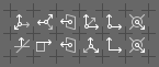
Looking at it, I realize that both it and “normal” seem the most clear of the set, while the rest become a sea of multiple axes. I think it is because those two whittle down “orientation” to a much simpler “which way is up?” Yes, I realize that neither of those arrows is “up” but that is relative, which is exactly the point with orientation.
Could this be applied to the others? Just a single arrow on something, rather than a set of axes? So global could be something like the grid used for “3D Viewport” but with a single arrow somewhere in there instead of an object. Local could be a little square with one side extending into an arrow. View could have something to represent the view with an arrow inside. Gimbal would then work great as it is.
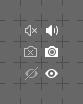
With the multistate icons, for me personally, it seems like the “off” states reveal little information about their state. Probably the sole exception being lock/unlock which clearly shows each state and so works independently. The others seem more like “disabled” (unchangeable) than “off”.
So I prefer the “breaking” chain for “not linked” versus just having the gap. And I like seeing the little “x” for “muted sound” because it more clearly tells the story. Maybe I just look at these things wrong, but I like to see just the “off” state and know what it is without having to compare it with “on”…
All transformation orientation icons share a specific visual style that makes them all belong to one family. Most of transformation orientations are determined by the mutual relationship of the coordinate system axes, and sometimes by the relation of the entire coordinate system to space. So, bunches of arrows in different configurations is the best way to depict a problem. Each of those icons quite precisely and vividly represents different causes of transformation orientation in space.
Personally, I don’t have problems with all those arrows and I think that further simplification won’t be a good thing.
Regarding the “off” state of two-state icons - I avoid strikethroughs because they unnecessarily unify icons, that should stay visually different. That’s why “on” eye is open and “off” is closed (really abstract BTW). For similar reason I removed the “x” from muted speaker icon - the silhouette of “on” and “off” pictograms were way too similar.
It’s extremely difficult to find symbols that can be legibly presented in the form of contradictions, without using strikethrough or x-deletion. For this reason, I came up with the idea that the “off” state will be represented by the maximum possible extinction and simplification of the pictogram silhouette. The treated icons are clearly different from ordinary dim. In this way, I could avoid problems with symbols that do not have an obvious representation of opposite states. Breaking chain was too busy, so I drew the icon with middle chain link removed; I opened the arrow and leaved just two lines that define the shape; the muted speaker does not emit a sound wave, thus the waves were removed; colour chart had all colour/fills removed; and so on…
On the other hand I really like Your “exclude from rendering” icon, since the “x” is less obtrusive than the lens’ circle and clearly suggests that the camera is blind.
I’d be more than glad if You could lean over some of icons, which “off” state depiction isn’t as good as it should be:
the pin;
the colour chart;
the modifier (this one is especially hard, and I think it will have to stay as is).
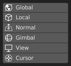
It might just be me then. But I really can’t see anything in Global, Local, and Gimbal that sets them apart in a way that I can make sense of. To my eyes they just look like three axes in slightly different orientations, but not in a way that says “local” versus “global” versus “gimbal”.
All icons that have to be tridimensional were drawn in oblique cabinet projection.
Having this in mind:
Global - X, Y and Z axes reflect a standard arrangement of axes in the Euclidean space - the Z axis is vertical and perpendicular to the plane defined by X and Y axes that are perpendicular to each other.;
Local (custom) - generally the same as above, but skewed in space, so that Z axis ain’t vertical. The skew angle depends on individual object’s coordinates. I agree that this one ain’t perfect. It could use generic Object symbol somehow. I’m no sure…
Gimbal - the selected axis changes its position relative to the others. Try it with gizmo on and You’ll see, that this one is quite good.
Whether that “pin” is better or not… damn, you really are good at this!
All icons that have to be tridimensional were drawn in oblique cabinet projection
In my “global” I kept that projection, but just made it look more like the global axes. Removing two of the arrows seems like a nice way to make them more unique, and is something you did for Normal and Cursor.
When I play with “Gimbal” it is more likely to look like my version, but probably because I don’t know what it is doing. LOL.
It is true that my “local” broke the “oblique cabinet projection” rule, but it was just an (ugly) suggestion that still says “local” to me. Part of the problem with your “local” is that you kept it aligned too much - that left axis is too horizontal so it implies that there is relation to the global axes that doesn’t exist. Local should be wonkier.
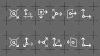
This is more on the right track in my opinion, having looked over literally every icon in the set and scrutinised it, I can tell you the multiple axis orientations can’t be told apart easily enough.
@jenkm - we’ve been there. Kind of.
The point is to:
get all Transform Orientation icons different from the the Object, World, Sphere, Screen Space and 3D Cursor;
make all those pictograms share a distinct visual style that define all of them as one family.
Will leave the design as is, but some efforts will be made to improve readability and highlight the uniqueness of individual icons. The Local and Global icons need some more love, I think.
I think the safety pin’s not widely used, because its shape is quite hard to depict.
However, it has an advantage over the pushpin - it unambiguously changes the state from “closed / OFF” to “open / ON”.
Definitely worth considering.
So much nicer than my “programmer art”! I can actually guess immediately which is “global” versus “local”, and they all still indicate that it is about “orientation”. Nicely done…
That looks nice, but I think the problem is that (at least in English) the metaphor the “pin” uses is the idea of saving an important piece of paper for later to a cork bulletin board. So generally just pushpins.
Not that the “safety pin” couldn’t work as a metaphor if we try really hard. The Blender user could just be thought of as a “Lazy Dad” and the file being worked could be his baby. In that way the safety pin closed on the diaper would keep all the crap in. But if the pin is left opened then the crap will leak out and then someone else (the less lazy mother probably) will clean it up for you. LOL