You deffinitely should repost this in the Paper-Cut section. Or even better - start there a thread “misused icons” with this very issue as first post. A thread for reporting wrong use of existing icons, but not related to design issues. Low hanging fruits I mean. I bet there’re tons of such tiny bits to track down.
can we make the 3d cursor icons more consistent pls ? I know there are reasons to be different on the toolbar and on the header Orientation and origin and on the SHIFT S Snap pie menu but still…
I love you bro, can you try your luck with the extra objects and similar defaults addons for the Add Mesh menu and for the super usefull and easier to use boolean addon Fast carve/ For now I think it uses some placeholders default icons.
But yeah these look very professional.
Im still vey unhappy with the modest Object framed square icon that now has to be replicated in all places for the sake of consistency
They’re descriptive but at the same time they are of poorer quality and they look off in the set.
I don’t know how else to represent location, rotation and scale in that limited space though…
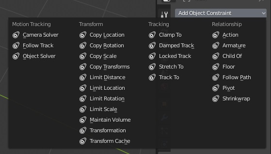
Maybe there should only be two icons, one for copy, one for limit. What do you think about it @jendrzych@billrey ?
I’m sorry but no, I don’t know if William is of the same opinion, but with hundreds of addons out there I think we can’t prefer one over the others by adding custom icons in the main icon sheet.
The space there is limited and only core developers can define new icons in the code.
If in the future addon developers would be able to define new icons via python, then it will be a different matter, but since then I think that every addon should be treated equally and only have access to the blender core’s icons.
Depeche mode, because time in my job is running out like a madman:
would be best to avoid composing icons of several different symbols (it’s sometimes unavoidable, though);
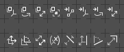
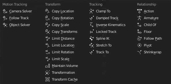
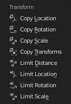
the Copy Location uses an Empty icon, which can be misleading - another depiction of the location is needed;
the Copy Transform uses an Object icon. Why?
Using only Copy and Limit icons is acceptable, unless we work out better solution. Will lean over this during this week. No hurry, I suppose, since the UI is frozen until next release cycle.
nah pls not only 2 icons. For position rotation and scale why not use the Blender respecive gizmos as symbols ? And in general same thing like modifiers, its hard for them to be descriptive enough for what they do, so they are not meant for beginners acquaintances with them but rather for experienced user that already uses them and serves more for quickly distinguishing one from one another.
@jendrzych Did @billrey ever comment on replacing the wrench in the tool settings icon? I’m not sure if it’s too late, but I’ve been bringing it up for months now, and it really should be addressed.
Some times less is more, using only two different icons makes stuff a lot easier to find. I’d even go with only drawing two icons, one for the first item of each category (copy and limit)
the original idea also had very similar icons for Copy and limit Constraints. I dont know in what way taking out the little extra particular symbol from each of them would make them more findable. I find it it hard to believe he cant tweak a bit some generic symbols like rotate, scale etc to be on his like if thats the problem. As a parallel with the modifiers icons, we also have there modifiers that share the same icon but the idea of a modifier is way harder to convey through a minimalistic symbol (like the Vertex weight ones) so in that case sharing same icon is probbably the best compromise. Here I think its kinda basic so dont need to go beyond minimal.
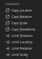
The rotation ones and limit scale may work really well!
I’m not sure about the others though:
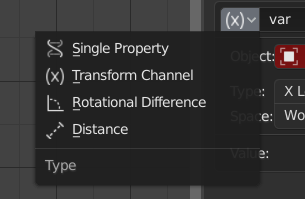
I don’t think that the transform channel idea would work, I always thought of the X in that icon as a generic indication of “one among a list”, and that’s basically what it does, you can only choose one of the properties.
Maybe the one you did for copy transforms could be used for the “Transformation” constraint instead, with which you can use, for example, the rotation of an object to drive the scale of another. Then we could use this one as “copy transforms” (mirrored to follow the rotation one you did).
limit distance is difficult to understand imo, with both the endings like in the drivers panel it’s clear but like this it seems more like an interrupted movement (or also a lever).
copy scale maybe is a bit too similar to the fullscreen one, the context is completely different, but still…
Maybe it could be something like this?
(“limit transforms” and “copy distance” do not exist btw )
Yep. First shot and I missed the point a bit.
What 'bout that (Yours above, my at the bottom):
Do not mind the Copy Transforms for now. What is the difference between this one and the Transformation Constraint, BTW?


 )
)