Hold Your horses sir! Let’s move the update a bit in time.
The Outliner’s visibility discussion (this task especially: #61578 - Outliner Visibility Update - blender - Blender Projects), inspired me to revamp some of visibility restriction icons. There’s always something to improove.
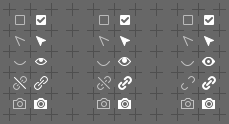
Left column - what we have now.
The middle one and the one on the right - my proposals.

The right column is the most coherent in style IMHO.